Categories
Project 3

Project #3 – Andy Loeshelle

What question/problem did you choose?

Taken from Cornell’s Summer Session 2013: Create a structure that resides on a cliff and is a part of the cliff itself.

Why did you choose this topic and why does it matter to you?

I chose this as my topic because this was the first real architectural problem that I had when I was at Cornell and I wanted to readdress it with more skill and abilities.  I can now use a program such as Rhino to actually place the structure in the intended environment.  This was a huge challenge for me when I was at Cornell and took me about four weeks to complete, I want to see if I can finish it in much less time.

Give some details on the question/problem – explain it in depth.

The question, as outlined by Cornell, was to take a building and make it one with its site.  While many people tried to just physically incorporate it into the space, I tried to place a deeper meaning on the question and make the building a reflection of nature and a way to view it harmoniously and reflectively.

List out 10 tangible places/people/things that are associated with your question/problem.

  1. Mountains
  2. Canyons
  3. Grand canyon
  4. Cultural sites – provide meaning and context
  5. Rock
  6. Viewing stations
  7. Tourists
  8. Shearing
  9. Fissures
  10. Striations

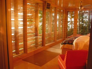
Influential artist: Taylor Smyth Architects

Artwork: Sunset Cabin

SUNSET CABIN

Attribution: I will use a version of the slats located on the windows to bring more significance to my work.

Categories
artsXpose

ArtsXPose #4 – Andy Loeshelle

Title of Event: Bryan Wills’ Senior Recital

Date and time of event: Friday, 17 April 2015, at 7:30pm

Location of Event: Natalie Davis Rooke Recital Hall in the Sigrid Weis Music Building

Type of Event: Musical Performance

1.) Provide a brief detail-oriented technical description or summary of the event you attended. (This section should remain journalistic and should not be reflective of your opinion.)

This concert featured baritone singer Bryan Wills.  He sang twelve songs for his concert, including many that were not in English.  He did three songs in English, one song in French, four songs in Italian, and four songs in German.  Following the recital was a reception where I spoke with Bryan about his performance and the differences between performance routines for singers and instrumental musicians.

2.) Use the section below to write a well-structured paragraph focusing on your personal criticalinsight / response to the event. How did you interpret or react to what was presented to you?

I found his performance to be incredibly interesting.  However, I would have liked some background on each of the pieces before I listened to them.  While the program did have translations for most of the songs, I was surprised that he didn’t stop between pieces to explain his next works.  Upon asking him about this, he said that the music department is highly critical of performers actually speaking to the audience, and he was therefore not allowed to interact with them.  Bryan has been a friend of mine for a long time and I haven’t heard him sing since Freshman year.  It was amazing to hear how much his voice had changed and developed.

3.) What information, ideas, images, etc. most impressed you and why?

The thing that I found the most impressive was his ability to do such a long program and switch effortlessly between languages.  The different pronunciations and syllabic nuances of each language would have given me a headache if I were a singer.

4.) Overall, how would you rate this event (10 being the most worthwhile)?
(10 / 9 / 8 / 7 / 6 / 5 / 4 / 3 / 2 / 1 )

9.5

5.) Justify your rating in the question above:

I thought that Bryan’s singing ability was unbelievable.  However, his accompanist made a few mistakes that I was able to pick up on – such as entering in early and forcing Bryan to come in late for his entrance, forcing him to start in the middle of a passage.  To clarify, I would give Bryan a 10 and the accompanist an 8.5.

Categories
artsXpose

Andy Loeshelle – ArtsXpose #3

Title of Event: Visit to the Frick Museum

Date and time of event: Sunday, April 5th, 2015

Location of Event: Frick Museum, New York City

Type of Event: Visit to the Frick – viewing of permanent collection and new Don Quixote special exhibit

1.) Provide a brief detail-oriented technical description or summary of the event you attended. (This section should remain journalistic and should not be reflective of your opinion.)

The Don Quixote exhibit features several tapestries featuring the hero of the Cervantes books.  Also, there is a collection of woodcuts and etchings that show the hero and explain the influences behind the creation of the tapestries.  Each work had a description of what was featured and where the depiction came from in the Don Quixote storyline.

2.) Use the section below to write a well-structured paragraph focusing on your personal criticalinsight / response to the event. How did you interpret or react to what was presented to you?

This exhibit was interesting to say the least.  However, it lacked what was supposedly the featured element.  There were only five tapestries that were featured and the vast majority were etchings and woodcuts.  While some of the tapestries were visually beautiful and quite colorful, they lacked real technique.  They were merely depictions / reproductions of the surrounding woodcuts and etchings.  Other than this exhibit, though, I enjoyed the rest of the museum.  I have been to the Frick several times and regularly go to see the paintings of Turner, Constable, and the famous works such as the painting of George Washington, which is perhaps the best known work depicting the President.

3.) What information, ideas, images, etc. most impressed you and why?

Frankly, I was left unimpressed with the Don Quixote tapestries.  However, I am still baffled with the beauty of the Turners.  Turner has been my favorite artist for a very long time and his works always fill me with a sense of wonderment.

4.) Overall, how would you rate this event (10 being the most worthwhile)?
(10 / 9 / 8 / 7 / 6 / 5 / 4 / 3 / 2 / 1 )

Eight

5.) Justify your rating in the question above:

I had originally gone for the special collection, which I feel really let me down.  However, the etchings that were shown next to the tapestries were quite beautiful.  Also, the rest of the museum, as always, was wonderful.

Categories
Research Binder

Cremaster Reading Response

When Blyn discusses how we have entered a posthuman era, I believe that she is trying to describe how humans have the capability to physically reinvent themselves through technology. In this posthuman era, humans have the ability to change their own characteristics, including the way that they look. An example of this would be Mullins who has become an architect of her own identity. As a handicapped woman, Mullins is given enhancements that allow her to walk again. Because of these enhancements and the beautiful clothing that she wears, she isn’t restrained to being thought of as handicapped. Rather she is “handi-capable.” As to Blyn’s suggestion that the posthuman era is marked by corporate domination, I would tend to agree. Seemingly, America is dominated by corporations that hold influence on all aspects of our lives. Not only do they hold influence over governmental functions, but they are also the facilitators of the great consumer culture that is America. I would say that humanity is facing a net loss by augmenting our bodies. While slight augmentations, such as prosthetics may be incredibly beneficial, bodily manipulation can get to a point where it is going too far. Plastic surgery is not entirely frowned upon now. What is to say that humans will not be altering the genes of their children in the future so that they will look better or so that they are more intelligent? At what point have we gone too far? When humans figure out how to efficiently manipulate genetics, they will have the ability to change whatever they want about the human figure.

Categories
Research Binder

3D Scans

Categories
Research Binder

Cremaster 3 – Art Report – Andy Loeshelle

Immediate Response

This video was incredibly confusing and slightly off-putting. I couldn’t help but think however much money the movie cost to produce, it would be worth paying more to never have to experience it again. The movie was an assault on all of the senses, blending mixed visual cues, musical cues, and characters who seem to make countless mistakes in their choreography. The building itself stood out to me because I have been to the Guggenheim museum countless times. My experiences there will now forever be tainted by the memory of Cremaster 3.


Objective Description

The film starts with several scantily clad females in a pool filled with bubble bath. They exit the bath and proceed to encounter dancers who are dressed like lambs. Then, the mostly-nude girls proceed to a rotating pedestal, on which are presented the main characters of the film one after the other. Text appears with the arrival of each character giving them a designation or title of some kind. The last character to be introduced, and the “star” of this production is a man who appears in all pink wearing a kilt and massive hat that looks like a Bearskin, or a cap that was ceremonially worn by Scottish soldiers. More striking though is his “beard,” which appears more like a living rag that he has bitten into and is now bleeding all over his face. After his introduction, this character proceeds to scale the interior of the building using rock-climbing stones and the balconies. At each level of the structure, the other characters that we met before on the pedestal confront him. He ascends and then descends the levels after having his encounters.


Technical Decisions

Each individual element of the story seems to be meticulously crafted to create the confusing work of nonsensical stupidity that is Cremaster 3. Not only were the costuming choices somewhat odd, with the makeup being imperfect and nowhere close to realistic, but the music was off-putting, and the content poorly rehearsed. Obviously whoever created this film chose to incorporate all of these elements for a reason, but I cannot even begin to understand why they would choose to incorporate anything that was shown.


The Work in the World

This film really seems to be a hodge-podge of elements, being anything but seamless in its presentation. Many of the visual elements and cues seem random when mixed with the horribly atonal sounds that are playing in the background. Whoever put this together must have wanted to confuse the audience, because there is no possible way that anyone could piece together the meaning of it without outside knowledge.


The Story It Tells

I have absolutely no idea whatsoever as to the message of this film. I do not understand it at all. It seemed so ridiculously ill-conceived that I find it hard to believe that people would even consider it art. This work was seriously odd and leaves me with more questions that could possibly be answered.

Categories
Miscellaneous

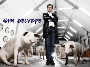
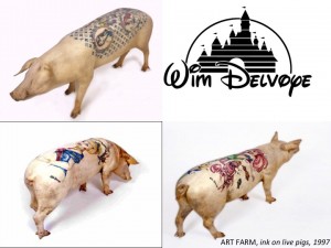
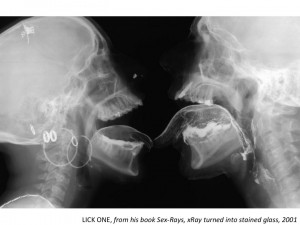
Artist Presentation – Wim Delvoye

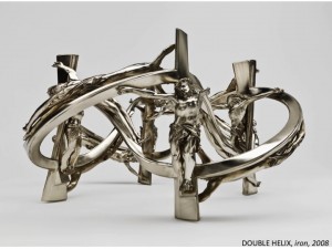
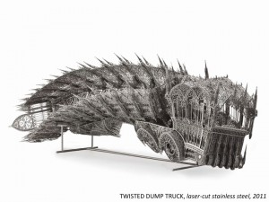
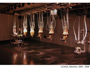
Slide1 Slide2 Slide3 Slide4 Slide5 Slide6

Categories
artsXpose

Andy Loeshelle – ArtsXPose 2

Title of Event: An Evening of Arab Music with members of Al-Bustan Takht Ensemble

Date and Time of Event: 7:30pm, Tuesday, February 3

Location of Event: Rooke Recital Hall

Type of Event: Musical performance

20150203_203357

Categories
Research Binder

Andy Loeshelle – Chapel (Scale Model) by Wim Delvoye


Wim DelvoyeWim Delvoye 2


ARTIST: Wim Delvoye

WORK NAME: Chapel (Scale Model) 2007

LOCATION FOUND: http://www.wimdelvoye.be (Artist’s Personal Website)


Immediate Response:

Primarily, I chose Wim Delvoye as my artist because a lot of his sculptural works incorporated architectural elements into them. I find his work fascinating because of his use of 3D modeling in his sculpture creating process. When I saw his work Chapel, I was at first amazed by the sheer precision of every surface and facet. What I particularly liked about this work was his use of a cutaway section. When I was younger, I loved books that showed, not only the exteriors of buildings, but also the interiors and how the exterior of the building was reflected in the interior and how the style carried over. Seeing this work, my childhood fascination again showed itself and made me really like this work of art.


Objective Description:

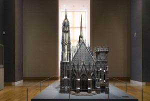
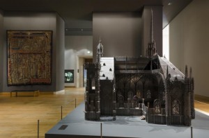
The work itself sits on a flat, gray base, which becomes part of the floor of the chapel when viewed through the cutaway side. The work is incredibly intricate and looks to be a scale architectural recreation of an existing gothic structure. On the entrance side of this structure, there are three main entranceways all capped by a pointed gothic arch. On either side of the archways are two towers. The tower on the left is much higher than the right and is capped by a pointed peak. The other tower is lower and doesn’t even come all the way to the height of the roof of the chapel. This tower, in addition to being much shorter, also is capped with a flat top with medieval-looking battlements on top. The church itself is shaped in your typical cruciform manner with another peaked steeple over the crossing. The gothic windows all appear to actually be made of glass while the rest of the structure seems to be made of metal sheeting cut very thin, probably with a laser cutter or an equivalent machine. The cutaway section (on the right side of entranceway) shows a highly ornate interior in terms of architectural elements, but lacks any sort of seating. Also, the interior seems to be much smaller than the exterior, almost as if the scale had suddenly shifted on the inside. The interior seems to be much more compacted than the exterior would suggest.


Technical Decisions:

I find this work to be incredibly interesting, especially in terms of the material choices used in its construction. The materials, as described by the blurb given by the artist, were laser-cut corten steel and stained glass. I think that the artist chose to use materials that closely resembled what the actual structure was made out of. However, since stone would probably be too difficult to manipulate and work into a smaller project, laser-cut metal would work incredibly well, especially if sanded down to look less metallic, which is what it looks like the artist has done. Interesting, though, is that some parts of it look to still be metallic in color, maybe because these elements would be made of metal on an actual gothic chapel. The stained glass is very interesting because it shows that the artist is really trying to be as close in detail as possible to the real thing. He could have simply left the windows without glass, but he chose to make the scale model realistic, instead.

The Work in the World:

I think that one of the main reasons why this work was created is to show off the technical capabilities of machinery and how modern fabrication methods, such as laser cutting and 3D printing, can be an accurate and fascinating way of producing works of art (and architecture in this case). I also think that Wim Delvoye may have even wanted to contrast the modern materials with the old architectural style. I find it strange, yet intriguing, that Delvoye would choose to recreate a gothic chapel. Perhaps he was trying to preserve history using modern methods and materials.


The Story It Tells:

As previously mentioned, I think that this work is meant to stand as a sort of reminder of the past, yet a view of it through a modern lens. As he explains in an interview, his works, and one of his goals as an artist, is not to worry whether his works are truly “artistic” or not, but rather to show things that are beautiful and visually intriguing. One of the other issues that he discusses is that his art could not possibly be duplicated if given to a renaissance sculptor. I believe that his work is trying to show sort of the opposite, that modern invention and skill has surpassed older styles and methods of production.

Categories
artsXpose

Andy Loeshelle – ArtsXPose

Title of Event: Current Samek Art Gallery Exhibit
Date & Time of Event: Wednesday, January 28th, 2:30pm
Location of Event: Samek Art Gallery
Type of eventVisit To See Current Samek Art Gallery Exhibit

20150128_144431 (1)

Categories
Research Binder

Andy Loeshelle

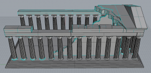
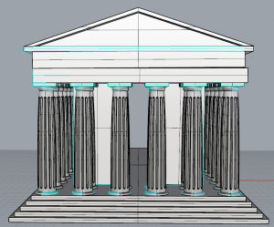
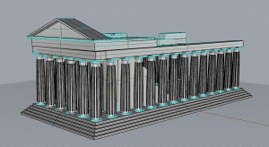
Parthenon 1 Parthenon 2 Parthenon 3

Categories
Miscellaneous

First Day Questionnaire: Andy Loeshelle

Your name:

Andy Loeshelle

Your major:

History with a minor in Classics

Please list a few of your interests, sports you play, or other activities you’re involved in (on or off campus).

Architecture, Art, Music (orchestra on campus)

Why are you taking this class? What do you most want to get out of it?

I want to be able to better use 3D modeling programs so that I will be able to use them in Graduate School with some degree of proficiency.

Are there any particular topics or techniques that you’re hoping to learn about in this class?

How to model 3D designs that follow curves and are not solely linear.  Multi-axis curvature and distortion.

Bucknell email address:

arl015@bucknell.edu

Cell phone number:

917-597-0295

Cell phone service provider:

Verizon

Fondation_Louis_Vu_3076988b