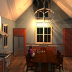
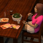
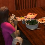
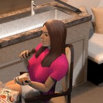
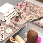
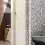
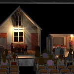
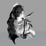
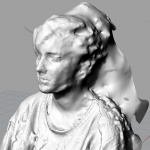
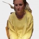
Thesis: For my final project, this series captures the intimate and private moments of one young woman who is preparing herself for her evening. She is intended to represent a much larger phenomenon in society and our obsession with beauty, and what these expectations are in order to meet the standard ‘beautiful’. This medium lends itself well to this concept in that the superficial application of makeup and our physical obsession with weight is expressed in this artificial, intangible form of digital sculpture. In this private space, one can see the figure impacted by the influence of social media, and how she responds with her own figure. These isolated scenes are intended to be observations as a voyeur, which is something that is revealed in the very end with an entire audience watching this series, as if it is a live show. I am interested in the juxtaposition between the privacy and behaviors in these spaces, with an audience (society) ever present and always ‘regarding.’
Author: lpr005
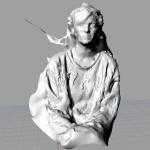
123d catch-Lily
** Conversation with Prof Meiser regarding the other three 3d printing trials were deleted- this version is representative of all three efforts
Project 3: Fashion paradox
What question/problem did you choose?
Fashion involves change, novelty and the context of time, place, and a wearer. In today’s world, there is an expected dress attire based on one’s environment. High fashion for example, now incorporates technology and scenes to re-evaluate the conventional methods of garment construction, by trying to push the boundaries of digital fabrication in this luxury market. There are dress codes based on one’s environment that are only ‘acceptable’ for that brief place, gender, or period of time.
Why did you choose this topic and why does it matter to you?
I chose this topic because I am fascinated in the relationship between the designed product and how it is distributed and consumed. This product is clothing and its unique existence in each era and the time of day/activity for each attire is an interesting phenomenon. Especially on our campus at Bucknell, there is an assumed dress code to each daily activity that has its time and place such as what one wears to the gym, what one might wear out on a Saturday evening. or even to class. Why we dress this way tells something about our identity, and yet there is an interesting paradox because it is also one of conformity. There is a duel tendency of conformity and individuality, as one of self-expression and yet at the same time from dressing similarly to others. Over the course of history, our attire and the specific dress codes have provided an identity as both an emblem of hierarchy and as an equalizer of appearance. I believe dress code includes expression of fundamental aspects of age, status, fashion interest and occupation; and when juxtaposed in an unexpected time period or space could create a powerful statement.
Give some details on the question/problem – explain it in depth.
This question of our cultural fashion trends that are reflective of a time and place and come with tremendous gender stereotypes. The critical gaze of the knowing observer shows how our appearance is something recognized, studied, and emulated. By looking back at our history of fashion, there have been significant differences in gender roles and fashionable appearances of men and women which have changed. These interpretations of male and female ideas are a visual and literary interpretation of the human body. For example, the male has been associated throughout dress of one with significant proportion, strength and nobility, whereas the female’s attire was typically more delicate, colorful, and more petite in size.
In my final project, I want to create a sense of movement, that these are all flowing scenes like that of a the fashion trends that trickle up and down through several historical influences. The flow of fashion trickles from one element of society to another, that either moves down depending on the hierarchical society and social mobility, or trickles up in movement that originated from lower-income groups and moved up towards couture. This flow however has a paradox in defining the ancient and contemporary by referencing the past and representing the present.
List out 10 tangible places/people/things that are associated with your question/problem.
1. Paris, France
2. 1920’s art deco
3. Geometric fashion objects/accessories (jewelry:Elsa Peretti)
4. Places of formal dress- ballrooms, courts, restaurants
5. Feminine: size, delicacy and color
6. Masculine:proportion, strength, nobility, grace
7. Unexpected spaces
8. Rococo period–>modern architecture
9. Preppy Handbook
10. Coco Chanel
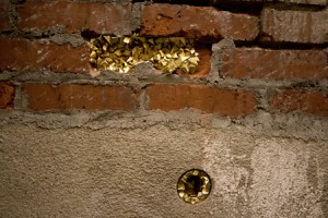
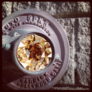
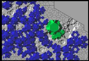
Geode 6 & 7, Daily Dose DTLA
GEODE #2, 805 TRANSACTION AVE, ARTS DISTRICT
Artist: Paige Smith
Inspiration: Takes made geometries and hides them in obscure, natural spaces. There is an interesting juxtaposition in two elements that are typically not seen together. I am going to use this idea in my fashion scenes and construct scenes representaive of time period and fashion trends that are typically not expected with one another. Smith says in her artist statement “Geodes are formations made and found in nature and my process of using manmade materials and placing them in major cities concurrently signals the tension between nature and industry and celebrates the beauty of urban space. My work is infused with a magical realism that encourages us to pause, to discover, to be present and to find beauty in the mundane.”
Inspiration board:
Lily Robinson
Eyal Gever- Lily Robinson
cremaster response-lily
This article by Blyn discusses this concept of entering into the post human era, as something that is a melange between technology and humanity. Mullins is aided by technology for she can choose her artificial legs as a part of her identity. These technologies help enhance the lives of humans through artificial organs, and prosthetics. This article talks about the bourgeois art as something was about ‘idealized beauty’, in comparison about how society wants the ideal human to become a machine- and a perfect one at that. I am still a bit confused by the production of cremaster 3 even after having had read this chapter however. The role of technology was very much demonstrated in the powers of augmenting and altering the body to achieve this notion of unattainable beauty. The doctors through surgery are manipulating the human body parts to reach this idealized beauty notion, while becoming else and less identifiable as a natural human being.
Cremaster 3 Robinson
Lily Robinson
Immediate Response
I found this short film to be very bizarre and off-putting. There is a tension throughout this piece that doesn’t seem to ever get resolved until the very end scene when the piece reaches its climax. The odd use of music, filming perspective, and almost theatrical characters mixed with ordinary people picked off the streets resulted in a strange juxtaposition. I felt a bit unsettled and confused throughout this whole work, constantly searching for sense or some kind of progressing narrative- of which I found none.
Objective Description
This short video is filmed in a building where construction is going on and various scenes are occurring at different levels. There are two main characters that seem to have some kind of relationship, and several changes in mood and volume of music suggest the development of narrative. The apprentice is the most notable character dressed in theatrical garb and the main female lead transforms from a handicapped goddess to a cat-like creature. Throughout the film there is a building ensign that occurs with the musk and screaming/chanting crowd, in conjunction with the building’s construction.
Technical Decisions
This work is a short film that is filmed from several perspectives, angles and directions for a total of 30 minutes. The decisions seem intentional to film it in this manner, and yet there is a randomness which also benefits this deliberateness. I am not sure how the title impacts my understanding or interpretation of this work, for I am very confused about its objective. At the very end when the main female lead is shot/wounded four times, this suggested to be a metaphor to me for something larger. There are a few biblical references throughout this work such as the cross box for example that suggest perhaps this is a religious interpretation about the future or a social critique. The presentation suggests that the creator wanted the viewer to make his own conclusions, and seems to be rather ambiguous which changes the meaning of the piece.
The Work in the World
I believe the characters/actors in this work are most demonstrative of the intended commentary. This work suggests a commentary on our world, in a large commercial skyscraper building with an odd juxtaposition of scenes that occur inside.
The Story it Tells
I am unsure of the concept behind this work, however the deliberate decisions in this piece’s filming, composition, and visual mechanisms help aid in the narrative. I feel that there is a deeper significance with this work that references either biblical or mythological literature, that has been applied to modern day and its relevance for our future.
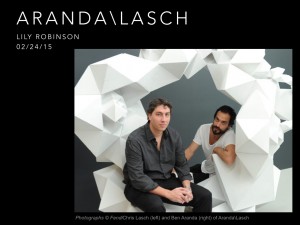
ARANDA\LASCH Presentation
Arts Xposé #2- Lily Robinson
Date and time of event: Monday February 16, 7:30 pm, 2015
Location of Event: Tustin Studio Theatre
Type of Event: Department of Theatre and Dance Student Directed Play
1.) Provide a brief detail-oriented technical description or summary of the event you attended. (This section should remain journalistic and should not be reflective of your opinion.
The Department of Theatre and Dance presented the play Dead Man’s Cell Phone by Sarah Ruhl, and was directed by a Bucknell Student for his honors thesis as a theatre major John Brunner, ’15. This two hour show was performed by a small cast Bucknell students with a simple yet effective set design. Dead Man’s Cell Phone explored the relationship with modern technology’s ability to bring together and also isolate people in today’s digital, fast-paced and always distracted age.
2.) Use the section below to write a well-structured paragraph focusing on your personal critical insight / response to the event. How did you interpret or react to what was presented to you?
I very much enjoyed attending this performance. The director, John Brunner ’15 is a close friend to me and fellow French TA and French major, and I spent last spring speaking with him about this performance and his plans/goals as a director. After watching this performance yesterday evening, I was proud to see his ambitions to come into fruition in a clear and thoughtful manner, and that the overall show ran very smoothly. My own thesis for my Studio Art project has shared some of the main themes covered in this piece, specifically the presence/absence of the cell phone and modern day technology. I was pleased to see this concept expressed in another art form that effectively shared with the audience of ‘being present’ and ‘living in the moment’.
3.) What information, ideas, images, etc. most impressed you and why?
I was most impressed by the simple set design, and especially the incredible acting performances by my peers. It was a treat to watch my friend’s directing accomplishment come into fruition, as well as share in the overall experience of attending the play and appreciating it’s message towards the affects of technology.
4.) Overall, how would you rate this event (10 being the most worthwhile)?
(10 / 9 / 8 / 7 / 6 / 5 / 4 / 3 / 2 / 1 )
9
5.) Justify your rating in the question above:
I have not attended many play’s at Bucknell University, and for me this one especially was at the top of my list. I enjoyed the story line, but my only critique would be the length and the pace seemed a bit slow in parts.
Robinson, Aranda/Lasch
Immediate Response:
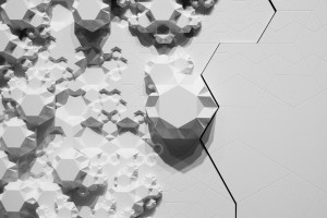
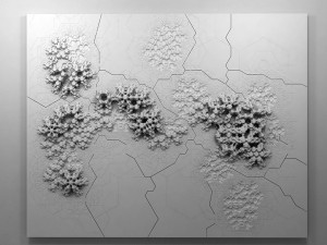
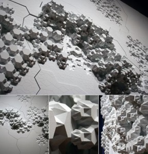
This image/sculpture at first glance appears to be a white surface or a series of panels that has objects excreting horizontally from the vertical surface. Down the center of this wall is a giant crack that almost appears to ressemble an earthquake, a randomized puzzle piece, or something that has shifted these naturally beautiful excretions seeping out of the cracks. The panels seem flush to the wall, and out of the panels are objects growing almost like fungi but have a very systematic geometric pattern. These repeating objects are different in scale and complexity and are molded to the surface that almost appear by natural means.
Objective Description:
As stated above, this sculpture is constructed on a wall plane, with varying points in height of objects protruding from the surface. There are cracks in the surface of the plane which appear to be constructed randomly as well as the growth patterns which do not seem to have any regularity or calculated formula. One might suppose that there is a perhaps a connection to a law or geometric pattern based on the sculptures title ‘Rules of Six.’ Again, this work is solid white and creates shades of gray and black from the different in dimensions from the growths, paired against an almost topographical surface.
Technical Decisions:
Rules of Six is an installation commissioned as part of the Design and Elastic Mind exhibition at the MOMA in New York. In collaboration with material scientist Mathew Scullin, the project uses new material structures that are not carved or composed by conventional tools but are rather ‘grown’ by interactions with molecules. (www.arandalasch.com/works/rules-of-six/) Three dimensional output from this application was used to produce a large-scale wall relief mounted in the gallery alongside two monitors- one running the simulation ‘live’ and the other displaying a slideshow of actual nanostructures. Rules of Six is designed to multiply indefinitely without recognizing scale, as it is symbolic as the scaling of molecules, rooms, buildings, or communities. The composition is a flat surface stood upright so that the objects can extrude horizontally into space. The software used was processing and Rhino 3D software on panels of painted high-density foam and hydrocal. The title ‘rule of six’ is extremely pertinent to the projects context, in that it is in fact a binding rule of transformation that an algorithm that connects the movement from ‘six’ to ‘no two are alike’.
The Work In The World
This relief sculpture was commissioned for the exhibition concept to engage designers and scientists in a dialogue by addressing their relationship to each other and their role in the culture. Aranda/Lasch’s work deals with science and mathematics with naturally occurring geometries with underlying themes of nature in their work. The Rules of Six explore the molecular processes taken directly from science which also applies to the six-sided snowflake of which no two are alike. This relationship of structure and nature and space and environment are very relevant in our own world’s depletion of natural resources and constantly evolving and changing world. This piece has such a level of ambiguity that allows several rapports to be drawn on with scale and our physical existence at the molecular level.
The Story It Tells
The theme prevalent in a lot of Aranda/Lasch’s work is their exploration of the relationship between structure and space. They appear to constantly be searching for patterns present in the natural world and new points of view to transfer into their works- and this exemplifies the random yet beautiful qualities of nature with sculpture in a natural law combined with technology’s rendering capabilities. The scales explored in this piece are relevant to human existence and our own presence in our surroundings, and this work allow the viewer to engage with the information itself and this relationship with design.
Robinson, Aranda/Lasch
Immediate Response:
This image/sculpture at first glance appears to be a white surface or a series of panels that has objects excreting horizontally from the vertical surface. Down the center of this wall is a giant crack that almost appears to ressemble an earthquake, a randomized puzzle piece, or something that has shifted these naturally beautiful excretions seeping out of the cracks. The panels seem flush to the wall and out of the panels are objects growing like fungi but have a very systematic geometric pattern. These repeating objects are different in scale and complexity and are molded to the surface that almost appear by natural means.
Objective Description:
As stated above, this sculpture is constructed on a wall plane, with varying points protruding from the surface. There are cracks in the surface of the plane which appear to be constructed randomly as well as the growth patterns which do not seem to have any regularity or calculated formula. One might suppose that there is a perhaps a connection to a law or geometric pattern based on the sculptures title ‘Rules of Six.’ Again, this work is solid white and creates shades of gray and black from the difference in dimensions from the growths, paired against an almost topographical-like white surface.
Technical Decisions:
Rules of Six is an installation commissioned as part of the Design and Elastic Mind Exhibition at the MOMA in New York. In collaboration with material scientist Mathew Scullin, the project uses new material structures that are not carved or composed by conventional tools but are rather ‘grown’ by interactions with molecules. (www.arandalasch.com/works/rules-of-six/) Three dimensional output from this application was used to produce a large-scale wall relief mounted in the gallery alongside two monitors- one running the simulation ‘live’ and the other displaying a slideshow of actual nanostructures. Rules of Six is designed to multiply indefinitely without recognizing scale, as it is symbolic as the scaling of molecules, rooms, buildings, or communities. The composition is a flat surface stood upright so that the objects can extrude horizontally into space. The software used was processing and Rhino 3D software on panels of painted high-density foam and hydrocal. The title ‘rule of six’ is extremely pertinent to the projects context, in that it is in fact a binding rule of transformation that an algorithm that connects the movement from ‘six’ to ‘no two are alike’.
The Work In The World
This relief sculpture was commissioned for the exhibition concept to engage designers and scientists in a dialogue by addressing their relationship to each other and their role in the culture. Aranda/Lasch’s work deals with science and mathematics with naturally occurring geometries with underlying themes of nature in their work. The Rules of Six explore the molecular processes taken directly from science which also applies to the six-sided snowflake of which no two are alike. This relationship of structure, nature. space and environment are very relevant in our own world’s depletion of natural resources and constantly evolving and changing world. This piece has such a level of ambiguity that allows several rapports to be drawn on with scale and our physical existence at the molecular level.
The Story It Tells
The theme prevalent in a lot of Aranda/Lasch’s work is their exploration of the relationship between structure and space. This duo appear to constantly be searching for patterns present in the natural world and new points of view to transfer into their works- and this work specifically exemplifies the random yet beautiful qualities of nature with sculpture in a natural law combined with technology’s rendering capabilities. The scales explored in this piece are relevant to human existence and our own presence in our surroundings, and this work allow the viewer to engage with the information itself and this relationship with design.
Art Xposé #1: Lily
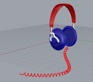
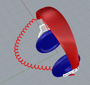
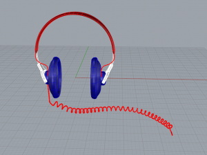
Earbuds Questions- Lily Robinson
1. When is it helpful to lower the opacity/frequency of the object?
2. Can we go over the transform-array tool?
3. Can we also review the boolean (difference) adding and subtracting benefits?
Lily Robinson-headphones
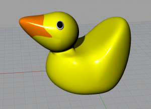
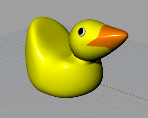
Rubber Duck- Lily Robinson
HW assignment #1- Lily Robinson
Lily Robinson
Your name: Lily Robinson
Your major: Studio Art and French
Please list a few of your interests, sports you play, or other activities you’re involved in (on or off campus).
I am a French Teaching assistant and I participate in the Bucknell Be Fashion magazine on campus.
Why are you taking this class? What do you most want to get out of it?
I am excited to take this class and learn how to create artwork digitally in a three dimensional space. I hope to learn a new software as a result of this course.
Are there any particular topics or techniques that you’re hoping to learn about in this class?
Yes, I want to learn about the software in particular and am curious if there is any exploration with three dimensional printing.
Bucknell email address:
lpr005@bucknell.edu
Cell phone number:
914-589-1009
Cell phone service provider:
Verizon
Bite of Tempt ation
ation
