Category: Research Binder
Son Pham: Final Project Research
Description
The culmination of the Independent Study will be a series of sculpture juxtaposition that describes different issues in society. These issues are not only general ones that we generally observe on media such as politics, environment, equality, but also include some of my experiences with art-making and my life on campus. Each juxtaposition will be a combination of seemingly unrelated elements that would become bizarre and expressive once they become fused together. By juxtaposing the objects, the content of each has a chance to interact, alternate and create meaningful expression.
In terms of style, juxtaposition is a suitable method for this final project. Firstly, it allows for simple background so that the audience can truly focus on what is happening. This will simplify a lot of composition problems and help me truly focus and able to make a series in stead of just a sculpture set with multiple camera angles as before. The amount of details that I can put on a single object can also increase significantly and that I don’t have to worry too much about big composition as a whole (which takes a lot of time evident in the second project. Secondly, juxtaposition allows me to make a better compare and contrast and fuse different elements however I like. And finally, juxtaposition is inherently expressive. Thus, it allows me to put my own opinion and emotion into the artwork. (My previous sculptures address quite big and general problem and don’t have much of individualism.
Collected Images
Sketches
Intellectual researches
Intellectual researches for this project will be two days spent on enhancing the visual quality and the depth of the last two projects. Both projects have interesting geometry, yet doesn’t quite reach its full potential in terms of ideas. The colors from both projects don’t have strong impact to the viewers, but there are plenty of room for improvements.
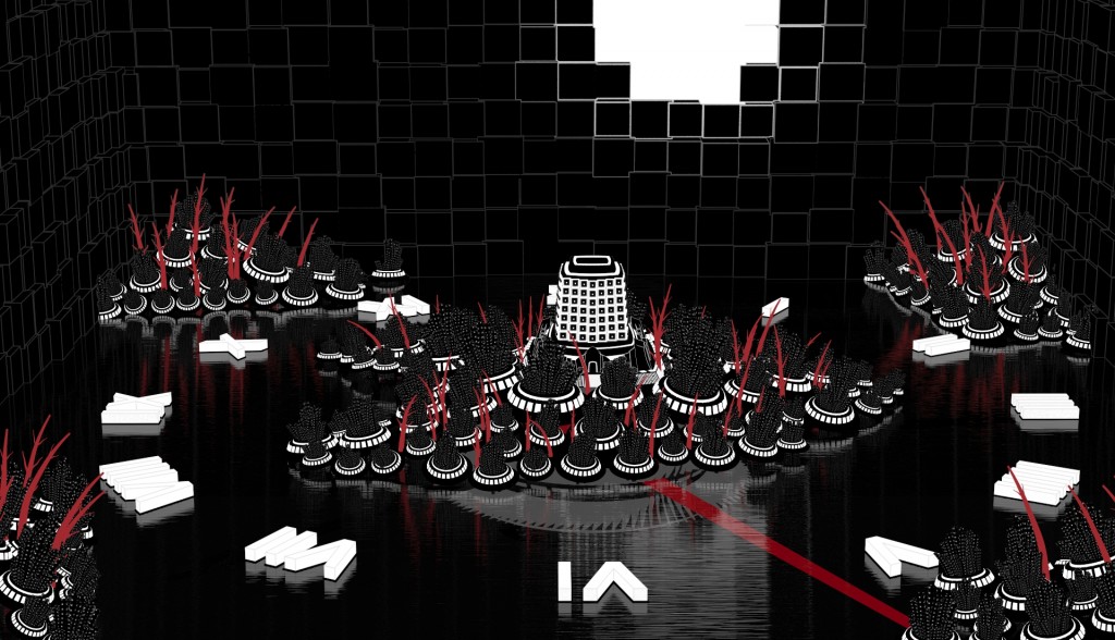
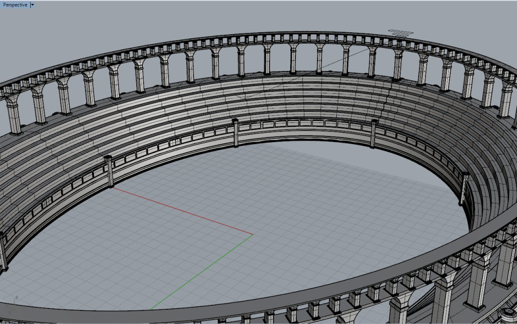
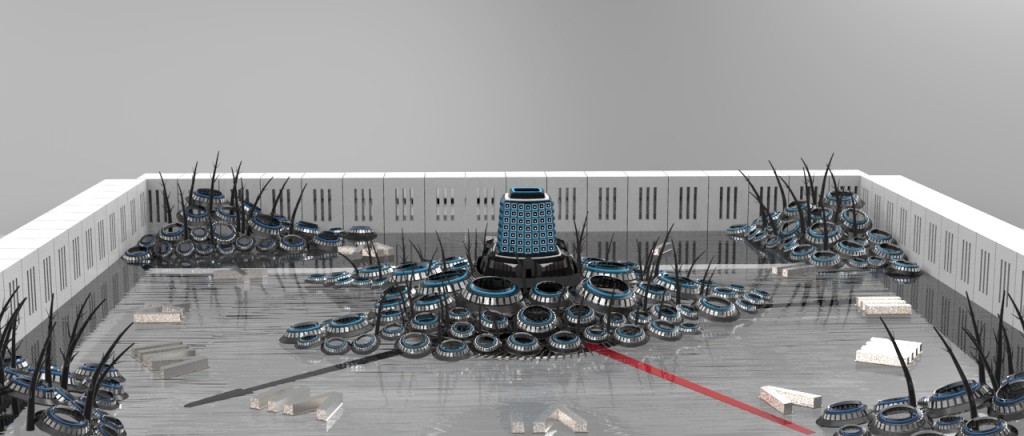
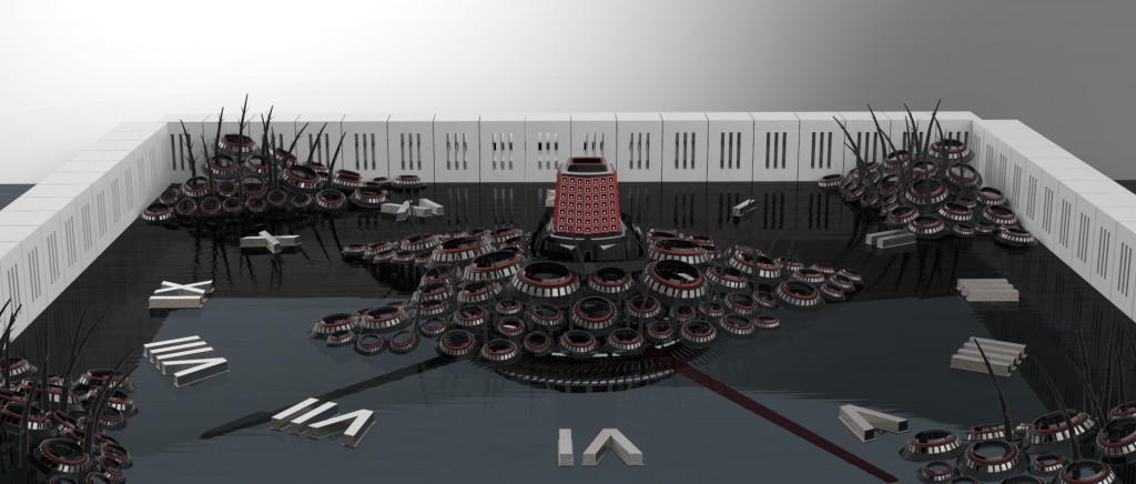
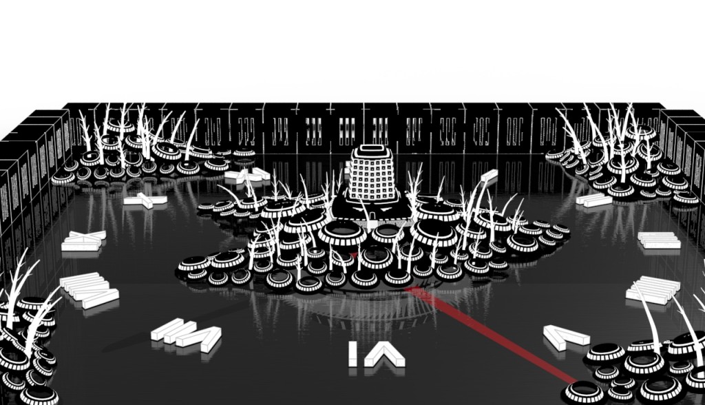
For the second project, there is a big imbalance of the amount of details in different parts of the artworks. There are a lot of details in the center, but most of them are similar and only serve to distracts any possible patterns of other parts. The buildings almost complete obscure the beautiful circle arrangements. These amount of details provide a nice contrast with the background, but the overwhelming contrast doesn’t provide any useful implication and makes the whole picture looks even more melancholic. The clock is supposed to bring the surrealist effect to the scene. But the overall tone of the picture is so dark that the clock brings little effect to the renders both visually and conceptually. Three hands are already enough for a reference to the clock in the pictures. Thus, possible enhancements for this project are:
- Remove the clock geometry
- Add more stuffs into the building parts to better represent the idea of unsustainable growth.
- Delete all windows. Windows create distracting noise that is completely necessary and flatten the geometry. Also, building should be constructed lower. It’s possible that I should RECONSTRUCT the whole building circle to better suit the project.
- Thing about more interesting texture for the tree. Psychotic texture can work very well.
- The background can be embedded with a sunset background, with the sun the in the bright spot. Each block will have a color according to a mosaic image of that background.
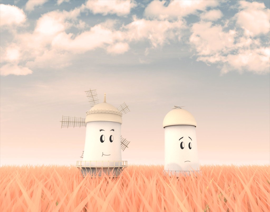
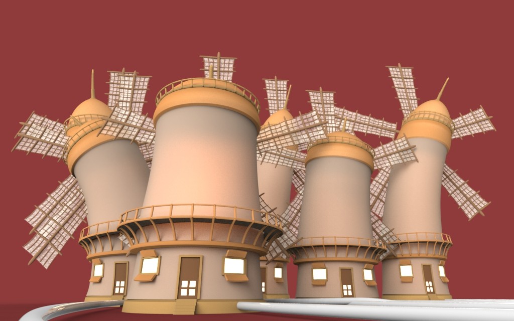
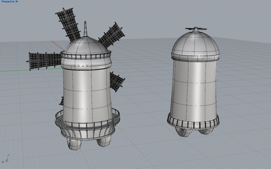
The geometry in the final renders were too grotesque and was not well received as the the right image. Since the googly eyes bring less serious attitude, I can use this geometry to bring massive quantity of these windmills in different size and context. These massively cloned puppets will actually turn out to look extremely grotesque and can be used to indicate a lot of social issues that related to violence. One composition I can think of right now is a dictatored windmill trapping a bunch of others in a grinding machine.
I will try to bring the sketches into the project tomorrow. The sketches will have both some improvisation on the previous two projects as well as geometries for the new ones.
Son Pham: Third Project Research
Description
Animation is a series of images that create a recognizable sequence of motion that is really catchy to the eye. In order to keep things manageable in this project, I wish to do a project exploring the potential of animation in 3D sculpture. The project will be 3 or 4 GIF animation sequences using multiple keyshots render at the same camera position.
Throughout the last 2 projects, I have always have a very “formalist” approach. My concept tends to gradually change over time based on the situation and the geometry that works. Since this project is only 2 weeks, instead of digging deeper into conceptual problem and devise a representation, I want to try to get emotion from the simple shape that I that usually use. The simple shapes of the geometry, combined with the harmonic motion, can produce very emotional effect. Some artists were able to combine animation with simple geometry to produce phenomenal effect.
Visual researches
Intellectual research
Animation is a very hard medium for Keyshot since the software is not made specifically to animation. However, my animation has a specific characteristic of looping around, which will helps reduce the number of frames tremendously. This also comes with careful calculation on the angle, rotation and position of the object so that the object animated smoothly without any obvious signs that it is a loop.
I developed a work flow that help me work Keyshot with Rhino altogether.:
- Draw the geometry in Rhino.
- Import the geometry to Keyshot.
- Work the materials as usual and SAVE the file.
- Move geometry in Rhino.
- Update the geometry to Keyshot. Just by pressing update, Keyshot will only update changes in geometry, which is much more convenient and faster than import the whole thing. The previously worked materials are also saved in Keyshot.
This workflow is remarkable fast and saves me a lot of time from repeatedly going and back and forth between Rhino and Keyshot through the import function.
Critical thinking about the project
The theme I chose is environmental issues in politics. As this project only lasts 14 days and only serves as an exploration to new technique. I don’t wish to go into too complicated topic that potential takes a lot of time to form coherent geometry and modify. The style I would like to use in the project is the playful Pixar style. The style is something I really want to explore, and it is appropriate for this project because Pixar is both beautiful and not too distracting for the eye of the viwer, so that the viewer can totally concentrate on the animation and figure out what it means. This is a very hard style to follow and definitely requires more research about form and especially color.
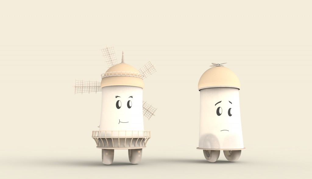
I am really happy with my first renders on these forms. The form has a satisfactory color that accompanies with cute and not-too-perfect geometry. Well, I was not awared of how fallic these geometries look. But for sure, I will use this form for the next project and the coloring style for this project.
Son Pham: Second Project update
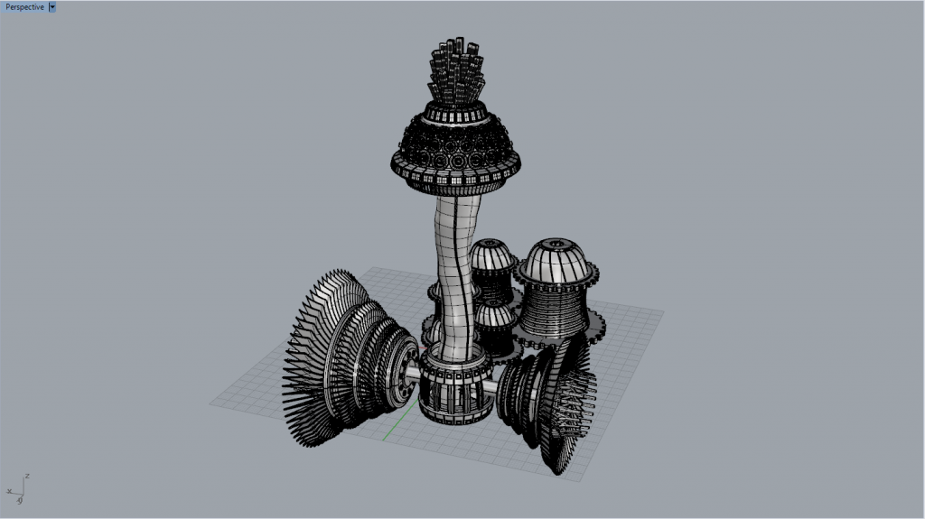
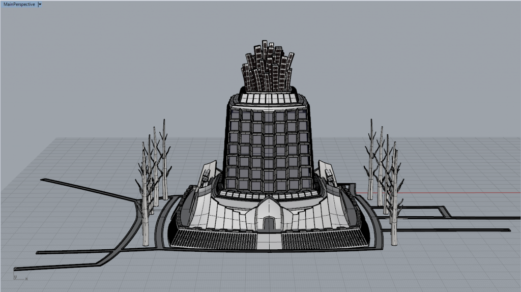
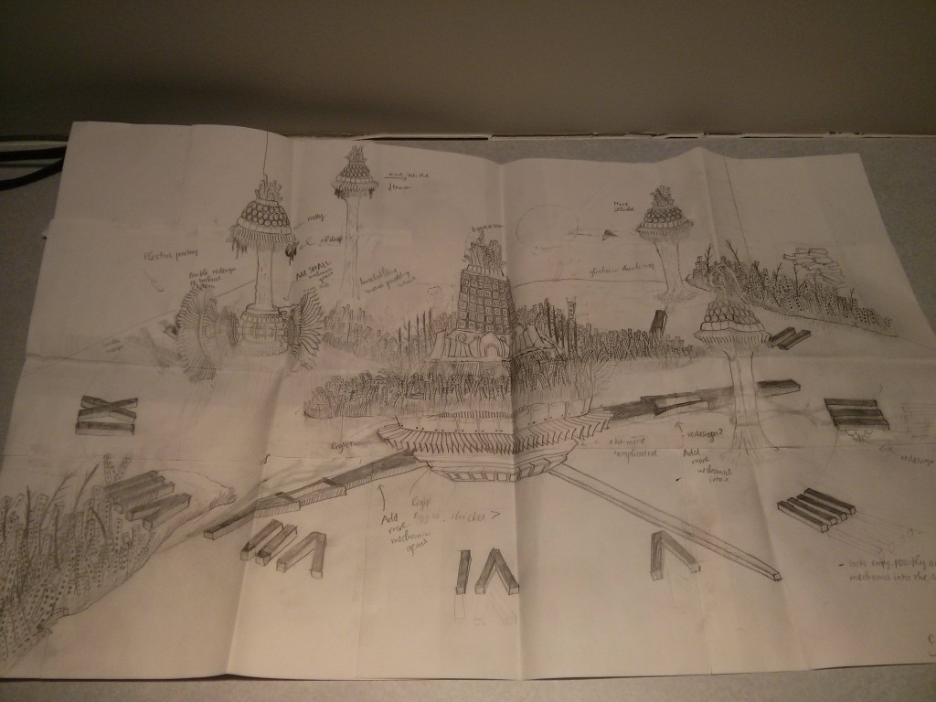
The sky castle and the tower have some enhanced geometry. I also optimized the building geometry so that the building parts can be copied around. I also finished sketching the overall composition of the piece. Here are the screen shots of each.
The final composition will look like this.
I hope I will finish the geometry by tomorrow so that I have a full Wednesday for doing Keyshot materials and renders. Wednesday night will be reserved for any little problems that arise.
Son Pham: Second Project Research
Motivation
Dreams have been powerful creative tools for me to break off from normal way of thinking and all kinds of constraints and come up with a normal approach. Thus, I would like to dig deeper into the field of irrationality and come up with a surrealist object or artwork that based on dream and impossible objects. This has a lot of potential because the object doesn’t necessarily have to make sense and there are a lot of rooms for more warped and organic forms. I also want to take the next project to break off from my old style of using a lot of hard curves, black metals and black plastic, which starts to look cliche.
The object that I want to examine is the nail. Nails contain very interesting screw curves that can be further explored for meanings or modified into other kinds of objects. Minimally, I hope to create some kinds of objects or buildings that can represent the nails, and somehow use the curve of the nails to create some wild and elaborate geometry.
The project potentially relates to Twist and Bend command. These are the commands that I really want explore more of their potentials.
Visual images collected
Some sources of Surrealists artworks:
- http://www.beautifullife.info/art-works/surrealistic-paintings-by-vladimir-kush/
- http://www.hongkiat.com/blog/surreal-photo-manipulation-40-amazing-artworks/
Surrealist artworks turned out to be plenty. Thus, I would have to figure out a unique style for my objects.
Critical thinking about the project
The theme I chose is the wearing down of human’s emotion in the face of social challenges and constraint. It seems that as humans grew older over time, they start to have troubles finding sweetness for their long days. People can still buy a pack of candy, but they don’t know how to eat the candies like a child. The project aims to demonstrate the complexity of human’s emotion based on surrealist arts. Objects can be warped and modified wildly to be more expressive. My aim is not to follow the traditional style and goes for more organic materials, even though these organic materials might not fit the smooth nature of my geometry and demands more meticulousness. I also would like to use Adobe After Effects to apply some flat color into my work because as a “formalist,” I want to apply flat color so that the renders appear more expressive. Flat colors will also served to hide some of the weakness in geometry and make the final results look more natural.
Intellectual research
I am really glad that I was able to bring the model into keyshot to apply material. Initially, I resorted to my old styles which use mechanical and plastic materials. The result looks quite dull and doesn’t have that much emotional emphasis on it. I was initially very unhappy with the result.
I decided to completely overhaul my own style, switching to a more flat and comic approach. The result turns out to have a lot potential! Since materials are almost completely vanished, the focus of the picture was turned completely into form. Even though there are little edges or contour, the form are still very recognizable. The audience would take the form as it is instead of getting distracted by the material.
Several possible modifications for the final render:
- Make the hour hand and the minute hand more visible.
- Extending the background to the hold picture frame and add a sun into the background to represent sunset (or the down fall)
- Adding buildings and windows.
- Adding sky castles and possibly some more “building circles” to truly represent unplanned growth. The circles right now still look to have some what an order into it.
Son Pham: First Project update
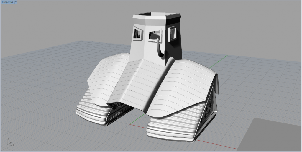
Tank tread is a little bit over-complicated. Consider simplifying it depending on the processor. (The PC already shows sign of slow when the tank is assembled.
Son Pham: First Project Research
Motivation and description about the project
Ancient warfare has always been one of the most appreciated topics in the field of history. The strategy, the tactics, the victories of the underdog and the mastermind behind them have drawn great inspiration for historians, artists and politicians of all era. As for me, I have always been interested in the history of Three Kingdoms (181 – 265). During this period of time, China descended into total chaos; eunuchs use the puppet emperor rule the imperial court; people suffer hunger and drought, warlords fight each other for territory and survival. During such a chaotic time, many intelligent and capable generals have the opportunity to prove their virtue to the worthy ruler they serve and to the people they protect. As such, Three Kingdoms, while full of sufferings and bloodshed, featured some of the greatest historical figures in Chinese history, with great military achievements and significant advancement in warfare technology.
Much of the philosophy in military warfare during the Three Kingdoms period were recorded in texts by several scholars of the era, but there was a lacking in sources of illustrated images. Therefore, this project aims to use 3D technologies to recreate the ancient warfare system, including army, weapons and different kinds of units, in a more futuristic settings. Specifically, the author will try to combine imaginary weaponry and construction technology with the philosophy of the ancient military system to create a visually satisfying representation of ancient military, The project will include renders of each military units, their descriptions of strengths and weaknesses. Further developments may also include portrayals of historical figures but in futuristic costumes. In the initial stage, I will focus on designing cavalry unit, since horses are symbolic icons of ancient warfare.
Visual sketches
The sketches start with diverging and exploring some new idea about how to connect futuristic elements with traditional value of warfare. Much of the philosophy and strategy of each weaponry remained the same, but the form is much altered to fit the new futuristic feeling and struggle. In order to avoid being only a mere 3D representation of new kinds of weapons, I mustn’t emphasis solely on technicality and has to incorporate elements that represent the material and emotional struggles in war time. Such elements can be composed into meaningful scenes.
Visual researches
Collected images are related to Horse, Armor, Tank Tread and the Cross Bow. I’m trying to collect images such that the materials don’t significantly favor either machines or ancients.
Intellectual research
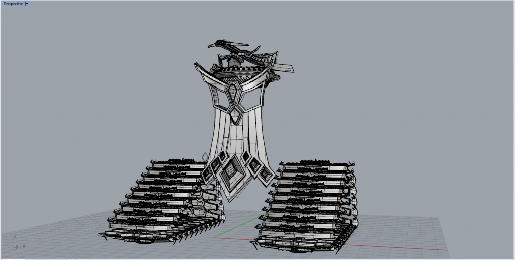
The hardest part about the project is to combine elements of ancient warfare with more futuristic aspects. Ancient weaponry (as evident in collected image) usually features assemblage of small pieces, while futuristic elements usually have really smooth curve. Unbalanced combination between the two can make the model look quite toyish, evident in the first model version, which is heavily based on the sketch.
The resulting model looks quite toy-ish and doesn’t have much room for improvements. I decided to redesign the front of the image by breaking apart a lot of pieces. The breaking apart into pieces have a lot of advantage. A lot more sharp corner can be created, while the model still retains the smoothness of each element. The modeling of the front, attached with a cross bow on the top, shows a lot of potential.
123d catch-Lily
** Conversation with Prof Meiser regarding the other three 3d printing trials were deleted- this version is representative of all three efforts
3D Scanning Exercises – Heather
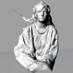
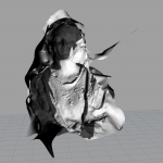
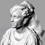
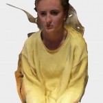
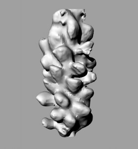
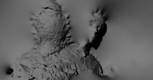
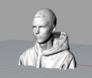
Below are three 3D images created using three different scanning technologies. The Kinect created the best images as both the Digitizer and the 123D catch app created weird geometries that had holes depending on the picture angles.
3D Scanning Exercises- Eric
Rhinorendering
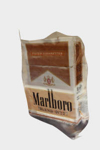
This is the 3d rendering of a pack of Marlboro cigarettes.Out of all three softwares, this was definitely the easiest to use. It did however, create a bump on the front part of the object.
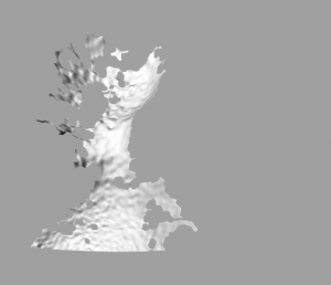
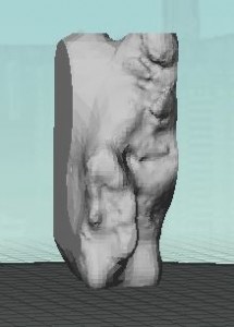
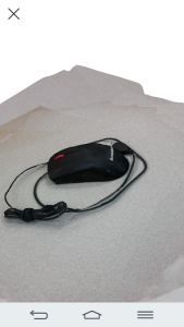
This is the 123D catch image. Even though I took as many photos as possible, the app captured the front part of the image but the whole back side was empty.
Cremaster Response – Zander
Blyn suggests that the post humanera is defined by an industry that is dominated by corporate companies. Smaller groups in contrast, will not survive. This seems to be somewhat a representation of what hipsters often stand for, the minority against the majority. But, over time, it is inevitable the minority will be lost or become the majority, there will be few varieties of people that dominate.
With the use of technology, Mullins was able to attain enhanced human characteristics. I believe that technology will allow you to replace what you want on your body, but it will never be to the same level of what was organically made.
I think the post-human era is defined as something beyond humans. In a civilization in which technology reins supreme, it is likely that initially technology begins spread out to different companies, but over time, it is likely that the world would see the emergence of a few dominate companies. In comparison to modern day, Apple and Google began as small companies but over time have been able to rise to have a dominant role in the technology world.
I positively endorse enhancements to the human body for the pursuit of regaining capacity similar to other humans. I do not support the use of technology to enhance an individual beyond what he or she is naturally capable. I believe when technology is used to enhance one beyond normal capabilities, there is certain quality of natural life that is lost.
The idea bodies wanting construction and reconstruction of the posthuman era is a chilling parallel with any mechanical enthusiast, such as a car owner, of modern day. It seems very likely that once bodily enhancements become a socially admirable enhancement, the world will be lost to those tinkering with their own bodies to create the next best enhancement. It is scary to conceive the power that could be given to just one person.
cremaster response-lily
This article by Blyn discusses this concept of entering into the post human era, as something that is a melange between technology and humanity. Mullins is aided by technology for she can choose her artificial legs as a part of her identity. These technologies help enhance the lives of humans through artificial organs, and prosthetics. This article talks about the bourgeois art as something was about ‘idealized beauty’, in comparison about how society wants the ideal human to become a machine- and a perfect one at that. I am still a bit confused by the production of cremaster 3 even after having had read this chapter however. The role of technology was very much demonstrated in the powers of augmenting and altering the body to achieve this notion of unattainable beauty. The doctors through surgery are manipulating the human body parts to reach this idealized beauty notion, while becoming else and less identifiable as a natural human being.
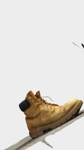
This is my 123D Catch model of one of my boots. I found that this program worked the best out of all three programs used to model an object in 3D.
This is my 3D render of myself on KScan. The actual 3D model formed in Rhino looks slightly better in form, but is not completely accurate, lesser than that of 123D Catch.
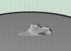
This is my model rendered by MakerBot, clearly the worst of the three programs. I am not sure what made the program create such a deformed and inaccurate depiction of my object, but it is far from the actual object’s design.
3D Scanning Exercises- Eric
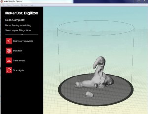
The digitizer didn’t work too great, it kept disconnecting itself for no reason, but once it finally scanned, I was left with a decently workable (if not too lumpy) 3D. I am unsure why the flamingo’s left leg got chopped off.
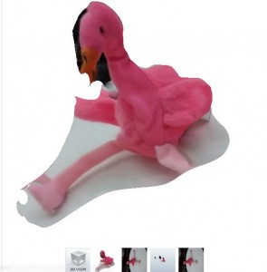
Only one side of the flamingo seemed to scan in a recognizable way. Everything else was way too twisted and flat. I tried increasing the number of photos but I was limited to only 12 on the app. The app would often crash or tell me that a scan could not be made.
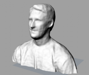
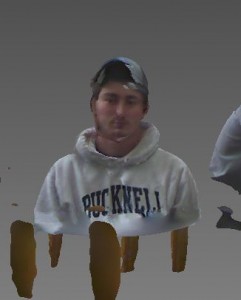
My Face Scan came out excellently. I may have just been lucky but I was able to get a very workable mesh from these scans, and they weren’t even too lumpy. The only thing is I can ‘t figure out how to get the photographic information (colors, etc.) to export with the mesh.
Three Scans Stadel
This was developed by K-Scan. Using 18 pictures of my head rotating around a point, K-Scan developed this 3D rendering of my head.
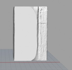
This was developed using Makerbot Digitizer. This did not turn out as well as I thought it would. Not very reliable.
This was developed using 123D Catch. I took about 17 pictures to get this 3D image. I tried two other objects previous. The first said the capture failed after processing. The second image, a tissue box, turned out really well. However, the program lost the image before I could take a screenshot of it. This program is not very reliable.
Cremaster Reading Response
I fully agree with Bryn’s suggestion that the post human era is marked by corporate domination and ideological mechanization. Generally speaking skyscrapers exist because of capitalism otherwise the land value wouldn’t be high enough to put 90 floors on it to make it profitable. There is a massive army of architects designing these structures. Chrysler building for example, I think is so well done that it became a symbol not even mentioning the eagles that were perfectly placed. Big art is purchased by the big and for 21st century that’s corporates unlike in the past for queens and kings. Similarly Mullins who has many prosthetic legs, is portrayed as not only beautiful but also powerful, she is more than just human in Cremaster. I looked up Aimee Mullins online and I think she is no different than any other model but one difference she is a post human model. Prosthetic legs are not attainable for all for the most people but they were made for Mullins. While Mullins was saying that she had a dozen pairs of legs and she could create anything there she was so confident she could afford it, there was no limitation. I believe that the problem itself she portrays herself as post human just because she has the privilege to obtain those gadgets. That is a huge market, and by adding more value, meaning to it; she might be creating a social stigma. Beauty being commercialized successfully now, the corporates are taking the next step.
On the other hand, I believe the technology helps us to shape the space for this case the legs. I think it is amazing we can do it, I just genuinely believe that it should not be seen filtered from all the social implications. She is a white, blonde, good looking woman. I just wonder why didn’t put a black woman with prosthetics there.
Cremaster Reading Response
When Blyn discusses how we have entered a posthuman era, I believe that she is trying to describe how humans have the capability to physically reinvent themselves through technology. In this posthuman era, humans have the ability to change their own characteristics, including the way that they look. An example of this would be Mullins who has become an architect of her own identity. As a handicapped woman, Mullins is given enhancements that allow her to walk again. Because of these enhancements and the beautiful clothing that she wears, she isn’t restrained to being thought of as handicapped. Rather she is “handi-capable.” As to Blyn’s suggestion that the posthuman era is marked by corporate domination, I would tend to agree. Seemingly, America is dominated by corporations that hold influence on all aspects of our lives. Not only do they hold influence over governmental functions, but they are also the facilitators of the great consumer culture that is America. I would say that humanity is facing a net loss by augmenting our bodies. While slight augmentations, such as prosthetics may be incredibly beneficial, bodily manipulation can get to a point where it is going too far. Plastic surgery is not entirely frowned upon now. What is to say that humans will not be altering the genes of their children in the future so that they will look better or so that they are more intelligent? At what point have we gone too far? When humans figure out how to efficiently manipulate genetics, they will have the ability to change whatever they want about the human figure.
Cremaster Reading Response – Greg
Blyn means that the lines between technology and humanity are being crossed when discussing the posthuman era. Signs that point to this are technologies that are helping humans live longer such as pacemakers, prosthetics and artificial organs. Including I believe Mullins is able to be her own architect for her identity because of technology. She can choose whatever types of legs that she pleases. She has beautiful glass legs to show a loving, caring or pure side of her personality. However, her cheetah legs show a fierce side that is aggressive and limitless. Technology gives her a way to define her legs, which in turn changes her identity. It is something that makes her stronger rather than fixing a problem. I don’t see the posthuman era being defined by corporations, but I do think that it is defined by ideological mechanization. There would be no need to try and perfect unless that is what you want. Society wants the ideal human, a human which is being turned into a perfect machine. However, I think that individuals or small groups of individuals can contribute to this and it is not all about large corporations. I think that humans, if using the technology correctly, will benefit from a net gain from augmenting their bodies. It cannot be abused because we are humans and we are not meant to live forever or be perfect. It is great to have the perfect solution to a problem, but there is no reason to go overboard. There will need to be some type of regulation.
After reading Blyn’s chapter on Cremaster and her discussion of the posthuman, I believe that one point that she is comment on is the idea that humans are no longer defined only by their biological selves. There are many ways in which individuals can alter and “enhance” themselves whether due to necessity or in many cases, for cosmetic purposes. I believe that a possible feature of the post human era is that individuals are not thinking entirely for themselves and instead of have “brain washed” in a sense to think, behave or act in a certain way. This also relates to the fact that in a post human society, our bodies are not defined only by biology. There are many new forms of technology that allow individuals, such as Mullins to be “architects of their own identity”. In the case of Mullins, instead of accepting herself as disable, she has embraced the use of technology and can change her appearance and her appeal just by changing her legs. Aside from changing their clothing, there is not much that an individual without these technological advancements could do to alter their being. I believe that humanity is facing a net loss in regards to body augmentation. Of course, there are some individuals, like Mullins who may require augmentation for continue everyday functioning, however, overall, it is sad that individuals are no longer satisfied with their bodies and instead are turning to augmentation to improve their sense of self-worth. As augmentation increases in popularity, I believe that individuals will become less happy and satisfied as everyone is striving for a biologically unattainable goal. In terms of the corporate domination and ideological mechanization portion, I do believe that corporations have too much power within our country and will continue to have that power unless legislation is written that takes that power away from them.
3D Scans
Blyn article
After reading the chapter I am still confused by Cremaster 3. I followed the reading closely, but am still confused by certain aspects of the film. Perhaps I am not connecting the ideas together as well as I should be, but overall I find the concepts involved in the film and how they are portrayed a tad overwhelming. Blyn talks about the post-human era and ideological entanglements that have shaped by a culture industry indebted to corporate profits, yet I fail to see the corporate aspects within the segment of the film we watched. I believe that Blyn portrays aspects of the post-human through Aimee Mullins, who is an amputee, yet is portrayed in a flowing white dress and tall glass boots that adorn her in beauty. She is a symbol of art and technology, two aspects that when combined, can become a picturesque scene. At first I viewed her in a freakish way, as her proportions seemed off, but after reading this chapter I realized that she is not only portrayed as beautiful, but also powerful. She mentions that she has had less surgery done then Pamela Anderson, yet society looks upon her as deformed, and Pamela as a nearly perfect woman. To Mullins, this is a fault within society, as she has become an architect of her own beauty.
Blyn also talks about the idea that the post-human era is marked by corporate domination, a troubling thought, but a truthful statement. Corporations are extremely powerful and have obtained the rights of humans throughout history, which allows them to sneak past the law, when in reality they have no right to. An example of this is the corporate bailout by Obama that did nothing to solve the foreclosure problem that affected millions of households within the United States. Unless government officials are taken off of corporate payroll, companies will continue to surpass their rights and control our society well in the future, a grim path for those supportive of the post-human era.
Lastly, in terms of considering the effects of augmenting the human body, I believe that humanity is facing a net loss. As society and history progress together, people have lost the meaning of true beauty, as beauty is now something that is purchased, whether it is makeup or plastic surgery. We see this negative effect through the multitude of advertisements on television and in animations, with help from programs such as Make Human, which allow one to create a “perfect” human. Overall, it is clear that the beauty of the human form is formed and not born, creating an increasing void in society.
Blyn’s Article Stadel
Even with this written explanation of Cremaster I still find the work confusing. I thought the author brought up very interesting points, but even as I read over parts again and again, I do not know if I am following their point as well as I should be. I believe Blyn means we have entered a post human era in ways that are shown with Mullins legs. Instead of having her crippled and on the ground, this lady, with no feet, stands tall and is beautiful. It is the work of art and machines that make her this way. In this same way, technology allows Mullin to be an architect of her own identity. Technology allows Mullin to build legs and walk, it empowers her. As a result she is not disabled but super-abled. Technology has changed her from deformed to whatever form she wants to be.
Blyn then moves on to suggest the post human era is marked by corporate domination. To this point I understand and believe fully. As quoted in the text, and I remember this statement in history, corporations are considered people. This is scary in that they have the rights of people, yet are somehow held to different standards that allow them to get past the law. There was a corporate bail-out by Obama for instance, but there was no bailout for the millions of people with foreclosed homes. Corporations are running the world now and will continue to into the post human era unless government officials are taken off corporate payroll.
In terms of augmenting the body, I think humanity is facing a loss as we choose to change our bodies more and more. Beauty is no longer born; it is created by doctors through surgery. And it is becoming less and less obtainable as advertisers create the perfect human in ads with the help of computer programs. As a result, only people with money can be beautiful and by that, a further gap between high society and low society is created.
Blyn Response- Eric
When Blyn suggest that we have entered a posthuman era, I think that she means we are beginning to transcend that which makes us human. There are several examples in today’s society of figures who have gone beyond our standard biological specifications and currently exist in a state that is beyond. I think that as we are only just beginning to enter this era, the features of what makes something posthuman are not clearly defined, but they are easy to spot when confronted with face to face. Something like being able to change one’s gender through a surgical process may fall under the posthuman umbrella. The other example Blyn gives is Aimee Mullins, a double amputee with glass prostheses. I thought it was very interesting how Mullins has managed to spin what was once seen as a disability into perhaps her greatest asset. She suddenly has the ability to mold her identity through her physical features, swapping her legs at will to suit her environment. This blows me away! I think overall, the ability to transform our bodies in a way that, while not entirely natural, gives us new abilities is an incredible positive leap for our species. As someone constantly dealing with injuries and illnesses that hinder my capabilities, I would love to swap out my tendinitis-ridden foot with a sleek, pain-free glass one. Once this type of augmenting the body becomes more widespread, will the posthuman become human? The corporate domination is one of the few negatives I can think of coming from this, but it would be no different from how corporations run all other aspects of our lives. They control the types of food we eat, the clothes we wear, the make-up we put on. It seems like a logical progression that body parts will one day become another accessory for them to market to us.
Immediate Response:
I asked myself “What is this 30 minute long thing?”. I most certainly did not enjoy what I have seen. It seemed so out of the reality that the story was casted in a place where nothing made sense. Music selection affected the way I looked at different sections of the video. For example the the music that was overlapped for first 5 minutes really irritated me. It didn’t have smooth harmony whatsoever but a messy set of sounds in an endless manner. I believe it is chosen to be that way since it is hard to achieve such chaos without aiming for it.
Objective Description:
The video took place in Guggenheim Museum. The apprentice, the pink male with Scottish Kilt and bloody cloth in his mouth is the main character. In the floor ground by the pool the topless ladies are making the start. In 5 different stories there are 5 different characters are set. The first Level had the bunny ladies dancing. The second floor had the punks followed by the tiger lady in the third floor. Fourth floor was composed of building materials that needs to be done in a specific way but it was unclear. Fifth floor had the man throwing wax at a black substance he set up.
Technical Decisions:
The costume selection for the piece was very vibrant both in terms of colors chosen and the forms of the clothing. However for the top floor and the second floor where the world we know might be placed in had a more ordinary scene. I think the camera angles were used appropriately, many different angles yet it was clear that the artist didn’t want some documentary style. He showed what he wanted to in a moderately descriptive manner.
The Work In The World:
I don’t know if this work has any work in the world I want to be in. I don’t know how to make sense out of it. It is really hard to follow and frankly I don’t think it adds anything the world. The piece could be used in music classes to demonstrate how overlapping different songs could end up.
Story it Tells:
I could follow that the apprentice needs to go all the way up and get challenged by different problems. Since he doesn’t interact with Richard on the top floor I am not what is going on there. When he completes the cycle once he takes a bath and this crazy weird worlds keeps spinning in its own overlapping reality.
Immediate Response
This video was incredibly confusing and slightly off-putting. I couldn’t help but think however much money the movie cost to produce, it would be worth paying more to never have to experience it again. The movie was an assault on all of the senses, blending mixed visual cues, musical cues, and characters who seem to make countless mistakes in their choreography. The building itself stood out to me because I have been to the Guggenheim museum countless times. My experiences there will now forever be tainted by the memory of Cremaster 3.
Objective Description
The film starts with several scantily clad females in a pool filled with bubble bath. They exit the bath and proceed to encounter dancers who are dressed like lambs. Then, the mostly-nude girls proceed to a rotating pedestal, on which are presented the main characters of the film one after the other. Text appears with the arrival of each character giving them a designation or title of some kind. The last character to be introduced, and the “star” of this production is a man who appears in all pink wearing a kilt and massive hat that looks like a Bearskin, or a cap that was ceremonially worn by Scottish soldiers. More striking though is his “beard,” which appears more like a living rag that he has bitten into and is now bleeding all over his face. After his introduction, this character proceeds to scale the interior of the building using rock-climbing stones and the balconies. At each level of the structure, the other characters that we met before on the pedestal confront him. He ascends and then descends the levels after having his encounters.
Technical Decisions
Each individual element of the story seems to be meticulously crafted to create the confusing work of nonsensical stupidity that is Cremaster 3. Not only were the costuming choices somewhat odd, with the makeup being imperfect and nowhere close to realistic, but the music was off-putting, and the content poorly rehearsed. Obviously whoever created this film chose to incorporate all of these elements for a reason, but I cannot even begin to understand why they would choose to incorporate anything that was shown.
The Work in the World
This film really seems to be a hodge-podge of elements, being anything but seamless in its presentation. Many of the visual elements and cues seem random when mixed with the horribly atonal sounds that are playing in the background. Whoever put this together must have wanted to confuse the audience, because there is no possible way that anyone could piece together the meaning of it without outside knowledge.
The Story It Tells
I have absolutely no idea whatsoever as to the message of this film. I do not understand it at all. It seemed so ridiculously ill-conceived that I find it hard to believe that people would even consider it art. This work was seriously odd and leaves me with more questions that could possibly be answered.
Cremaster 3 – Greg
Immediate Response
I thought this was the weirdest thing I have ever seen. There was a guy climbing to different levels. At different times, the levels had different amounts of chaos. It was a fascinatingly confusing video. The main character looks like he is dressed in pink Scottish kilt. I have no idea what that means or where that came from, but it did appear to be hindering him throughout the video when he began to scale the walls and such. I was also really confused by the gelatin type liquid that was flowing down the small slide.
Objective Response
There were multiple characters in this piece. There were sheep ladies, a man in a pink Scottish kilt, a woman with glass legs, a tiger lady, to bands having a concert with a huge mosh pit and an old man that appeared to be destroying and building something at the same time. The old man was throwing what looked like lard at a wall to stop a leak, but it looked like he was trying to break the lard. The main character (man in a pink Scottish kilt) got attacked by the tiger lady. The main character was climbing to different floors and each of the other characters was waiting for him on those floors.
Technical Decisions
The artist definitely chose this type of presentation for a reason, but I have no idea what the reasoning was. The music was ridiculous throughout the entire video. It would change tune depending on which floor the video was looking at. It was fascinating, disturbing and distracting all at the same time. I was so confused. I do think that it was shot in a tall building with multiple floors for a reason. It gave a felling that the main character was climbing to a goal.
The Work in the World
This has no place in the world. It does not relate to anything for me. It does not fit anywhere except for in the world of crazy and weird movies. It was so abstract that I can’t understand its fit in this universe. Maybe in fits in some alternate universe, but not here. If I was forced to give an answer of where it fits, it could possibly fit in with some motivational speakers talk. It could mean climbing up through various goals. It would be also about learning that there are going to be obstacles and it will take all of your strength to get through them.
The Story it Tells
It tells a story of a weirdly dressed Scottish man with a bloody face climbing through various floors of a building. He goes through various challenges at each level, and he need to conquer them to save everyone from the top floor man. However, I am not sure how the man at the top was causing any of problems. Anyway, this main character goes through all of these challenges, and it all culminates with him killing the tiger lady. He conquered all of his goals and it saved the day. I am not sure what he saved the day from, but he looked relieved.
Immediate Response
All I can think, “What did I just watch?” I watched the video twice trying to understand what was possibly happening. The music was off-putting, the characters were extremely bizarre, and I still do not understand the relevance of the video in regards to myself and this class. I was left with many questions and no answers, including, who are all of these characters, where are they, what is the point of this video, and many more that I cannot even express/comprehend at this point in time.
Objective Description
The video took place in a rather plain building that contained five floors and pillars connecting the levels. The narrative begins with skimpily dressed women in a bath tub. Then, more skimpily dressed women appear who appear to be line dancers, like the Rockettes. A Scottish looking man with a bloody rag in his mouth, a pink kilt, and pink hair appears. He encounters the dancing women and then proceeds to scale the walls of the building, finding a new group of people on each floor. The second floor contains members of a screaming punk band, the next, a women dressed in white who becomes a cheetah and proceeds to fight the Scottish man, the fourth piles of pillars/sculptures that the Scottish man must arrange, and fourth a man throwing a molten substance against a wall. The Scottish man appears to have to complete a challenge on each floor.
Technical Decisions
My best guess in terms of the technical decisions that went in to this film were to choose the most abstract and bizarre music, filming angles, characters, plot etc. and throw them all together into one “work of art”. The video appears to take place in the Guggenheim Museum which is an interesting juxtaposition in comparison to the other content of the film. While the circular structure of the Guggenheim is interesting, the location appears bland and clearly stands out against the bizarre characters and music. It is my guess that there are many allusions and references within the work, perhaps to the Bible (the cross on the second floor), however the metaphors and references were lost on me.
The Work in the World
Even after watching the video twice, I am unsure of connections between the work and the world. One possibility is that each level represents a different challenge that we face in our lives. These challenges could be chaos, represented by the punk rock band, seduction, represented by the women dressed in white and the dancing girls, and time, represented by the liquid/molten material that is moving down the ramp as it is thrown by the man on the top floor. The juxtaposition between the chaos in the video and the Guggenheim may also suggest an attempt by individuals in today’s society to mask the chaos within their lives through a beautiful and sophisticated exterior shell.
The Story it Tells
I believe that the video was meant to represent a game that the Scottish man is playing where he must complete a task, or escape, from the individuals on each floor. The game is being timed as represented by the liquid running down the ramp. Each level of the game represents a challenge that we face in our lives. There are points throughout the game where the man becomes stuck or returns to another level, therefore touching on the ups and downs that individuals face in their lives and the way that they are able to fight through those challenges.
Cremaster 3 Art Report- Eric
- Immediate Response
I’m really not sure what to make of this video. The first thing I thought was that it felt like a really over-extended dream/nightmare/hallucinatory scene from a movie. None of it made any sense to me or left me with a clear idea of what it could possibly have been about. I feel as though I am missing something important, and I don’t know if that’s intentional. It was not an enjoyable video at all, with off-putting characters, costumes, scenes, and grating music. At about a half hour, I struggled to focus my attention on the video the whole time, as I constantly felt it was without purpose. The title of the video only offers more confusion.
Objective Description
The video begins with a pool full of nearly nude women bathing in a bubble bath as what sound like wind chimes clanging in the background. They then exit the bath to meet a group of line dancers dressed like lambs twirl around. The bath girls introduce us to several of the video’s characters that they spin around on a blue stage while confusing texts pop up on the screen. The final character is a man in pink wearing a skirt and biting on a bloody rag. The pink man runs to the walls of the building they are in and begins to climb. The building is circular and mostly white, and it is made up of several levels. The pink man climbs these levels, meeting different characters such as group of punks, a janitor-looking guy who is shoveling a gross white goo at a black plate, and throws around abstract white sculptures. He does this all seemingly without much direction, and eventually kills a cheetah woman. At the end we see a woman in a white dress with her eyes covered holding a strip of cloth around a few lambs.
Technical Decisions
The most interesting thing to me technically about this video is the set up of space. The white circular building, which at my first thought reminded me of the Guggenheim Museum, is divided into levels by floor. This seems very significant, as the levels separate the different sets of characters, and our protagonist, if we can call him that, the pink man, traverses between floors the entire video like a parkour athlete. There seem to be hook and handles installed on the walls to assist in his ascent and descent. There is even a floor, where the cheetah woman sleeps, that has bars on the ceiling for the pink man to shimmy along. It showed an impressive amount of athleticism and the set-up reminded me of a jungle gym.
The Work in the World
As far as relating this video to the world as a whole, I’m a bit at a loss. It reminds of why I am not a fan of video installation art. Often times they feel like they are trying way too hard to just be super wacky and bizarre. They violate your senses in a less ignorable way than, say, a painting, because videos operate in more dimensions. They bring in the aspects of sound (which was offensively grating here) and time (a half hour at the least to view to the end, and I still have no clue what it means). I was just thinking about how much I dislike most video installations when I visited the Chelsea Galleries recently. I saw one called “You the Better” by Ericka Beckman that was beyond irritating. Through this medium, I find myself unable to think much about greater concepts and more about how annoyed I am at their randomness and sloppily spliced together sounds and scenes. I will say that I saw a really great video installation exhibition in the Hirschorn Museum in Washington DC last month that was very enjoyable to walk through. It used sound in a much more conservative way, which may have had a big effect on my experience.
The Story It Tells
If I had to make a leap and put a story to this bizarre video, I’d say it has something to do with how we construct our world in a way that resembles video games. We place things on different levels, depending on importance, and we traverse these levels as we would progress through a video game. In video games, there is usually a motivating factor or someone needing to be saved: the Princess Peach to Mario, the Princess Zelda to Link. That is what I think the woman in white with the lambs at the end represents. The pink man is traversing the levels to find her. It seems the cheetah woman acts as a final boss, an antagonist on his quest, and it is why he ultimately must kill her. He must go through her to get to his reward. It is highly likely I’m missing something major here, perhaps some context or previous videos (this is Cremaster 3, after all) but I’ve resisted the urge to research it further. I took this for what it was, a standalone video, and quite frankly, I think there are much more effective way to convey the message, whatever it may be.
Cremaster 3 Robinson
Lily Robinson
Immediate Response
I found this short film to be very bizarre and off-putting. There is a tension throughout this piece that doesn’t seem to ever get resolved until the very end scene when the piece reaches its climax. The odd use of music, filming perspective, and almost theatrical characters mixed with ordinary people picked off the streets resulted in a strange juxtaposition. I felt a bit unsettled and confused throughout this whole work, constantly searching for sense or some kind of progressing narrative- of which I found none.
Objective Description
This short video is filmed in a building where construction is going on and various scenes are occurring at different levels. There are two main characters that seem to have some kind of relationship, and several changes in mood and volume of music suggest the development of narrative. The apprentice is the most notable character dressed in theatrical garb and the main female lead transforms from a handicapped goddess to a cat-like creature. Throughout the film there is a building ensign that occurs with the musk and screaming/chanting crowd, in conjunction with the building’s construction.
Technical Decisions
This work is a short film that is filmed from several perspectives, angles and directions for a total of 30 minutes. The decisions seem intentional to film it in this manner, and yet there is a randomness which also benefits this deliberateness. I am not sure how the title impacts my understanding or interpretation of this work, for I am very confused about its objective. At the very end when the main female lead is shot/wounded four times, this suggested to be a metaphor to me for something larger. There are a few biblical references throughout this work such as the cross box for example that suggest perhaps this is a religious interpretation about the future or a social critique. The presentation suggests that the creator wanted the viewer to make his own conclusions, and seems to be rather ambiguous which changes the meaning of the piece.
The Work in the World
I believe the characters/actors in this work are most demonstrative of the intended commentary. This work suggests a commentary on our world, in a large commercial skyscraper building with an odd juxtaposition of scenes that occur inside.
The Story it Tells
I am unsure of the concept behind this work, however the deliberate decisions in this piece’s filming, composition, and visual mechanisms help aid in the narrative. I feel that there is a deeper significance with this work that references either biblical or mythological literature, that has been applied to modern day and its relevance for our future.
Cremaster 3 Stadel
Immediate Response
My immediate response to this video was wondering what I just witnessed. My mouth was wide open the entire time pondering what everything meant that was going on in the film. I have a lot of questions as a response to this video. Who was this pink man? Why did he kill the cheetah girl? How does this have to do with digital sculpture? Since this section is uncensored, I will mention that I thought it was a pretty terrible video that made no sense. I actually feel like I experienced some other person’s acid trip. I’m not sure how this is art.
Objective Description
The setting is inside a building with white walls, pillars, and many floors, all circular with an open middle. There are woman dressed in white thongs and white tape over their breasts, five in total. They spin around a circle shaped platform with five points on the ground floor, one point per girl. A man dressed like a Scottish person in a kilt, except he is completely pink, appears. He climbs the walls using carabineers, stopping at different floors. One floor has a screamo band playing for an audience. One floor has a girl dressed in all white. One floor has a man covered in metalwork gear throwing liquid at a wall.
Technical Decisions
I thought the material choices were very interesting for this video. One man is dressed in a kilt with a red cloth hanging out of his deformed bloody mouth. One girl was a cheetah, naked from the waist up. There were girls in the beginning barely covered at all, but wearing tiny bits of white. I believe the artist had an idea in mind with the materials and each outfit and material choice had a very important meaning behind it. I struggle to find that meaning, but at the very least the materials and costumes were very detailed and uniform between similar players in the film. I do think the different materials and costumes helped to differentiate layers the pink man approached on his journey through the floors of this building.
The Work in the World
There were some worldly references in this film. For one, there are many different types of people that emerge through the levels of this floor. There are girls in white that appear rich, clean and innocent. A man in metalwork clothing that does a meticulous task over and over again. There are tap dancers and a punk crowd. These groups are very polar from each other. Maybe this is trying to represent the different people in the world. There is also Scottish man that appears to be bleeding in the mouth. He beats a cheetah girl to death. Maybe this represents how hurt people take out their anger on animals.
The Story it Tells
After reviewing everything I wrote and analyzing the film even more, I think this film may tell the story of humans playing a game. The film starts off with the pink Scottish guy being introduced by the clean, beautiful girls as if he is starting something. Then he climbs up the floors, or levels, and does a task at each floor. Then he moves up a floor and does another task. At one point he can’t get a task complete so he moves on and goes back to it later. At another point he falls to the bottom, but then rises back up to the top. In the end he kills what seems to be his adversary, the cheetah girl. Therefore, I think it is telling the story of a game, like a video game, where there are levels to complete and how each level is different. Sometimes you get stuck, sometimes you fall, and there is always a bad person to beat in the end. The liquid running down the drain during the film may represent the time limit.
Cremaster3 – Art report – Roy
Immediate Response
I am not sure what I just saw on my screen. The music was heinous, the plot development was outlandish, and the concept was bizarre. Furthermore, I have absolutely no idea what I am supposed to retain knowledge-wise from watching this video, as I saw nothing that seemed of importance to me, or to our digital sculpture class. As I sit here writing this report, I am bewildered and nearly at a loss for words. I found that the characters in this video were erratic, mysterious, and damning. The flow of the video was illogical, and the creator of this video must have been tripping on some ridiculous drug, or combination of drugs.
Objective Response
The film starts off with skimpily clad women in a bubble bath tub on the bottom floor of what appears to be designed similarly to the Guggenheim Museum. The women then proceed to exit the tub and push a pentagonal stage in circles with several different characters on it, which are seen later on different floors of the museum. The last character, a man dressed in pink Celtic-like attire with a large pink afro and bloody mouth clamping onto a red rag, sprints towards one of the walls and begins climbing up it in parkour style athleticism. On each level he encounters different people; the first, a line of dancers; the second, a group of punk rock fans and a band; the third, a woman in a white dress who later becomes a cheetah; the fourth, multiple piles of abstract sculptures; and lastly, a man throwing a jello-like substance against a piece of black metal. As the Celtic-like attired man descends the floors, he kills the cheetah woman, and then falls into the bath tub with the scantily clad women, where he emerges and sees the woman in the white dress with cuts on her face, blind folded, and holding onto pieces of fabric attached to the necks of several lambs.
Technical Objective
The construction of the scenes in this video is odd. It seemingly takes place in the Guggenheim Museum, but I am not positive about this. The layout of the space is completely white, with exceptions from all the human figures, and the water in the bubble bath on the ground floor. What influences the creator had in making this video goes way over my head as I have zero knowledge or insight about what he or she is trying to portray to the audience. The only context I have is that there is a seemingly overarching theme of chaos and death.
The Work In the World
What this video has to do with the world, I haven’t the faintest clue. Perhaps it has to do with the chaos that surrounds our everyday lives, or the abstractness of life itself and the variety of circumstances we find ourselves in throughout our lifetimes. One of the characters is a woman who looks like a cheetah, so perhaps there is a reference to nature in some way, shape, or form. The only connection I can make that may not even be correct is that this video takes place in the Guggenheim Museum, given the circular structure and walkways of the interior space of the building.
The Story It Tells
I do not know. I have pondered for a long time what possible meanings could come out of this video, but have yet to find one. The chaos within the video and the randomness of its plot are driving me insane. The characters are unpredictable, mysterious, and unflattering, which does not help create a foundation for meaning within the context of the plot. As I finish writing this report, I find myself in a constant state of befuddlement, speechlessness, and pain, as I struggled to sit through watching such a tumultuous and whacky video.
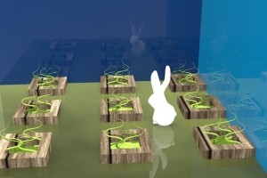
Easter Bunny
Dunne Bunny
Wine Stopper Stadel
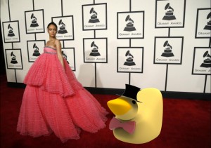
A Red Carpet Affair
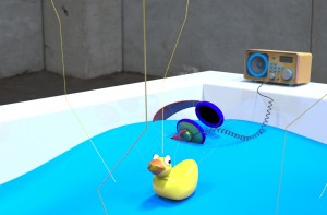
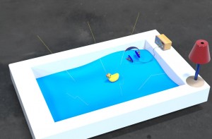
Fried Duck – Stadel
Robinson, Aranda/Lasch
Immediate Response:
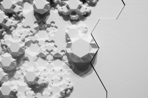
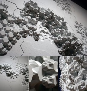
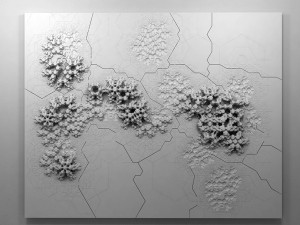
This image/sculpture at first glance appears to be a white surface or a series of panels that has objects excreting horizontally from the vertical surface. Down the center of this wall is a giant crack that almost appears to ressemble an earthquake, a randomized puzzle piece, or something that has shifted these naturally beautiful excretions seeping out of the cracks. The panels seem flush to the wall, and out of the panels are objects growing almost like fungi but have a very systematic geometric pattern. These repeating objects are different in scale and complexity and are molded to the surface that almost appear by natural means.
Objective Description:
As stated above, this sculpture is constructed on a wall plane, with varying points in height of objects protruding from the surface. There are cracks in the surface of the plane which appear to be constructed randomly as well as the growth patterns which do not seem to have any regularity or calculated formula. One might suppose that there is a perhaps a connection to a law or geometric pattern based on the sculptures title ‘Rules of Six.’ Again, this work is solid white and creates shades of gray and black from the different in dimensions from the growths, paired against an almost topographical surface.
Technical Decisions:
Rules of Six is an installation commissioned as part of the Design and Elastic Mind exhibition at the MOMA in New York. In collaboration with material scientist Mathew Scullin, the project uses new material structures that are not carved or composed by conventional tools but are rather ‘grown’ by interactions with molecules. (www.arandalasch.com/works/rules-of-six/) Three dimensional output from this application was used to produce a large-scale wall relief mounted in the gallery alongside two monitors- one running the simulation ‘live’ and the other displaying a slideshow of actual nanostructures. Rules of Six is designed to multiply indefinitely without recognizing scale, as it is symbolic as the scaling of molecules, rooms, buildings, or communities. The composition is a flat surface stood upright so that the objects can extrude horizontally into space. The software used was processing and Rhino 3D software on panels of painted high-density foam and hydrocal. The title ‘rule of six’ is extremely pertinent to the projects context, in that it is in fact a binding rule of transformation that an algorithm that connects the movement from ‘six’ to ‘no two are alike’.
The Work In The World
This relief sculpture was commissioned for the exhibition concept to engage designers and scientists in a dialogue by addressing their relationship to each other and their role in the culture. Aranda/Lasch’s work deals with science and mathematics with naturally occurring geometries with underlying themes of nature in their work. The Rules of Six explore the molecular processes taken directly from science which also applies to the six-sided snowflake of which no two are alike. This relationship of structure and nature and space and environment are very relevant in our own world’s depletion of natural resources and constantly evolving and changing world. This piece has such a level of ambiguity that allows several rapports to be drawn on with scale and our physical existence at the molecular level.
The Story It Tells
The theme prevalent in a lot of Aranda/Lasch’s work is their exploration of the relationship between structure and space. They appear to constantly be searching for patterns present in the natural world and new points of view to transfer into their works- and this exemplifies the random yet beautiful qualities of nature with sculpture in a natural law combined with technology’s rendering capabilities. The scales explored in this piece are relevant to human existence and our own presence in our surroundings, and this work allow the viewer to engage with the information itself and this relationship with design.
Immediate Response
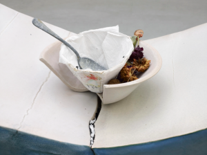
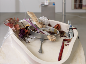
When I first look at these images from Helen Marten’s A.M installation, the first thing that comes to mind is food and the way that is it presented. I see eating utensils, a paper cup inside a broken bowl, an aluminum container that she transformed and used it as the head of a banjo, all surrounded by dried vegetated motifs and a clear plastic bag. It almost seems as though Helen picked random and disposed elements and combined them to together to create this installation.
Objective Description
I find this installation contradicting because it is not your typical clean and ideal representation of food. The utensils are dirty, the napkins used to make the paper cup are used, and there are signs of a dried liquid stains inside the banjo. What is unique about this installation is it’s title and the contradiction created by the uncleanliness of a morning meal.
Technical Decisions
The materials used in this this installation are not intricate or fancy. They are simple and sometimes random objects that she puts together in order to create the idea of food and how its unusual representation. She used pieces of shaved and broken wood to create the neck of the banjo. She also scattered dried fall-type leafs and flowers around the paper cup and the banjo. In the banjo, these leaves are held together by a clear plastic bag.
The Work in the World
Helen Marten challenges our typical ideals around food. By reading the title or simply giving a quick glance at this installation, we immediately know that the main topic of her work is food. However, what is interesting about this is that Helen moves away from depicting a grand and clean representation of this concept and shows us just the opposite. In today’s modern world, we insist on representing food in its prime, its freshest, and most aesthetically pleasing form. Social media platforms such as Instagram have encouraged this behavior. If you didn’t Instagram what you had for lunch, was it actually that beautiful and tasty? Did it actually happen? Also her interplay of different artifacts plays on the idea of recycling and using objects that we take for granted and often discard to create innovative objects just like she did with the banjo.
The Story it Tells
As a whole, Helen Marten’s installation appears to be a banal representation of food. She takes a concept so revered and glorified and transforms it into something completely different. She refutes and challenges the conventions around food and shows us that food and the whole concept around it are not always so pretty. Also, her insistence to use random and trash-like items to create new ones accentuates and creates awareness around the importance of recycling.
Immediate Response
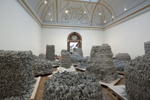
My immediate response to this was a generalization that everything in the art piece was the same smooth randomness. The smooth curves reminded me of dog poop. This art piece initially stimulated a feeling of almost disgust at the accumulation of these smooth tubular shapes. It, however, possessed something appealing about the way the material was accumulated. The shapes had a relaxing effect in that they exuded certain perfection in the confusion of their arrangement. It also elicited a feeling similar to that of a graveyard in the way the formations were erect, not curved formations. This stoic appearance of the formations made them feel like a guardian of something, hiding something, or representing something. One of the formations is wrapped in a smooth, consistent layer, that makes a smooth build up, like stucco of a house, looking like it was wrapped with this material.
Objective Description
As I looked closer, however, I became more aware of what the art piece was. Piles of smooth, similar diameter material were accumulated into a piles. These piles all had specific shapes. Some piles were arranged into shapes with sharp edges while others merely resembled pyrimads or cylinders. All tops of the shapes were flat. I noticed that there was a cylindrical pile with a white material surrounding it on the bottom. This white material looped around the base of one of the piles. All other piles are grey. Another pile is wrapped in smoother material, with some of its tubular formations exposed on one side of its shape.
Technical Decisions
Anish Kapoor arranged the piles so that your eyes naturally drift to the center right formation of a pyramid with a flat top. This is the shape that is wrapped in smooth tubular material, some of its uneven tubular network exposed on one side of the shape of the pile. This division, between the smoothness and unevenness of tubular material required special attention of the artist. The actual contents of the sides were less of a concern; it was rather the mere juxtaposition of the two ways the material could be arranged to make a pyramid with a flat top. The difference between the sides, however, also had to stay within certain artistic bounds that didn’t change the overall shape of the pile. The other piles have more continuous tubular formations on their side. Although the specific contortion of the tubular shapes in each pile were not as much of a concern for the artist, creating an overall shape that had discrete edges required more time to attain.
The Work in the World
After doing a little research into this piece I found that it was made with a 3D printer that deposited the material into the shapes we saw. It’s amazing that this was made with a 3D printer. Without looking into the technicality of how it actually was made, I can use my basic understanding of how a 3D printer works. I know that a 3D printer layes layer by layer. Culd this be different? Could this be something that just extrudes continuous tube? I think this method would make it impossible to achieve the shape contortion because of gravity and the time it took for the material to dry. If this was just made in a computer and the 3D printing was automated, planar layer by layer, then its amazing that someone is using the 3D printer to this scale. I have used a 3D printer to create small parts. The theory of a 3D printer can really be extended to any size, so its an artistic leap to magnify the size of the 3D printer to many square feet. This application of a 3D printer stimulated corresponding questions to what a 3D printer could evolve to be. If this machine is capable of making a layer that is stable enough for someone to walk on, then this technology could be the bridge to new platforms we’ve never experienced. What if the automation of the extruder escaped the defined channels that it currently uses to make prints? What if it could move itself into any context? What if it could elevate itself a little but then also climb up onto its own 3D printed constructions to start the next level? With very strong material, built with a very efficient machine, this could literally create bridges wherever it would like.
The Story it Tells
What seems most distinct about the middle pile that one’s eyes are naturally attracted to is the contrast from one side to the other. One side is made up of smooth and continuous material while the other is made up of more irregular tubular formations. This shape appears like its tubular formations were initially concealed with the smooth wrapping but over time the wrapping faded away and has exposed these irregular tubular formations on one side. All other piles in the room do not have this smooth side, therefore are already evolved piles. How does this evolution occur? Is it weathering or is it something else? In respect to the title, a Greyman seems to describe someone who is grey, which is often used to describe someone who is sad. The color of everything is also grey. Everything in the room is grey besides a white structure that is surrounding a cylindrical structure more in the background. This white structure seems to represent the dead shaman that, although knows the future, has still died. Its cause for death remains a mystery, but the white shape wrapped helplessly around the grey protrusion seems like it is surrendered to it. It is merely a puddle. It has no more life. The Greyman caused the death of the shaman from its cries. Smoke billowing up is represented as frozen in time by all of the tubular formations. The beauty is appreciated by trying to understand the work as a whole.
ARTIST: Wim Delvoye
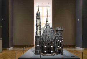
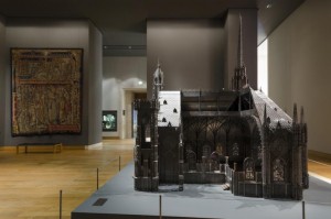
WORK NAME: Chapel (Scale Model) 2007
LOCATION FOUND: http://www.wimdelvoye.be (Artist’s Personal Website)
Immediate Response:
Primarily, I chose Wim Delvoye as my artist because a lot of his sculptural works incorporated architectural elements into them. I find his work fascinating because of his use of 3D modeling in his sculpture creating process. When I saw his work Chapel, I was at first amazed by the sheer precision of every surface and facet. What I particularly liked about this work was his use of a cutaway section. When I was younger, I loved books that showed, not only the exteriors of buildings, but also the interiors and how the exterior of the building was reflected in the interior and how the style carried over. Seeing this work, my childhood fascination again showed itself and made me really like this work of art.
Objective Description:
The work itself sits on a flat, gray base, which becomes part of the floor of the chapel when viewed through the cutaway side. The work is incredibly intricate and looks to be a scale architectural recreation of an existing gothic structure. On the entrance side of this structure, there are three main entranceways all capped by a pointed gothic arch. On either side of the archways are two towers. The tower on the left is much higher than the right and is capped by a pointed peak. The other tower is lower and doesn’t even come all the way to the height of the roof of the chapel. This tower, in addition to being much shorter, also is capped with a flat top with medieval-looking battlements on top. The church itself is shaped in your typical cruciform manner with another peaked steeple over the crossing. The gothic windows all appear to actually be made of glass while the rest of the structure seems to be made of metal sheeting cut very thin, probably with a laser cutter or an equivalent machine. The cutaway section (on the right side of entranceway) shows a highly ornate interior in terms of architectural elements, but lacks any sort of seating. Also, the interior seems to be much smaller than the exterior, almost as if the scale had suddenly shifted on the inside. The interior seems to be much more compacted than the exterior would suggest.
Technical Decisions:
I find this work to be incredibly interesting, especially in terms of the material choices used in its construction. The materials, as described by the blurb given by the artist, were laser-cut corten steel and stained glass. I think that the artist chose to use materials that closely resembled what the actual structure was made out of. However, since stone would probably be too difficult to manipulate and work into a smaller project, laser-cut metal would work incredibly well, especially if sanded down to look less metallic, which is what it looks like the artist has done. Interesting, though, is that some parts of it look to still be metallic in color, maybe because these elements would be made of metal on an actual gothic chapel. The stained glass is very interesting because it shows that the artist is really trying to be as close in detail as possible to the real thing. He could have simply left the windows without glass, but he chose to make the scale model realistic, instead.
The Work in the World:
I think that one of the main reasons why this work was created is to show off the technical capabilities of machinery and how modern fabrication methods, such as laser cutting and 3D printing, can be an accurate and fascinating way of producing works of art (and architecture in this case). I also think that Wim Delvoye may have even wanted to contrast the modern materials with the old architectural style. I find it strange, yet intriguing, that Delvoye would choose to recreate a gothic chapel. Perhaps he was trying to preserve history using modern methods and materials.
The Story It Tells:
As previously mentioned, I think that this work is meant to stand as a sort of reminder of the past, yet a view of it through a modern lens. As he explains in an interview, his works, and one of his goals as an artist, is not to worry whether his works are truly “artistic” or not, but rather to show things that are beautiful and visually intriguing. One of the other issues that he discusses is that his art could not possibly be duplicated if given to a renaissance sculptor. I believe that his work is trying to show sort of the opposite, that modern invention and skill has surpassed older styles and methods of production.
Roxy Paine-Symbiosis
Immediate Response:
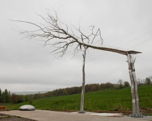
The fact that the older tree is broken makes this piece really special in my eyes. It is resting on the younger tree. It reminds me of the life cycle where the younger generation starts taking the control and takes care of the older generations. It also triggers the idea of support. The fact that the younger tree has most of its branches broken suggests a very strong storm; perhaps reflecting an economic crisis or another sort for man kind.
On the other hand the characteristic of wood are applied to steel in the fracture point with great detail. In addition to that the detail in form for the upper part of the tree makes me believe that he wants the audience to focus on the rapture and above rather than the base.
Objective Description:
The roots of the trees are not emphasized. The choice of material is also very dramatic, industrial level high carbon steel pipes are welded together to form a very organic shape. One can see the industrial baseline is secured with oversized bolts and screwed to the concrete foundation. It is clear that he doesn’t aim to hide the’ imperfections’ or inorganic forms where it connects to the ground. On the other hand the detail level increases significantly after the fracture point. Both younger and older tree are well polished, it creates an unusual affect with shades of the tree. The tips of the branches don’t seem as shiny unless there is a sharp light. The younger tree has much fewer branches and it seems that most of them are broken.
Craftspersonship:
Industrial level steel pipes and wires are masterfully welded. The thinner parts of the tree were made from thinner tubes or wires and Mr. Paine bent the thinner branches in order to create an organic form. The level of detail in the fracture point points out that there must have been some sort of casting. He masterfully imitates the organic flow of a tree. However he doesn’t pursue an organic form in the base. I think having a more organic form for the base would have been a good decision since it reunites the form tip to base.
Material Choice:
He uses steel as the material. Both tree and the steel are originated form earth so he might be transforming the inorganic qualities of steel into an organic one via imposing organic forms. In addition to that the steel is much more durable than wood so it enhances the work of art to be exhibited outside. Even though, the sculpture is really heavy (3.5 tons) the form is really slender.
Context:
The art work is exhibited in a public space very close to a modern art museum. I think that is the perfect location since it still resembles the museum but it is in a free space with no boundaries or rules. One is free to experience the details and physical properties of the sculpture without any consent. On the other hand, it may be due to the concern to exhibit the sculpture with real trees. By doing so the artist may be aiming to emphasize the contrast between the material properties. On the contrary, the size of the art work and the logistics might have been a major limitation for the project to be exhibited inside.
*I have found the info from http://www.roxypaine.com
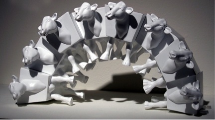
Immediate Response:
The first thing that strikes me about this piece is the arrangement of the cows. Last time I checked, it is not possible to arrange cows up in a vertical arch! However, the particularly polygonal bodies of Van Ness’s cows allows them to fit together like a puzzle as they support each other, seemingly defying the laws of physics as they do so. I also notice that the stark background and colors of the cows themselves are completely blank. There are not even any spots on the cows, which, in my mind, is one of the defining characteristics of a cow.
Objective Description:
This image shows white objects on a white background. The objects appear to be altered forms of cows. There are eight of these cows stacked up against each other, forming a vertical arch. Each cow appears to be exactly the same. The center of their body is a six sided polygonal form with angled edges on the sides. From this body, rather realistic body parts, including the head, legs, tail, and udder extend. The additional body parts do not blend into the polygonal form with any sense of curve. It is as if they were simple mounted on a block in a space that looks appropriate for a cow.
Technical Decisions:
The technical decisions made on this piece make it feel less like actual cows, and more like what they actually are: computerized renders of a creature that were edited and printed in multiples. There is no variation between each cow, which immediately feels unrealistic. Of course, the small size (only a few inches tall) and body shape of the cows contributes to this as well. It is a shape that doesn’t look like could ever be found in the natural world, but rather must have been fabricated using digital software for the sake of convenience in fitting these cows into the arch they form. There is no attempt at hiding this artificiality of these cows, as they are not painted or even placed in a faux-natural setting. They are simply printed in foam core and coated in a plain white resin.
The Work in the World:
This piece actually reminds me a lot of the Rare American Rhinocercow sculpture project I worked on last year. In that project, I made duplicates of a rhinoceros form through a mold-making process and then altered them to take away part of what made them rhinoceros (incidentally making them more like cows in the process) by removing their horns and painting them in a different way. Van Ness does something similar by altering these cows in a way that takes away part of what makes them uniquely cows. Because of his use of digital rendering, he has a more overt way of showing the artificiality of these imaginary creatures than what I did. These feel even more as though they could be marketed and sold as children’s toys, because of their lightweight material and small size, as well as the stacking capabilities.
The Story It Tells:
It seems as though David Van Ness is using these stackable cows to imagine a future where we can modify creatures and objects at will. I think that realistically, they won’t be able to be modified in such a clearly digitized and polygonal way, at least for some time. This works seems like an exaggeration of the genetic engineering that is being experimented with currently. Of course, once we learn more and more about tweaking parts of animal or plants, what exactly is going to stop us from turning things into conveniently stackable polygons, that eschew natural curves and details from straightforward efficiency? What practical use will unique colors and patterns of these creatures serve, when they can more easily just be blank canvases for our creations?
Greg Danchik, Quayola’s Captives
Immediate Response
The first thing that this piece reminds of the idea that every sculpture starts with a single piece of marble. It is almost like the beautiful piece of art is trapped within the giant slab of marble. It also is pretty incredible how it looks like it was a handmade piece of art even though it is 3D printed. The man also looks like he extremely powerful. Considering the title, it looks like he is trying to break through the rock, where he was a captive. I also think the artist clearly defines the difference human and marble/rock/sand through straight and smooth lines. The human looks more refined and smooth, while the other parts are jagged.
Objective Response
This sculpture looks like a human trapped within a rock. The rock is jagged. The human looks locked into the rock with his feet, right thigh, and his head. His head is mostly trapped in the rock, but the chin, which is bearded, appears to be escaping from the rock. The human’s arms are situated in such a way that it looks like he is trying to rip the rock off of his legs. The human is also extremely muscular with a well defined core and arms.
Technical Decisions
I believe the artist chose to print this with sand for a reason. The sand gives off the same color as marble so it looks like a real sculpture. Also, sand is really small so it can be make define everything as precisely as possible. I also think that sand is a great material to print with because you could print this digitally created sculpture at any size. This is roughly 6 feet tall, but it could have been printed at 6 inches tall. I also believe that the artist chose to define the human muscular nature to show that he is powerful and trying to break free from the rock.
The Work in the World
This artwork reminds me of other sculptures that look like they are almost left unfinished on purpose. This work almost looks like it was never finished, but it looks finished at the same time. It is an interpretation of Michealangelo’s unfinished series of sculptures, “Prigioni”. It also reminds me of oppression. It looks like someone trying to escape from something holding them back. It also looks like someone being created into something new. It could be a reminder of a new creation.
The Story It Tells
Considering the title, I believe this is a sculpture of someone trying to escape their past. I believe the person is being born into someone new. It looks like the rocks are the human’s old self, and the human is breaking away or trying to become something new. Someone else may interpret this work as someone being created. It looks like someone is growing from the rock. They are being created slowly, but perfectly. It could also look like something from man being born from nature. It is like taking something that is not perfectly formed and making it perfect.
Immediate Response
My first response to this sculpture is whether it is a life size human with a large iPad, or a very small figurine with a normal size iPad. Either way, this inclusion of art and technology is very interesting. Eaton seems to have taking what appears to be a Buddha like figure and matched it with a new age technology. It is very current, hip, and if this was a real iPad docking station, as I think it may be, this would be something I could see in houses across the world. The figure is guarding the iPad and keeping it safe in a way.
Objective Description
There is a sculpture of a very rotund woman sitting down, legs crossed. Her back is hunched and her head is peering down. Her hair is in a bun. She is looking at a real iPad. Her eyes seem to be gazing into the iPad as if she is reading something on it or perhaps looking at her reflection. Her large arms go down along the side of her big belly. Her hands are gripping the side of the iPad at the bottom, as if to secure it. Her drooping, large breasts are resting against the bottom front of the iPad. There is a cord running out of the bottom of her. Her whole body is white like ivory.
Technical Decisions
Designed Orientation toward the viewer:
This work was definitely made to engage the viewer. The viewer is invited to participate in the art by physically plugging their technology, their iPad, into the actual art. It is interesting that the figure of the woman by itself could be considered art to many viewers. The woman is well crafted and well designed and could stand alone on a table as a decoration. However, the art is not finished without the human interaction of placing the iPad into the hands of the woman. Only then can she be complete and have something to look at as she passes through her day.
The Work in the World
The woman is a replica of the curvy forms and symbols of ancient Venus figurines. Apparently she is a goddess that helps the fertility of the technology age. In this sense, she has helped to birth the iPad to creation and helped its many improvements. This is very current and relates to modern day. Technology is a huge part of human experiences in life. Understanding the relationship to the goddess and the technology she is holding, I now understand this art to a new level. Also, modern ports for iPads and technology in general are very boring. This work brings creativity and art into the once dull charging station.
The Story it Tells
After analyzing the work of art some more, it became clearer what Eaton was trying to portray. As the goddess of the fertility of the technology age, the woman has been very busy over the last few years making all this new technology. Here, she is resting from a job well done. She is admiring the fruit of her labor in a way, and that is why she is gazing so intently on the iPad she is holding. She is looking at what she made and how far technology has come in the last few decades. Others might just see this as a “cool” charging port, but I believe there is so much more to the story of the lady then what is noticed at first glance.
Heather Bothwell, Farm
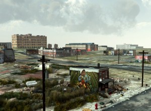
Immediate Response
Farm by Tim Portlock evokes an immediate sense of sadness and despair. I was drawn to the painting on the side of the building in the foreground as well as the yard surrounding the building. The painting humanizes the scene and makes it clear to the audience that this was once a prosperous land where happy and healthy people lived and worked. The trash in the yard consists of tires, couches, and an old car and there stray animals wandering the streets. This shows that these buildings are now uninhabitable and the owners have been forced out, leaving their old lives behind.
Objective Description
Tim Portlock’s Farm consists of an abandoned house and what is now a junkyard surrounding the house in the foreground. There is a mural on the left side of the home that depicts two African American farmers, a man and a woman, carrying a basket of colorful fruits and vegetables while standing within prosperous farmland. In the junkyard, an old couch, tires, empty boxes, an old car, and stray animals can be seen. Beyond the foreground is a series of other abandoned buildings that appear to be other homes and office buildings. The sky is gray-blue and cloudy with only small rays of light breaking through the clouds.
Technical Decisions
There are multiple aspects of the piece that demonstrate the technical decisions that went into this piece as well as the entire collection of work entitled “Here.” First, the trash and destruction that you see in Farm appear to be random but that is no accident. When the destruction that Portlock is displaying occurs naturally, tires will not be left in a junkyard lying perfectly flat next to each other and instead will likely be spread across the yard and stacked against other objects as in Portlock’s work. Additionally, while this is a strong piece of art on its own, it is presented as one of a series of six pieces all which display unfortunately common scenes of destruction. When you look at the pieces together, it becomes clear to the audience that Portlock is portraying a more widespread issue of abandonment and destruction which amplifies the emotions that the work evokes.
The Work in the World
This piece speaks to the subject of the industrialization and de-industrialization that occurred in the United States. The buildings in the image appear to be a mixture of factories, office buildings, and homes. This suggests that during the age of industrialization, people flocked to the land in search of jobs however once deindustrialization began, that factory industry was not the only industry harmed. Individuals lost their jobs and were forced to leave town leading to rampant abandonment and destruction issues in cities. The image of the African Americans on the side of the home touches on the issues of race and economic status, suggesting that many of the individuals who previously lived in such cities and were forced to leave their homes were those of color.
The Story it Tells
The title of the work, Farm, clearly tells the story behind the piece. Prior to the age of industrialization much of our country was composed of farmland where fruits and vegetables would grow. During the industrialization era, there was still growth on the land but instead it was the growth of factories, jobs, homes, etc. Once de-industrialization began, the vegetation that once existed on the farmland began to regrow but now instead of finding vegetables on the land, there is growth of trash which has been a growing problem within the United States. This piece is showing how much destruction we are causing to our land and to the people who once lived there.
Ear Bud Questions – Roy
1) What is sweep rail 1?
2) What are other uses of the Transform – Array tool?
3) What are the Boolean Tools?
Earbuds Questions- Lily Robinson
1. When is it helpful to lower the opacity/frequency of the object?
2. Can we go over the transform-array tool?
3. Can we also review the boolean (difference) adding and subtracting benefits?
Earbuds-Eric
What are the U and V values in rebuild, and is there a limit of how much you should put in?
What is sweep 1?
How do you change materials between different parts of an object, aside from having a bunch of different layers?
Earbuds
Can one use a wacum to trace the lines from the image or draw curves spontaneously? if so how does the curve points work in that case?
How can we custom reset the gumball exp: perpendicular to a surface rather than axis?
Are blend tool and filletting similar if there is an edge or two surfaces intersecting?
Ear Bud Questions-Greg
Is having too many degrees on ever a problem?
Are there ever times you should not use surface blend?
How do you Extrude with Gumball?
Can a projected shape only exist on a projected body or can it be separately removed?
What is the difference between blend and loft?
What does the history tab do?
Questions from the Modeling Earbuds Tutorial:
Can we go over some of the uses of the Transform – Array tool?
How do you know how many points and degrees you should use when you “rebuild” an object?
Can we go over all of the options in the “Adjust Surface Blend” menu?
Can we go over how to use the Boolean tools?
Lily Robinson-headphones
Earbuds Questions Stadel
I thought this tutorial was very interesting, especially since he only used a few tools and commands to make something pretty complex. Throughout this tutorial I did have some questions about what he was doing. It would also be useful to go over exercises with some tools he used that we have not done before.
Questions:
If F3 brings up properties, what do the other F# buttons do? (besides F10 and F11)
I saw what Transform – Array – Polar does, but I don’t understand why those commands do what they do.
Questions on reviewing tools:
Can we go over making a split on an isocurve?
Can we go over Patch? It seems like a helpful tool to review.
Can we also review adjusting trim and join?
