Currently viewing the category: "Art Report"

Immediate Response:

This video reminded me of abstract art that doesn’t necessarily make sense as a whole, but when broken down makes more sense. The variety of clothes that were worn reminded me of the 70’s from the colors and patterns used.

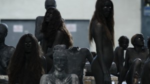
I also focused on the artistic messiness that was displayed in both the clothes worn by actors and physical props. For example, I noticed how despite the appearance of nudity, the women in the beginning had applied tape to their nipples to censor them. This tape was not applied in a symmetric or thought-out method, but rather the tape seemed to be applied with little thought to its appearance and rather with a complete focus to cover the nipple. Similarly, the man in black throwing wax seemed to have some randomness or arbitrary method to how and where it was thrown.

I noticed how similar the women looked, camera shots from a distance made the distinct features of the women blur together. In contrast, all men in the video were distinct and easily distinguished. The women dancing as a group reminded me of old fashion dancing in musicals. The music that accompanied it with the saxophone also aligned itself to this older fashion feel.

Objective Description:

All actors are not making eye contact and project a stoic facial expression for all parts in space that they inhabit. Also, the way many actors were dressed did not resemble fashion that would normally be worn in other contexts. The man dressed in pink was the main character of the story and utilized largely as a method for seguing to the next scene in the video. He played the main role in the video, everything revolved around his actions and his interactions. The music aligned itself with the scene by changing its frequency and tone to instill a feeling for the scene. It was through this method of utilizing music that we came to understand how we should feel.

Technical Decisions:

The director had a purpose to each component of the video. There is a beginning and end to many of the scenes of the video. For example, the mostly nude women in the beginning of the video are shown walking back to the water later to indicate that they will be there until we are shown differently.

The man dressed in pink brings the viewer to the next scene so that the story flows together and doesn’t seem to be haphazard. The scenes shown to the viewer in which the man in the pink is not present indicate a more private occurrence. The man in the pink provides us with a feeling that now the whole audience understands.

The sound and its loudness are played with to indicate the focus of the video.  Vague sound of other floors can be heard which indicates the floor’s location with respect to the other floors. The movement of people in the scenes also leads to the feeling that is instilled in the viewer. For example, the scene in which the man in pink chooses the weapons, two competing bands loudly play cacophonous music while people run around in a confusing mess that is so disorderly that it requires people with “STAFF” imprinted on their shirts to keep it under control.

The Work in the World:

The work demonstrates the common story of a man rejected by a woman. Many men lust for gorgeous women but many are also turned down. Rejection hurts and causes men to react. These men struggle to feel better. Some go through great lengths to plot revenge, doing what they can to cause damage to the woman hurt them. There are competing emotions in any decision to this degree, confusion, and lots of anger. Some times the reaction doesn’t make sense but they begin to do something to make them feel good. They can be so focused on a specific woman that hurt them that despite being comforted by other women, they still remain angry. If the hurt man does decide to try to cause harm to the woman that hurt him, then this leads to hurt for all at the end. The woman forever feels the pain and is always part of the man’s thoughts. The pain never goes away from a decision to act on revenge, it only gets worse.

The Story it Tells:

The video is led by the man in pink. The story begins with minimally clothed women to represent angels to introduce the story. The man in pink leads the viewer on an adventure through the story. The man falls in love with a beautiful woman, but hurts him represented as a leopard, when she turns him down. He escapes but is hurt. He finds a stock of material and begins to pile it up. This piling of material shows his process of developing a means to achieve revenge. The man is awarded a cloth and baby white goats for not hurting the woman and leaving her, despite his continued anger represented by her appearance as a leopard in the video. He returns to obtain the weapons where the hard rock is more evidently composed of two competing bands. These competing bands represent ferocious emotions competing, one that is good, not to use weapons, and one that is bad, to succumb and follow the desire for revenge.

The man kills the leopard, a metaphor for a woman who hurt him. The man attacks her. Dark colored, somber goats are seen at the end once the leopard woman in shape of her human self, blind and clearly very injured. She has goats on a leash only on the green fabric that is distinct from the orange fabric that represents the man in pink. She is sitting with most of her body in the green fabric and what looks like a skeleton of her past in sitting in the pink fabric that had been with. The man throwing liquid wax at the top floor keeps track of time for the video. When the liquid wax has reached the bottom, it is the end of the video.


Screen Shot 2015-02-05 at 7.36.04 AM Screen Shot 2015-02-05 at 7.36.36 AM

Immediate Response

When I first look at these images from Helen Marten’s A.M installation, the first thing that comes to mind is food and the way that is it presented. I see eating utensils, a paper cup inside a broken bowl, an aluminum container that she transformed and used it as the head of a banjo, all surrounded by dried vegetated motifs and a clear plastic bag. It almost seems as though Helen picked random and disposed elements and combined them to together to create this installation.

Objective Description

I find this installation contradicting because it is not your typical clean and ideal representation of food. The utensils are dirty, the napkins used to make the paper cup are used, and there are  signs of a dried liquid stains inside the banjo. What is unique about this installation is it’s title and the contradiction created by the uncleanliness of a morning meal.

Technical Decisions

The materials used in this this installation are not intricate or fancy. They are simple and sometimes random objects that she puts together in order to create the idea of food and how its unusual representation. She used pieces of shaved and broken wood to create the neck of the banjo. She also scattered dried fall-type leafs and flowers around the paper cup and the banjo. In the banjo, these leaves are held together by a clear plastic bag.

The Work in the World

Helen Marten challenges our typical ideals around food. By reading the title or simply giving a quick glance at this installation, we immediately know that the main topic of her work is food. However, what is interesting about this is that Helen moves away from depicting a grand and clean representation of this concept and shows us just the opposite. In today’s modern world, we insist on representing food in its prime, its freshest, and most aesthetically pleasing form. Social media platforms such as Instagram have encouraged this behavior. If you didn’t Instagram what you had for lunch, was it actually that beautiful and tasty? Did it actually happen? Also her interplay of different artifacts plays on the idea of recycling and using objects that we take for granted and often discard to create innovative objects just like she did with the banjo.

The Story it Tells

As a whole, Helen Marten’s installation appears to be a banal representation of food. She takes a concept so revered and glorified and transforms it into something completely different. She refutes and challenges the conventions around food and shows us that food and the whole concept around it are not always so pretty. Also, her insistence to use random and trash-like items to create new ones accentuates and creates awareness around the importance of  recycling.


Rule of Six 2 rule of six 3 Rules of Six Screen Shot 2015-02-05 at 12.48.18 AM

Immediate Response:

This image/sculpture at first glance appears to be a white surface or a series of panels that has objects excreting horizontally from the vertical surface. Down the center of this wall is a giant crack that almost appears to ressemble an earthquake, a randomized puzzle piece, or something that has shifted these naturally beautiful excretions seeping out of the cracks. The panels seem flush to the wall and out of the panels are objects growing like fungi but have a very systematic geometric pattern. These repeating objects are different in scale and complexity and are molded to the surface that almost appear by natural means.

Objective Description:

As stated above, this sculpture is constructed on a wall plane, with varying points protruding from the surface. There are cracks in the surface of the plane which appear to be constructed randomly as well as the growth patterns which do not seem to have any regularity or calculated formula. One might suppose that there is a perhaps a connection to a law or geometric pattern based on the sculptures title ‘Rules of Six.’ Again, this work is solid white and creates shades of gray and black from the difference in dimensions from the growths, paired against an almost topographical-like white surface.

Technical Decisions: 

Rules of Six is an installation commissioned as part of the Design and Elastic Mind Exhibition at the MOMA in New York. In collaboration with material scientist Mathew Scullin, the project uses new material structures that are not carved or composed by conventional tools but are rather ‘grown’ by interactions with molecules. (www.arandalasch.com/works/rules-of-six/)  Three dimensional output from this application was used to produce a large-scale wall relief mounted in the gallery alongside two monitors- one running the simulation ‘live’ and the other displaying a slideshow of actual nanostructures. Rules of Six is designed to multiply indefinitely without recognizing scale, as it is symbolic as the scaling of molecules, rooms, buildings, or communities. The composition is a flat surface stood upright so that the objects can extrude horizontally into space. The software used  was processing and Rhino 3D software on panels of painted high-density foam and hydrocal. The title ‘rule of six’ is extremely pertinent to the projects context, in that it is in fact a binding rule of transformation that an algorithm that connects the movement from ‘six’ to ‘no two are alike’.

The Work In The World

This relief sculpture was commissioned for the exhibition concept to engage designers and scientists in a dialogue by addressing their relationship to each other and their role in the culture. Aranda/Lasch’s work deals with science and mathematics with naturally occurring geometries with underlying themes of nature in their work. The Rules of Six explore the molecular processes taken directly from science which also applies to the six-sided snowflake of which no two are alike. This relationship of structure, nature. space and environment are very relevant in our own world’s depletion of natural resources and constantly evolving and changing world. This piece has such a level of ambiguity that allows several rapports to be drawn on with scale and our physical existence at the molecular level.

The Story It Tells

The theme prevalent in a lot of Aranda/Lasch’s work is their exploration of the relationship between structure and space. This duo appear to constantly be searching for patterns present in the natural world and new points of view to transfer into their works- and this work specifically exemplifies the random yet beautiful qualities of nature with sculpture in a natural law combined with technology’s rendering capabilities. The scales explored in this piece are relevant to human existence and our own presence in our surroundings, and this work allow the viewer to engage with the information itself and this relationship with design.


VABE-440-01vanessa-beecroft-vb66-201-copia-117560_0x440

24

Initial Response:

My initial reaction is to want to move closer to the piece, to determine whether the figures are alive or sculpted. I get feelings of shock and awe at the hauntingly beautiful dark figures peering out at me. The whites of their eyes draw me in, at the same time giving me shivers. The figures are so dark it is almost like they are shadows. In its entirety, “vb66” elicits an eerie sadness touching the viewer’s soul.


Objective Description:

Female models painted black in the nude are posed on a large square platform. There are at least 60 of them all with dark brown or black hair of varying lengths. The models towards the outside of the platform are reclining on the ground gradually posing in more upright positions towards the center of the platform where they stand. This positioning creates a pyramid effect. Dispersed throughout the models are broken black sculptures of women. The sculptures are lifelike and are most easily distinguished from the models by the lack of white eyes.


Technical Decisions:

Vanessa Beecroft is famous for her use of models in performance art. This exhibit is no exception. The decision to use models forces the audience to interact with the piece, make eye contact. The decision to keep the models in the nude gives them a sense of vulnerability to the viewer. By painting their bodies this vulnerability is lessened slightly. But the black paint also makes the models blend in more with the life size figure sculptures breaking them up. Black as a color choice is bold and dark as black has a lot of connotations associated with it including death.


The Work in the World:

Modern art is increasingly interactive. Beecroft’s work is no exception. The audience’s reaction to the piece is part of the artwork. The interaction is between subject and viewer is in some ways the greatest part of the art. In this particular piece naked models make eye contact with the viewer, increasing the interaction between subject and viewer. As models look out at the viewer with their stark white eyes, they become alive in both the past and present.


The Story It Tells:

This work was installed in Naples, Italy in 2010. To me, the location of the piece, along with the pyramid-like structure and soot black figures allude to Pompeii. As a tragic historic event in Italy, Pompeii must have influenced Beecroft’s work in some way. The black models look to be coated in ash and feel deathly especially posing beside broken body parts of sculptures. In addition the shape of the piece could be compared to that of a small volcano. Black not only symbolizes death and burial, but also invisibility. These women, dead and buried are also forgotten.


pic

Immediate Response

My first response to this sculpture is whether it is a life size human with a large iPad, or a very small figurine with a normal size iPad. Either way, this inclusion of art and technology is very interesting. Eaton seems to have taking what appears to be a Buddha like figure and matched it with a new age technology. It is very current, hip, and if this was a real iPad docking station, as I think it may be, this would be something I could see in houses across the world. The figure is guarding the iPad and keeping it safe in a way.

Objective Description

There is a sculpture of a very rotund woman sitting down, legs crossed. Her back is hunched and her head is peering down. Her hair is in a bun. She is looking at a real iPad. Her eyes seem to be gazing into the iPad as if she is reading something on it or perhaps looking at her reflection. Her large arms go down along the side of her big belly. Her hands are gripping the side of the iPad at the bottom, as if to secure it. Her drooping, large breasts are resting against the bottom front of the iPad. There is a cord running out of the bottom of her. Her whole body is white like ivory.

Technical Decisions

Designed Orientation toward the viewer:

This work was definitely made to engage the viewer. The viewer is invited to participate in the art by physically plugging their technology, their iPad, into the actual art. It is interesting that the figure of the woman by itself could be considered art to many viewers. The woman is well crafted and well designed and could stand alone on a table as a decoration. However, the art is not finished without the human interaction of placing the iPad into the hands of the woman. Only then can she be complete and have something to look at as she passes through her day.

The Work in the World

The woman is a replica of the curvy forms and symbols of ancient Venus figurines. Apparently she is a goddess that helps the fertility of the technology age. In this sense, she has helped to birth the iPad to creation and helped its many improvements. This is very current and relates to modern day. Technology is a huge part of human experiences in life. Understanding the relationship to the goddess and the technology she is holding, I now understand this art to a new level. Also, modern ports for iPads and technology in general are very boring. This work brings creativity and art into the once dull charging station.

The Story it Tells

After analyzing the work of art some more, it became clearer what Eaton was trying to portray. As the goddess of the fertility of the technology age, the woman has been very busy over the last few years making all this new technology. Here, she is resting from a job well done. She is admiring the fruit of her labor in a way, and that is why she is gazing so intently on the iPad she is holding. She is looking at what she made and how far technology has come in the last few decades. Others might just see this as a “cool” charging port, but I believe there is so much more to the story of the lady then what is noticed at first glance.


Adam Martinakis-カイ-12

Immediate Response

Upon first glance at Adam Martinakis’s piece, “Peta,” part of his collection “The Inevitability of Time,” I was awed at the extreme detail and emotion his work has. Seeing a fleshy feminine figure holding a crumbling stone figure, seemingly a man, I thought of the idea of death. Thinking about what this piece could analogize aside from death, I though broadly and came up with the idea of the frailty of the human form and the inevitable death of the human race. The raw emotion captured in the image reminded me of a funeral, as people gather to grieve over the loss of another.

Objective Description

The piece is located in what appears to be a concrete room, with a feminine flesh-toned manikin kneeling and looking skyward in despair while holding a crumbling stone looking human figure horizontally in her arms. The female’s body is proportional and emotes an atmosphere of grievance, while covered in what looks like patches of blood breaking through her skin. The figure in her arms is of a bluish-grey stone texture and is cracked and separated throughout its body, almost looking as if a statue was hit multiple times with a hammer. Furthermore, there are multiple blood colored splotches over the stone figure implying that the feminine figure was with the body at its death.

Technical Decisions

I find the construction of the work to be absolutely stunning. The placement of the figures in the center of the isolated concrete room focus the audience’s attention to the raw emotion portrayed by the feminine figure and the crumbling stone figure enhances the feeling of gloom in the piece. The use of stone texture on the deceased body draws the audience to question the cause of death, while the bloody flesh-toned figure captivates the audience with sorrowful power. Additionally, I found the material choice interesting. The fleshy-toned figure and the stone figure together in a grieving embrace symbolize the frailty of the human condition and the inevitable idea of death.

The Work in the World

I think Adam Martinakis’s piece is a pure representation of the human condition and the continuous cycle of life and death. Captured in a moment of mourning, humans can relate to the sorrow and grievance portrayed by the kneeling human figure. Additionally, noting that Martinakis’s exhibition is called “The Inevitability of Time,” it is clear he is sending a message that mankind, as a whole, must face the fact that death is imminent, and that it cannot be avoided. In comparison to other works, I find that this similarly captures the emotion of Van Gogh’s “The Scream,” which portrays a feeling of shock, grievance, and mystery through the painting’s brush stroke curvature and array of colors. I think the true beauty of Martinakis’s work lies within his ability to freeze human emotion and the idea of death in time.

The Story It Tells

The Story Adam Martinakis’s piece “Peta” tells is that of the inevitability of death throughout time. The idea of time is endless, a stark contrast to that of a human life, something that is on a timer leading towards death. The use of flesh and blood tones in the female character contrasts the cracked and deathly looking stone figure in her arms, a symbol of the frailty of human life and the sorrow death brings with it. Additionally, the concrete room in which the two figures are contained adds a feeling of captivity to the piece, which could symbolize the idea that we as humans are trapped in a world of death with no way of escaping (at least not yet).