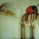
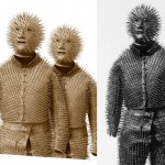
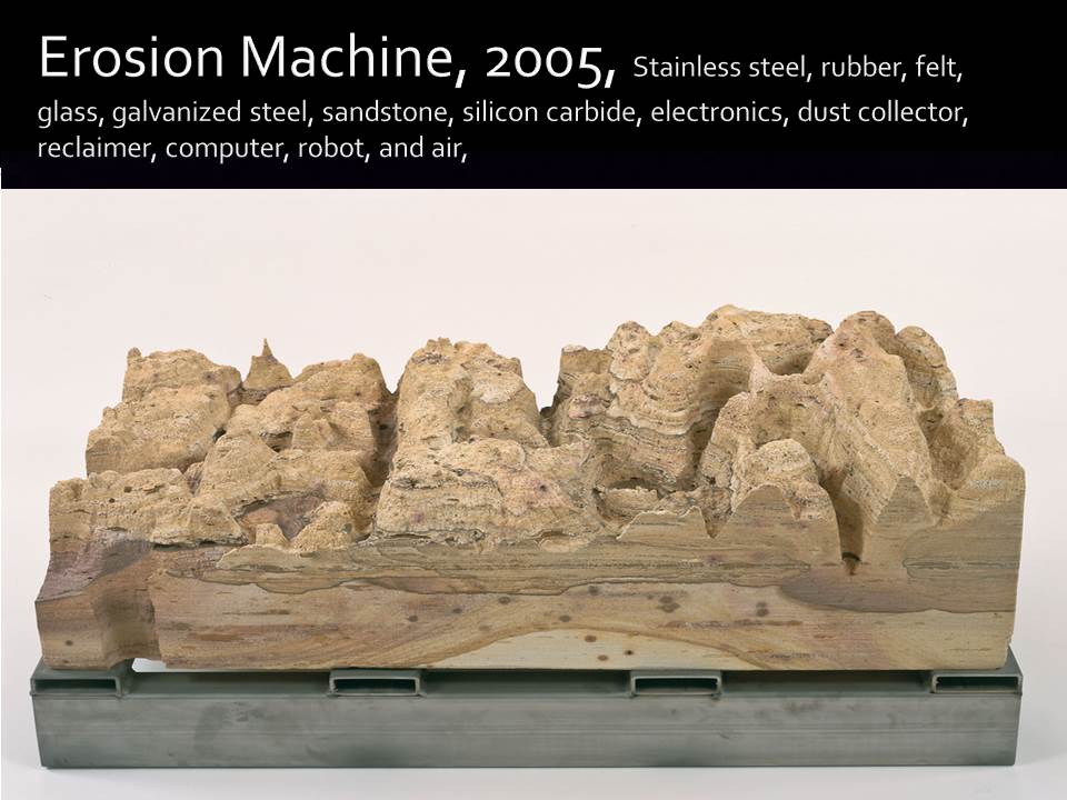
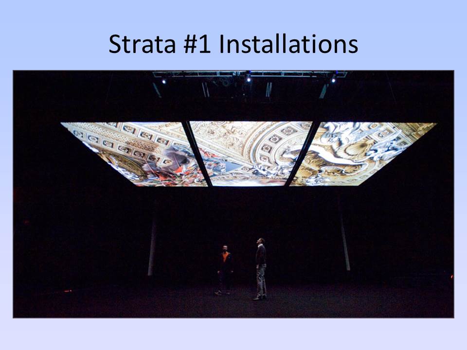
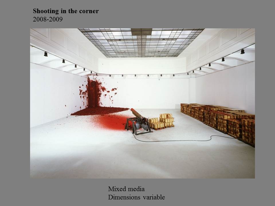
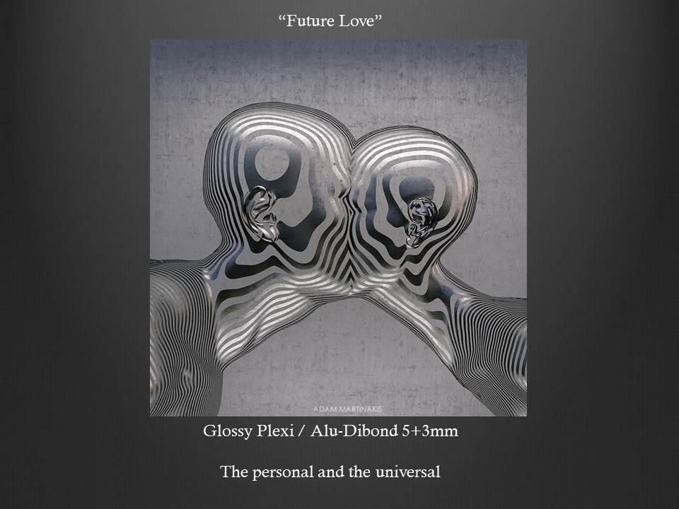
Event: The Oldest Living Things In The World
Location: ELC. 3rd floor
Date:2/25/2015
Type: Samek Art Gallery
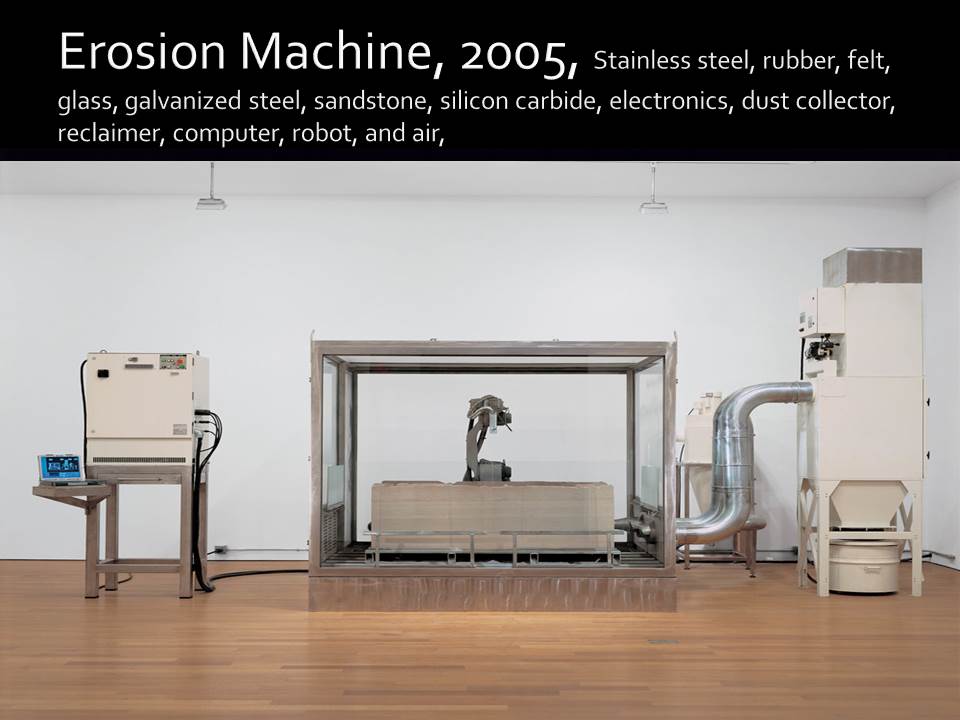
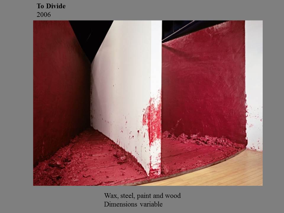
Event: The Oldest Living Things In The World
Location: ELC. 3rd floor
Date:2/25/2015
Type: Samek Art Gallery
Event: Esther Traugot: Arboretum
Location: Down town
Date: 17/Feb/2015
Type: Samek Art Gallery
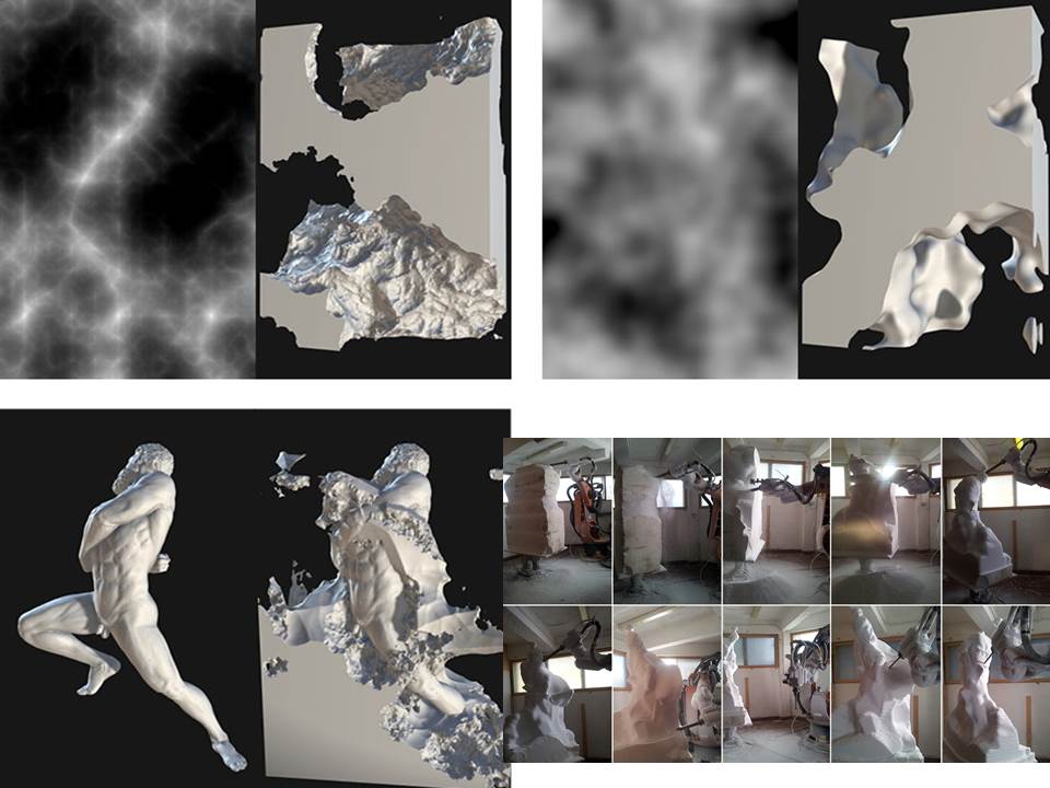
Step 1: Create a new folder for your project
When creating custom materials you’ll be working with a Keyshot file and a number of other image files. From one work session to the next, it’s easy to misplace your images, and if you open a Keyshot file and the program can’t locate the image files, your custom materials won’t show up properly. If this happens you’ll lose time and need to redo a number of steps. To keep this from happening I suggest creating a new folder in your netspace for your Keyshot project, and then save your Keyshot file and all of your custom material image files to that one folder. Then, when you backup your project to an external hard drive you’ll want to copy the whole folder.
Step 2: Create a seamless image with Photoshop
This youtube video will show you how. Watch from the beginning to 4:30.
Contrary to what the narrator suggests, I’ve found that the clone stamp works quite well for removing seams.
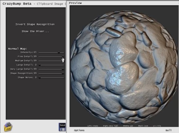
Step 3: Create bump/normal maps, and specular maps with Crazy Bump
Watch from 1:00 to 4:00, and from 7:30 to 10:00: http://www.blenderguru.com/tutorials/the-secrets-of-realistic-texturing/
Although Andrew Price’s Blender Guru tutorial covers texturing in Blender, it’s still relevant to our workflow in Keyshot. One key difference, though, is that in Keyshot we’ll use only the following: the color map (which you created in step 1), the bump/normal map, the specular map
Crazy Bump offers a free trial; download it here.
Step 4: Apply your Crazy Bump files in Keyshot
These instructions explain the process
Step 5: Learn about the various methods of texture mapping available in Keyshot
These tutorials will help you determine what kind of mapping (spherical, cylindrical, box, UV, etc.) is most appropriate for your form. The default is box, which works well in most situations.
https://www.keyshot.com/keyshot3/manual/texturing/texture_mapping.html
Keyshot texture overview youtube video
Step 6: Learn how to use UV coordinate mapping when necessary for complex forms
With some really complex forms you’ll find that mapping with box, spherical, cylindrical, etc., doesn’t give good results. It is sometimes necessary to unwrap complex forms and use the UV editor to align the unwrapped form with the image you created in step 1. I had to use this process in my Seneca project because all of the other mapping methods produced visible seams. In the Seneca project, by unwrapping and using the UV editor I was able to put the seams on the back of the warthog’s legs so they wouldn’t show up in the renders. I also used this process in my Aristotle project to make the wood grain align properly with the boat.
Watch this youtube video from 6:30 to 9:00
Additional resources
Advanced Keyshot tutorial videos on material creation (skip to lesson 3 if short on time):


 Event: Poetry Slam featuring Roger Reeves
Location: Uptown
Date: 8pm on 2/20/15
Type: Stadler Center Event
Note:I’m not sure why the photo is upside down. I can’t figure out how to rotate it online but it just uploaded that way.
This program can be used to create and pose a figure for your project. Easy to use. Some figures are free; others require a purchase. Finished figures can be imported in Rhino in OBJ or STL format.
Date and time of event: Monday February 16, 7:30 pm, 2015
Location of Event: Tustin Studio Theatre
Type of Event: Department of Theatre and Dance Student Directed Play
1.) Provide a brief detail-oriented technical description or summary of the event you attended. (This section should remain journalistic and should not be reflective of your opinion.
The Department of Theatre and Dance presented the play Dead Man’s Cell Phone by Sarah Ruhl, and was directed by a Bucknell Student for his honors thesis as a theatre major John Brunner, ’15. This two hour show was performed by a small cast Bucknell students with a simple yet effective set design. Dead Man’s Cell Phone explored the relationship with modern technology’s ability to bring together and also isolate people in today’s digital, fast-paced and always distracted age.
2.) Use the section below to write a well-structured paragraph focusing on your personal critical insight / response to the event. How did you interpret or react to what was presented to you?
I very much enjoyed attending this performance. The director, John Brunner ’15 is a close friend to me and fellow French TA and French major, and I spent last spring speaking with him about this performance and his plans/goals as a director. After watching this performance yesterday evening, I was proud to see his ambitions to come into fruition in a clear and thoughtful manner, and that the overall show ran very smoothly. My own thesis for my Studio Art project has shared some of the main themes covered in this piece, specifically the presence/absence of the cell phone and modern day technology. I was pleased to see this concept expressed in another art form that effectively shared with the audience of ‘being present’ and ‘living in the moment’.
3.) What information, ideas, images, etc. most impressed you and why?
I was most impressed by the simple set design, and especially the incredible acting performances by my peers. It was a treat to watch my friend’s directing accomplishment come into fruition, as well as share in the overall experience of attending the play and appreciating it’s message towards the affects of technology.
4.) Overall, how would you rate this event (10 being the most worthwhile)?
(10 / 9 / 8 / 7 / 6 / 5 / 4 / 3 / 2 / 1 )
9
5.) Justify your rating in the question above:
I have not attended many play’s at Bucknell University, and for me this one especially was at the top of my list. I enjoyed the story line, but my only critique would be the length and the pace seemed a bit slow in parts.
For additional help, see:
http://youtu.be/taJOV-YCieI?t=3m7s
Title of Event: Hirshhorn Museum Exhibit
Date & Time of Event: Saturday, Noon, 2/7
Location of Event: Hirshhorn Museum at the National Mall in Washington DC
Type of event: Visit To See Current Hirshhorn Exhibit in DC
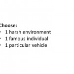
Project Overview
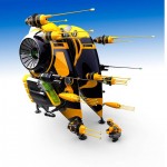
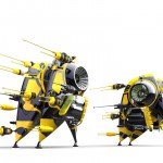
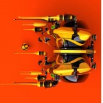
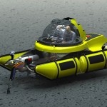
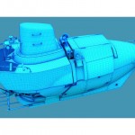
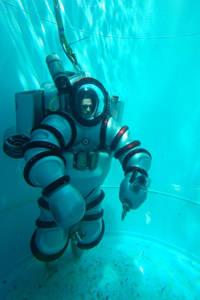
In this project, each student will design a vehicle capable of operating within a particular harsh environment. For example, a submersible ship meant to travel through lava, or a helicopter that can fly through a hurricane. Designs should integrate aspects of a particular preexisting vehicle, but should be significantly transformed to become something new and novel. To spur creative problem solving and integration of disparate influences, each student will use aspects of a famous person’s attributes, preferences, and aversions to inform the vehicle’s design.
Learning Objectives:
Grading Criteria – The best projects/highest performing individuals will:
RESEARCH ASSIGNMENTS
By the start of class on Tuesday, 2/17, each student should do the following:
<1> Review the grading criteria for this project if you have not yet done so. See above.
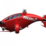
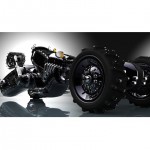
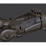
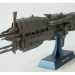
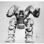
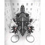
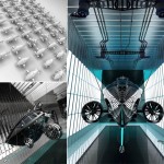
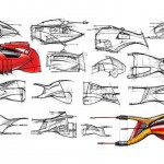
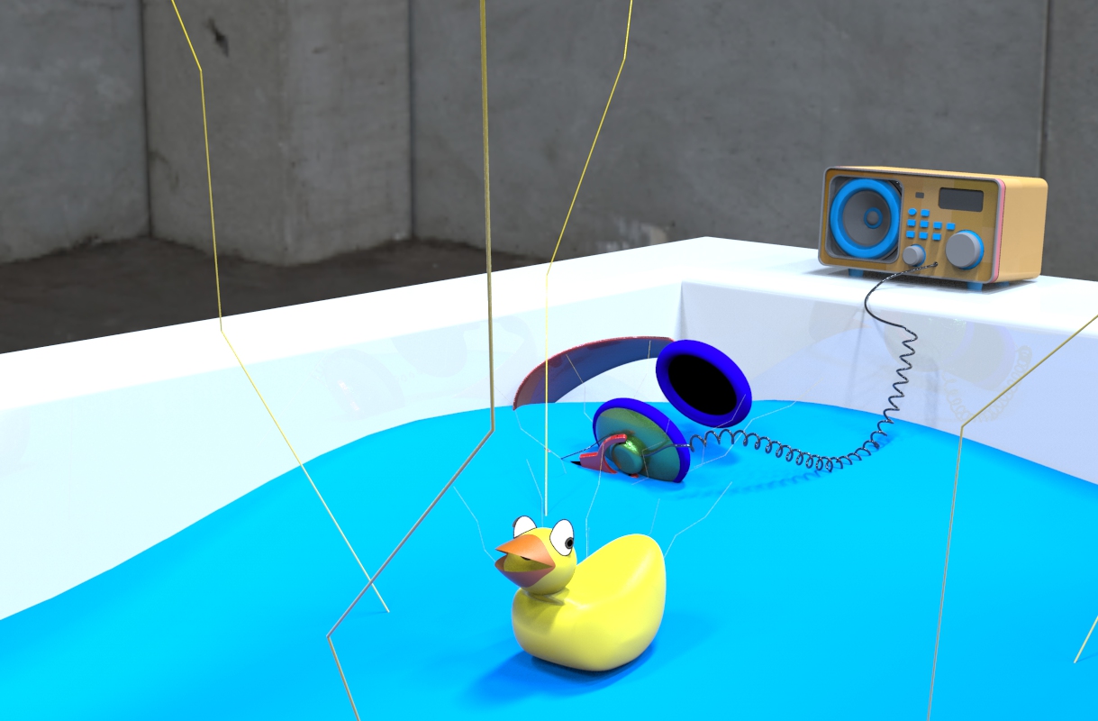
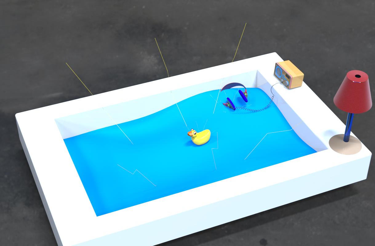
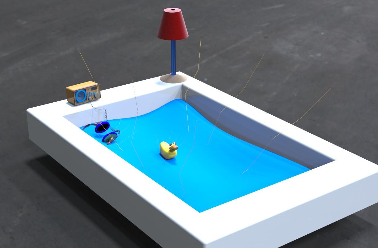
<2> Create a SIMPLE Rhino model of your vehicle that includes all of the main components. This model will help you conceptualize how the vehicle will look as a whole and exist in space. Examples of simple models from previous semesters are below:


<3> Create a post on the PUBLIC class website that responds to the following prompts. (100 to 20o words; include loads of images) :
*Note: I encourage you to create your post in the format shown here, with descriptive text below each image.
FINAL SUBMISSION OF WORK
By the start of class on 3/5, each students should:
Title of Event: An Evening of Arab Music with members of Al-Bustan Takht Ensemble
Date and Time of Event: 7:30pm, Tuesday, February 3
Location of Event: Rooke Recital Hall
Type of Event: Musical performance


Immediate Response:
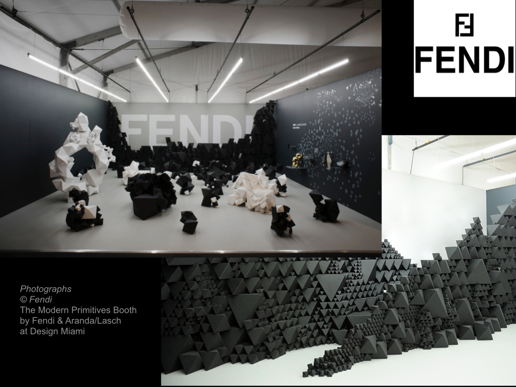
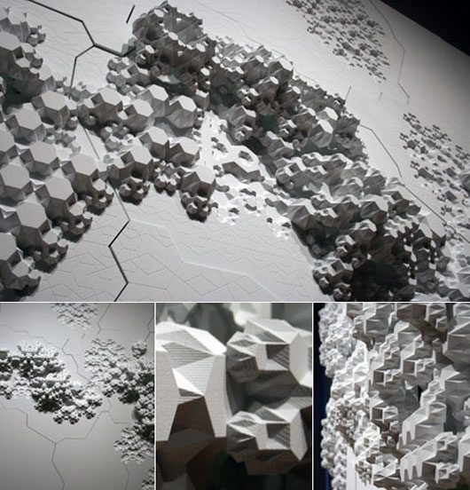
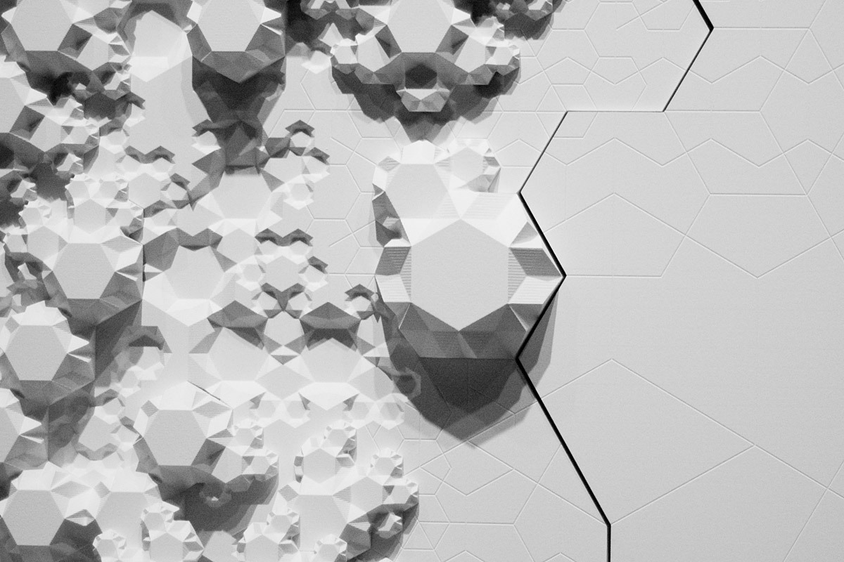
This image/sculpture at first glance appears to be a white surface or a series of panels that has objects excreting horizontally from the vertical surface. Down the center of this wall is a giant crack that almost appears to ressemble an earthquake, a randomized puzzle piece, or something that has shifted these naturally beautiful excretions seeping out of the cracks. The panels seem flush to the wall, and out of the panels are objects growing almost like fungi but have a very systematic geometric pattern. These repeating objects are different in scale and complexity and are molded to the surface that almost appear by natural means.
Objective Description:
As stated above, this sculpture is constructed on a wall plane, with varying points in height of objects protruding from the surface. There are cracks in the surface of the plane which appear to be constructed randomly as well as the growth patterns which do not seem to have any regularity or calculated formula. One might suppose that there is a perhaps a connection to a law or geometric pattern based on the sculptures title ‘Rules of Six.’ Again, this work is solid white and creates shades of gray and black from the different in dimensions from the growths, paired against an almost topographical surface.
Technical Decisions:
Rules of Six is an installation commissioned as part of the Design and Elastic Mind exhibition at the MOMA in New York. In collaboration with material scientist Mathew Scullin, the project uses new material structures that are not carved or composed by conventional tools but are rather ‘grown’ by interactions with molecules. (www.arandalasch.com/works/rules-of-six/) Three dimensional output from this application was used to produce a large-scale wall relief mounted in the gallery alongside two monitors- one running the simulation ‘live’ and the other displaying a slideshow of actual nanostructures. Rules of Six is designed to multiply indefinitely without recognizing scale, as it is symbolic as the scaling of molecules, rooms, buildings, or communities. The composition is a flat surface stood upright so that the objects can extrude horizontally into space. The software used was processing and Rhino 3D software on panels of painted high-density foam and hydrocal. The title ‘rule of six’ is extremely pertinent to the projects context, in that it is in fact a binding rule of transformation that an algorithm that connects the movement from ‘six’ to ‘no two are alike’.
The Work In The World
This relief sculpture was commissioned for the exhibition concept to engage designers and scientists in a dialogue by addressing their relationship to each other and their role in the culture. Aranda/Lasch’s work deals with science and mathematics with naturally occurring geometries with underlying themes of nature in their work. The Rules of Six explore the molecular processes taken directly from science which also applies to the six-sided snowflake of which no two are alike. This relationship of structure and nature and space and environment are very relevant in our own world’s depletion of natural resources and constantly evolving and changing world. This piece has such a level of ambiguity that allows several rapports to be drawn on with scale and our physical existence at the molecular level.
The Story It Tells
The theme prevalent in a lot of Aranda/Lasch’s work is their exploration of the relationship between structure and space. They appear to constantly be searching for patterns present in the natural world and new points of view to transfer into their works- and this exemplifies the random yet beautiful qualities of nature with sculpture in a natural law combined with technology’s rendering capabilities. The scales explored in this piece are relevant to human existence and our own presence in our surroundings, and this work allow the viewer to engage with the information itself and this relationship with design.
Immediate Response
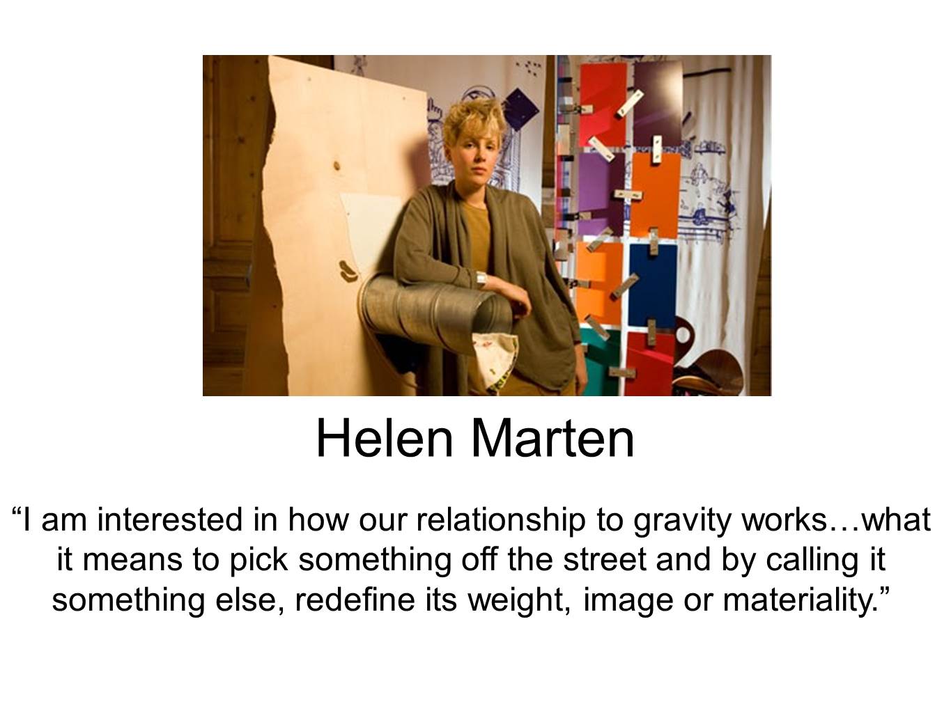
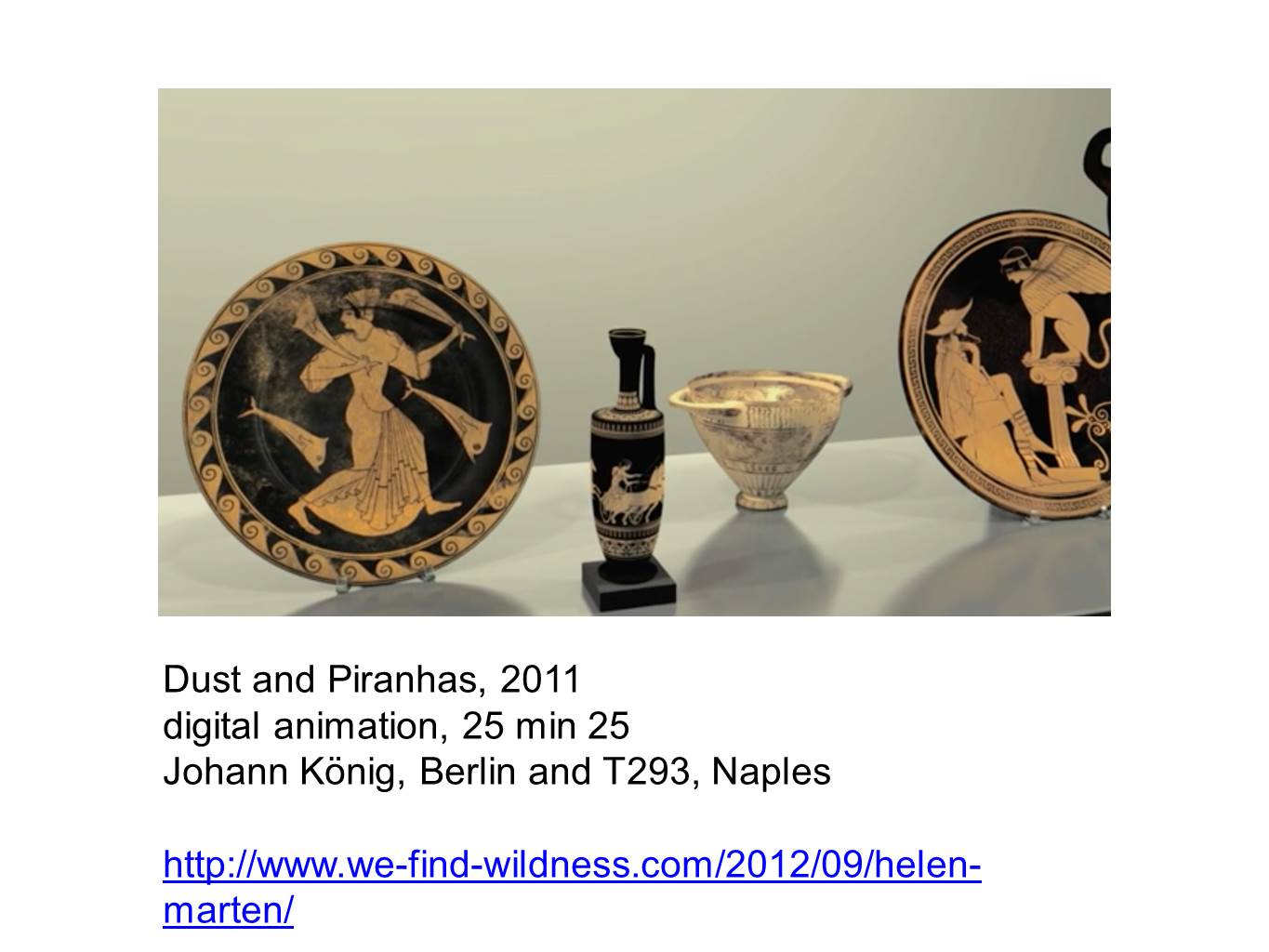
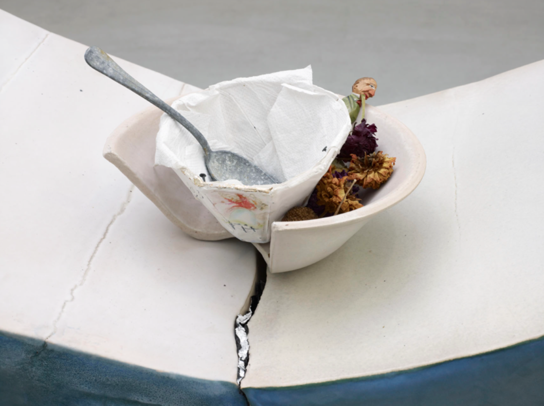
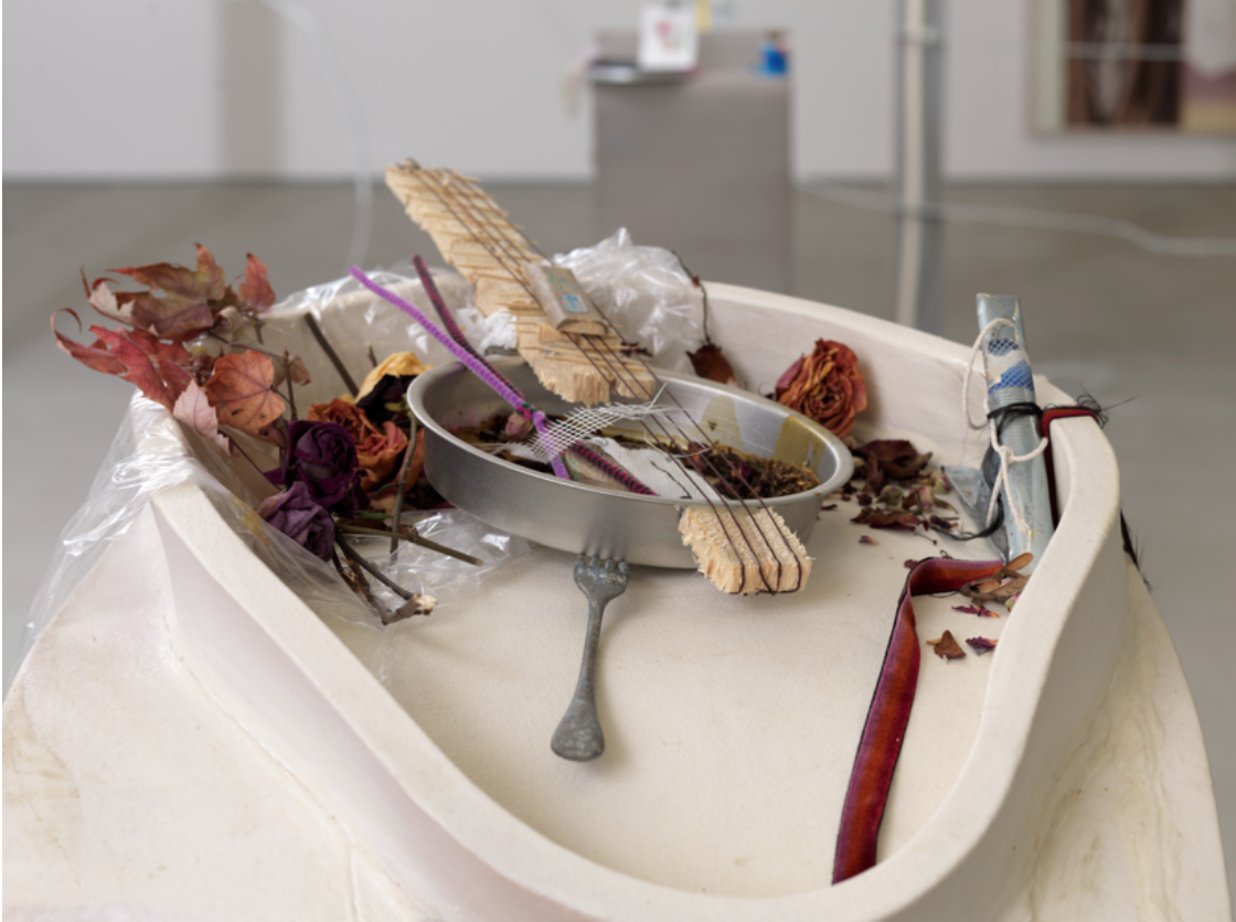
When I first look at these images from Helen Marten’s A.M installation, the first thing that comes to mind is food and the way that is it presented. I see eating utensils, a paper cup inside a broken bowl, an aluminum container that she transformed and used it as the head of a banjo, all surrounded by dried vegetated motifs and a clear plastic bag. It almost seems as though Helen picked random and disposed elements and combined them to together to create this installation.
Objective Description
I find this installation contradicting because it is not your typical clean and ideal representation of food. The utensils are dirty, the napkins used to make the paper cup are used, and there are signs of a dried liquid stains inside the banjo. What is unique about this installation is it’s title and the contradiction created by the uncleanliness of a morning meal.
Technical Decisions
The materials used in this this installation are not intricate or fancy. They are simple and sometimes random objects that she puts together in order to create the idea of food and how its unusual representation. She used pieces of shaved and broken wood to create the neck of the banjo. She also scattered dried fall-type leafs and flowers around the paper cup and the banjo. In the banjo, these leaves are held together by a clear plastic bag.
The Work in the World
Helen Marten challenges our typical ideals around food. By reading the title or simply giving a quick glance at this installation, we immediately know that the main topic of her work is food. However, what is interesting about this is that Helen moves away from depicting a grand and clean representation of this concept and shows us just the opposite. In today’s modern world, we insist on representing food in its prime, its freshest, and most aesthetically pleasing form. Social media platforms such as Instagram have encouraged this behavior. If you didn’t Instagram what you had for lunch, was it actually that beautiful and tasty? Did it actually happen? Also her interplay of different artifacts plays on the idea of recycling and using objects that we take for granted and often discard to create innovative objects just like she did with the banjo.
The Story it Tells
As a whole, Helen Marten’s installation appears to be a banal representation of food. She takes a concept so revered and glorified and transforms it into something completely different. She refutes and challenges the conventions around food and shows us that food and the whole concept around it are not always so pretty. Also, her insistence to use random and trash-like items to create new ones accentuates and creates awareness around the importance of recycling.

Immediate Response
My immediate response to this was a generalization that everything in the art piece was the same smooth randomness. The smooth curves reminded me of dog poop. This art piece initially stimulated a feeling of almost disgust at the accumulation of these smooth tubular shapes. It, however, possessed something appealing about the way the material was accumulated. The shapes had a relaxing effect in that they exuded certain perfection in the confusion of their arrangement. It also elicited a feeling similar to that of a graveyard in the way the formations were erect, not curved formations. This stoic appearance of the formations made them feel like a guardian of something, hiding something, or representing something. One of the formations is wrapped in a smooth, consistent layer, that makes a smooth build up, like stucco of a house, looking like it was wrapped with this material.
Objective Description
As I looked closer, however, I became more aware of what the art piece was. Piles of smooth, similar diameter material were accumulated into a piles. These piles all had specific shapes. Some piles were arranged into shapes with sharp edges while others merely resembled pyrimads or cylinders. All tops of the shapes were flat. I noticed that there was a cylindrical pile with a white material surrounding it on the bottom. This white material looped around the base of one of the piles. All other piles are grey. Another pile is wrapped in smoother material, with some of its tubular formations exposed on one side of its shape.
Technical Decisions
Anish Kapoor arranged the piles so that your eyes naturally drift to the center right formation of a pyramid with a flat top. This is the shape that is wrapped in smooth tubular material, some of its uneven tubular network exposed on one side of the shape of the pile. This division, between the smoothness and unevenness of tubular material required special attention of the artist. The actual contents of the sides were less of a concern; it was rather the mere juxtaposition of the two ways the material could be arranged to make a pyramid with a flat top. The difference between the sides, however, also had to stay within certain artistic bounds that didn’t change the overall shape of the pile. The other piles have more continuous tubular formations on their side. Although the specific contortion of the tubular shapes in each pile were not as much of a concern for the artist, creating an overall shape that had discrete edges required more time to attain.
The Work in the World
After doing a little research into this piece I found that it was made with a 3D printer that deposited the material into the shapes we saw. It’s amazing that this was made with a 3D printer. Without looking into the technicality of how it actually was made, I can use my basic understanding of how a 3D printer works. I know that a 3D printer layes layer by layer. Culd this be different? Could this be something that just extrudes continuous tube? I think this method would make it impossible to achieve the shape contortion because of gravity and the time it took for the material to dry. If this was just made in a computer and the 3D printing was automated, planar layer by layer, then its amazing that someone is using the 3D printer to this scale. I have used a 3D printer to create small parts. The theory of a 3D printer can really be extended to any size, so its an artistic leap to magnify the size of the 3D printer to many square feet. This application of a 3D printer stimulated corresponding questions to what a 3D printer could evolve to be. If this machine is capable of making a layer that is stable enough for someone to walk on, then this technology could be the bridge to new platforms we’ve never experienced. What if the automation of the extruder escaped the defined channels that it currently uses to make prints? What if it could move itself into any context? What if it could elevate itself a little but then also climb up onto its own 3D printed constructions to start the next level? With very strong material, built with a very efficient machine, this could literally create bridges wherever it would like.
The Story it Tells
What seems most distinct about the middle pile that one’s eyes are naturally attracted to is the contrast from one side to the other. One side is made up of smooth and continuous material while the other is made up of more irregular tubular formations. This shape appears like its tubular formations were initially concealed with the smooth wrapping but over time the wrapping faded away and has exposed these irregular tubular formations on one side. All other piles in the room do not have this smooth side, therefore are already evolved piles. How does this evolution occur? Is it weathering or is it something else? In respect to the title, a Greyman seems to describe someone who is grey, which is often used to describe someone who is sad. The color of everything is also grey. Everything in the room is grey besides a white structure that is surrounding a cylindrical structure more in the background. This white structure seems to represent the dead shaman that, although knows the future, has still died. Its cause for death remains a mystery, but the white shape wrapped helplessly around the grey protrusion seems like it is surrendered to it. It is merely a puddle. It has no more life. The Greyman caused the death of the shaman from its cries. Smoke billowing up is represented as frozen in time by all of the tubular formations. The beauty is appreciated by trying to understand the work as a whole.
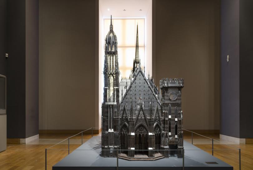
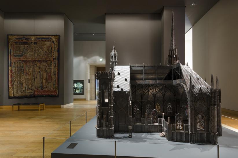
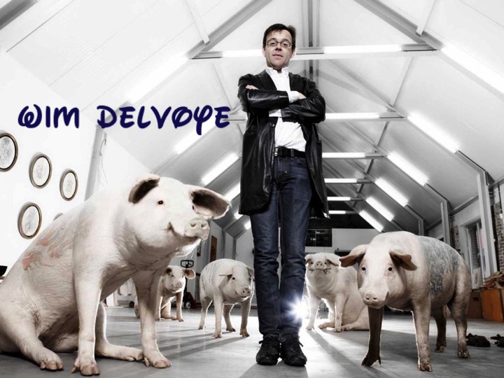
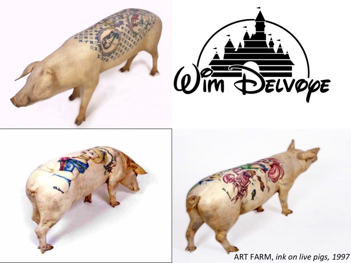
ARTIST: Wim Delvoye
WORK NAME: Chapel (Scale Model) 2007
LOCATION FOUND: http://www.wimdelvoye.be (Artist’s Personal Website)
Immediate Response:
Primarily, I chose Wim Delvoye as my artist because a lot of his sculptural works incorporated architectural elements into them. I find his work fascinating because of his use of 3D modeling in his sculpture creating process. When I saw his work Chapel, I was at first amazed by the sheer precision of every surface and facet. What I particularly liked about this work was his use of a cutaway section. When I was younger, I loved books that showed, not only the exteriors of buildings, but also the interiors and how the exterior of the building was reflected in the interior and how the style carried over. Seeing this work, my childhood fascination again showed itself and made me really like this work of art.
Objective Description:
The work itself sits on a flat, gray base, which becomes part of the floor of the chapel when viewed through the cutaway side. The work is incredibly intricate and looks to be a scale architectural recreation of an existing gothic structure. On the entrance side of this structure, there are three main entranceways all capped by a pointed gothic arch. On either side of the archways are two towers. The tower on the left is much higher than the right and is capped by a pointed peak. The other tower is lower and doesn’t even come all the way to the height of the roof of the chapel. This tower, in addition to being much shorter, also is capped with a flat top with medieval-looking battlements on top. The church itself is shaped in your typical cruciform manner with another peaked steeple over the crossing. The gothic windows all appear to actually be made of glass while the rest of the structure seems to be made of metal sheeting cut very thin, probably with a laser cutter or an equivalent machine. The cutaway section (on the right side of entranceway) shows a highly ornate interior in terms of architectural elements, but lacks any sort of seating. Also, the interior seems to be much smaller than the exterior, almost as if the scale had suddenly shifted on the inside. The interior seems to be much more compacted than the exterior would suggest.
Technical Decisions:
I find this work to be incredibly interesting, especially in terms of the material choices used in its construction. The materials, as described by the blurb given by the artist, were laser-cut corten steel and stained glass. I think that the artist chose to use materials that closely resembled what the actual structure was made out of. However, since stone would probably be too difficult to manipulate and work into a smaller project, laser-cut metal would work incredibly well, especially if sanded down to look less metallic, which is what it looks like the artist has done. Interesting, though, is that some parts of it look to still be metallic in color, maybe because these elements would be made of metal on an actual gothic chapel. The stained glass is very interesting because it shows that the artist is really trying to be as close in detail as possible to the real thing. He could have simply left the windows without glass, but he chose to make the scale model realistic, instead.
The Work in the World:
I think that one of the main reasons why this work was created is to show off the technical capabilities of machinery and how modern fabrication methods, such as laser cutting and 3D printing, can be an accurate and fascinating way of producing works of art (and architecture in this case). I also think that Wim Delvoye may have even wanted to contrast the modern materials with the old architectural style. I find it strange, yet intriguing, that Delvoye would choose to recreate a gothic chapel. Perhaps he was trying to preserve history using modern methods and materials.
The Story It Tells:
As previously mentioned, I think that this work is meant to stand as a sort of reminder of the past, yet a view of it through a modern lens. As he explains in an interview, his works, and one of his goals as an artist, is not to worry whether his works are truly “artistic” or not, but rather to show things that are beautiful and visually intriguing. One of the other issues that he discusses is that his art could not possibly be duplicated if given to a renaissance sculptor. I believe that his work is trying to show sort of the opposite, that modern invention and skill has surpassed older styles and methods of production.
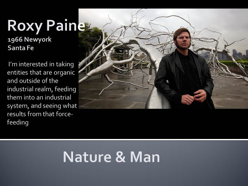
 1
1
Immediate Response:
The fact that the older tree is broken makes this piece really special in my eyes. It is resting on the younger tree. It reminds me of the life cycle where the younger generation starts taking the control and takes care of the older generations. It also triggers the idea of support. The fact that the younger tree has most of its branches broken suggests a very strong storm; perhaps reflecting an economic crisis or another sort for man kind.
On the other hand the characteristic of wood are applied to steel in the fracture point with great detail. In addition to that the detail in form for the upper part of the tree makes me believe that he wants the audience to focus on the rapture and above rather than the base.
Objective Description:
The roots of the trees are not emphasized. The choice of material is also very dramatic, industrial level high carbon steel pipes are welded together to form a very organic shape. One can see the industrial baseline is secured with oversized bolts and screwed to the concrete foundation. It is clear that he doesn’t aim to hide the’ imperfections’ or inorganic forms where it connects to the ground. On the other hand the detail level increases significantly after the fracture point. Both younger and older tree are well polished, it creates an unusual affect with shades of the tree. The tips of the branches don’t seem as shiny unless there is a sharp light. The younger tree has much fewer branches and it seems that most of them are broken.
Craftspersonship:
Industrial level steel pipes and wires are masterfully welded. The thinner parts of the tree were made from thinner tubes or wires and Mr. Paine bent the thinner branches in order to create an organic form. The level of detail in the fracture point points out that there must have been some sort of casting. He masterfully imitates the organic flow of a tree. However he doesn’t pursue an organic form in the base. I think having a more organic form for the base would have been a good decision since it reunites the form tip to base.
Material Choice:
He uses steel as the material. Both tree and the steel are originated form earth so he might be transforming the inorganic qualities of steel into an organic one via imposing organic forms. In addition to that the steel is much more durable than wood so it enhances the work of art to be exhibited outside. Even though, the sculpture is really heavy (3.5 tons) the form is really slender.
Context:
The art work is exhibited in a public space very close to a modern art museum. I think that is the perfect location since it still resembles the museum but it is in a free space with no boundaries or rules. One is free to experience the details and physical properties of the sculpture without any consent. On the other hand, it may be due to the concern to exhibit the sculpture with real trees. By doing so the artist may be aiming to emphasize the contrast between the material properties. On the contrary, the size of the art work and the logistics might have been a major limitation for the project to be exhibited inside.
*I have found the info from http://www.roxypaine.com


Immediate Response:
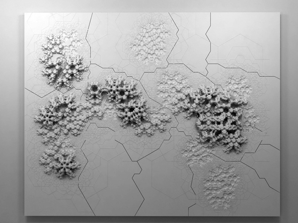
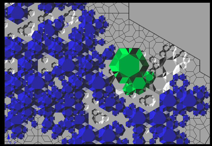
This image/sculpture at first glance appears to be a white surface or a series of panels that has objects excreting horizontally from the vertical surface. Down the center of this wall is a giant crack that almost appears to ressemble an earthquake, a randomized puzzle piece, or something that has shifted these naturally beautiful excretions seeping out of the cracks. The panels seem flush to the wall and out of the panels are objects growing like fungi but have a very systematic geometric pattern. These repeating objects are different in scale and complexity and are molded to the surface that almost appear by natural means.
Objective Description:
As stated above, this sculpture is constructed on a wall plane, with varying points protruding from the surface. There are cracks in the surface of the plane which appear to be constructed randomly as well as the growth patterns which do not seem to have any regularity or calculated formula. One might suppose that there is a perhaps a connection to a law or geometric pattern based on the sculptures title ‘Rules of Six.’ Again, this work is solid white and creates shades of gray and black from the difference in dimensions from the growths, paired against an almost topographical-like white surface.
Technical Decisions:
Rules of Six is an installation commissioned as part of the Design and Elastic Mind Exhibition at the MOMA in New York. In collaboration with material scientist Mathew Scullin, the project uses new material structures that are not carved or composed by conventional tools but are rather ‘grown’ by interactions with molecules. (www.arandalasch.com/works/rules-of-six/) Three dimensional output from this application was used to produce a large-scale wall relief mounted in the gallery alongside two monitors- one running the simulation ‘live’ and the other displaying a slideshow of actual nanostructures. Rules of Six is designed to multiply indefinitely without recognizing scale, as it is symbolic as the scaling of molecules, rooms, buildings, or communities. The composition is a flat surface stood upright so that the objects can extrude horizontally into space. The software used was processing and Rhino 3D software on panels of painted high-density foam and hydrocal. The title ‘rule of six’ is extremely pertinent to the projects context, in that it is in fact a binding rule of transformation that an algorithm that connects the movement from ‘six’ to ‘no two are alike’.
The Work In The World
This relief sculpture was commissioned for the exhibition concept to engage designers and scientists in a dialogue by addressing their relationship to each other and their role in the culture. Aranda/Lasch’s work deals with science and mathematics with naturally occurring geometries with underlying themes of nature in their work. The Rules of Six explore the molecular processes taken directly from science which also applies to the six-sided snowflake of which no two are alike. This relationship of structure, nature. space and environment are very relevant in our own world’s depletion of natural resources and constantly evolving and changing world. This piece has such a level of ambiguity that allows several rapports to be drawn on with scale and our physical existence at the molecular level.
The Story It Tells
The theme prevalent in a lot of Aranda/Lasch’s work is their exploration of the relationship between structure and space. This duo appear to constantly be searching for patterns present in the natural world and new points of view to transfer into their works- and this work specifically exemplifies the random yet beautiful qualities of nature with sculpture in a natural law combined with technology’s rendering capabilities. The scales explored in this piece are relevant to human existence and our own presence in our surroundings, and this work allow the viewer to engage with the information itself and this relationship with design.
Initial Response:
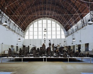
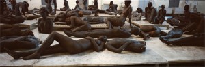
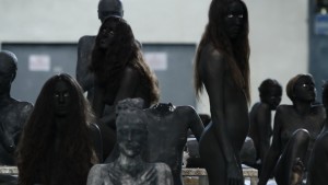
My initial reaction is to want to move closer to the piece, to determine whether the figures are alive or sculpted. I get feelings of shock and awe at the hauntingly beautiful dark figures peering out at me. The whites of their eyes draw me in, at the same time giving me shivers. The figures are so dark it is almost like they are shadows. In its entirety, “vb66” elicits an eerie sadness touching the viewer’s soul.
Objective Description:
Female models painted black in the nude are posed on a large square platform. There are at least 60 of them all with dark brown or black hair of varying lengths. The models towards the outside of the platform are reclining on the ground gradually posing in more upright positions towards the center of the platform where they stand. This positioning creates a pyramid effect. Dispersed throughout the models are broken black sculptures of women. The sculptures are lifelike and are most easily distinguished from the models by the lack of white eyes.
Technical Decisions:
Vanessa Beecroft is famous for her use of models in performance art. This exhibit is no exception. The decision to use models forces the audience to interact with the piece, make eye contact. The decision to keep the models in the nude gives them a sense of vulnerability to the viewer. By painting their bodies this vulnerability is lessened slightly. But the black paint also makes the models blend in more with the life size figure sculptures breaking them up. Black as a color choice is bold and dark as black has a lot of connotations associated with it including death.
The Work in the World:
Modern art is increasingly interactive. Beecroft’s work is no exception. The audience’s reaction to the piece is part of the artwork. The interaction is between subject and viewer is in some ways the greatest part of the art. In this particular piece naked models make eye contact with the viewer, increasing the interaction between subject and viewer. As models look out at the viewer with their stark white eyes, they become alive in both the past and present.
The Story It Tells:
This work was installed in Naples, Italy in 2010. To me, the location of the piece, along with the pyramid-like structure and soot black figures allude to Pompeii. As a tragic historic event in Italy, Pompeii must have influenced Beecroft’s work in some way. The black models look to be coated in ash and feel deathly especially posing beside broken body parts of sculptures. In addition the shape of the piece could be compared to that of a small volcano. Black not only symbolizes death and burial, but also invisibility. These women, dead and buried are also forgotten.
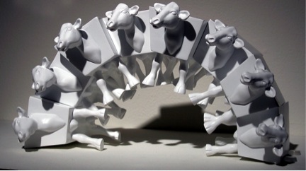
Immediate Response:
The first thing that strikes me about this piece is the arrangement of the cows. Last time I checked, it is not possible to arrange cows up in a vertical arch! However, the particularly polygonal bodies of Van Ness’s cows allows them to fit together like a puzzle as they support each other, seemingly defying the laws of physics as they do so. I also notice that the stark background and colors of the cows themselves are completely blank. There are not even any spots on the cows, which, in my mind, is one of the defining characteristics of a cow.
Objective Description:
This image shows white objects on a white background. The objects appear to be altered forms of cows. There are eight of these cows stacked up against each other, forming a vertical arch. Each cow appears to be exactly the same. The center of their body is a six sided polygonal form with angled edges on the sides. From this body, rather realistic body parts, including the head, legs, tail, and udder extend. The additional body parts do not blend into the polygonal form with any sense of curve. It is as if they were simple mounted on a block in a space that looks appropriate for a cow.
Technical Decisions:
The technical decisions made on this piece make it feel less like actual cows, and more like what they actually are: computerized renders of a creature that were edited and printed in multiples. There is no variation between each cow, which immediately feels unrealistic. Of course, the small size (only a few inches tall) and body shape of the cows contributes to this as well. It is a shape that doesn’t look like could ever be found in the natural world, but rather must have been fabricated using digital software for the sake of convenience in fitting these cows into the arch they form. There is no attempt at hiding this artificiality of these cows, as they are not painted or even placed in a faux-natural setting. They are simply printed in foam core and coated in a plain white resin.
The Work in the World:
This piece actually reminds me a lot of the Rare American Rhinocercow sculpture project I worked on last year. In that project, I made duplicates of a rhinoceros form through a mold-making process and then altered them to take away part of what made them rhinoceros (incidentally making them more like cows in the process) by removing their horns and painting them in a different way. Van Ness does something similar by altering these cows in a way that takes away part of what makes them uniquely cows. Because of his use of digital rendering, he has a more overt way of showing the artificiality of these imaginary creatures than what I did. These feel even more as though they could be marketed and sold as children’s toys, because of their lightweight material and small size, as well as the stacking capabilities.
The Story It Tells:
It seems as though David Van Ness is using these stackable cows to imagine a future where we can modify creatures and objects at will. I think that realistically, they won’t be able to be modified in such a clearly digitized and polygonal way, at least for some time. This works seems like an exaggeration of the genetic engineering that is being experimented with currently. Of course, once we learn more and more about tweaking parts of animal or plants, what exactly is going to stop us from turning things into conveniently stackable polygons, that eschew natural curves and details from straightforward efficiency? What practical use will unique colors and patterns of these creatures serve, when they can more easily just be blank canvases for our creations?
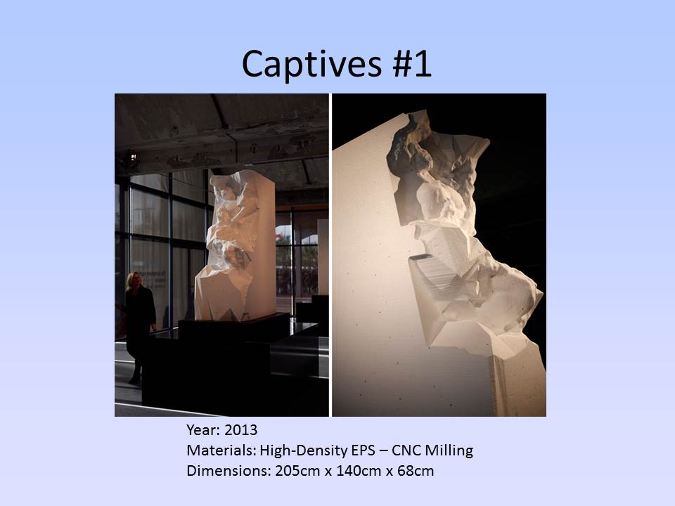
Immediate Response
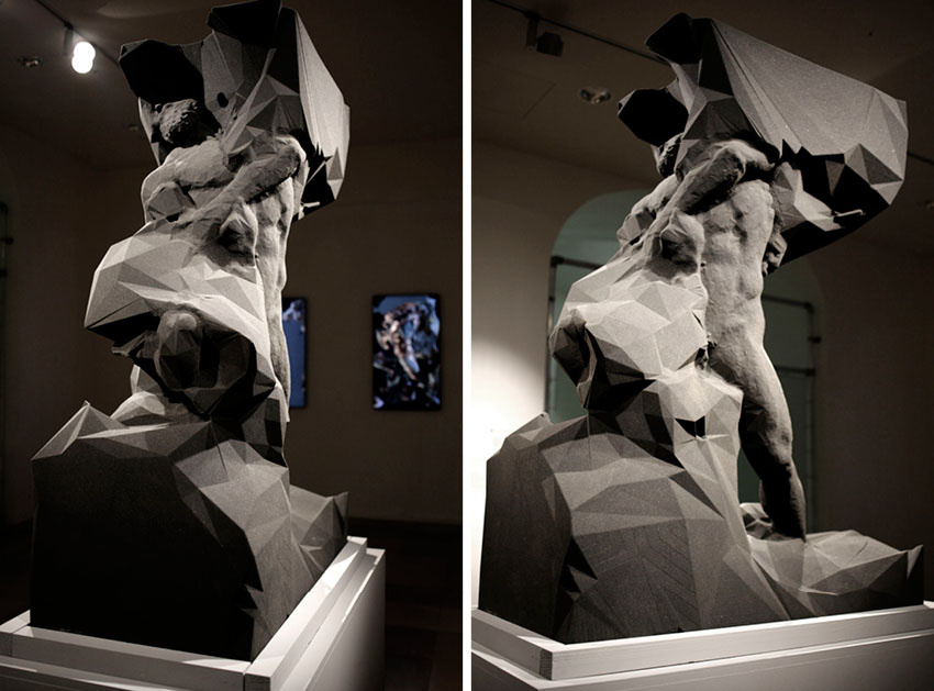
The first thing that this piece reminds of the idea that every sculpture starts with a single piece of marble. It is almost like the beautiful piece of art is trapped within the giant slab of marble. It also is pretty incredible how it looks like it was a handmade piece of art even though it is 3D printed. The man also looks like he extremely powerful. Considering the title, it looks like he is trying to break through the rock, where he was a captive. I also think the artist clearly defines the difference human and marble/rock/sand through straight and smooth lines. The human looks more refined and smooth, while the other parts are jagged.
Objective Response
This sculpture looks like a human trapped within a rock. The rock is jagged. The human looks locked into the rock with his feet, right thigh, and his head. His head is mostly trapped in the rock, but the chin, which is bearded, appears to be escaping from the rock. The human’s arms are situated in such a way that it looks like he is trying to rip the rock off of his legs. The human is also extremely muscular with a well defined core and arms.
Technical Decisions
I believe the artist chose to print this with sand for a reason. The sand gives off the same color as marble so it looks like a real sculpture. Also, sand is really small so it can be make define everything as precisely as possible. I also think that sand is a great material to print with because you could print this digitally created sculpture at any size. This is roughly 6 feet tall, but it could have been printed at 6 inches tall. I also believe that the artist chose to define the human muscular nature to show that he is powerful and trying to break free from the rock.
The Work in the World
This artwork reminds me of other sculptures that look like they are almost left unfinished on purpose. This work almost looks like it was never finished, but it looks finished at the same time. It is an interpretation of Michealangelo’s unfinished series of sculptures, “Prigioni”. It also reminds me of oppression. It looks like someone trying to escape from something holding them back. It also looks like someone being created into something new. It could be a reminder of a new creation.
The Story It Tells
Considering the title, I believe this is a sculpture of someone trying to escape their past. I believe the person is being born into someone new. It looks like the rocks are the human’s old self, and the human is breaking away or trying to become something new. Someone else may interpret this work as someone being created. It looks like someone is growing from the rock. They are being created slowly, but perfectly. It could also look like something from man being born from nature. It is like taking something that is not perfectly formed and making it perfect.
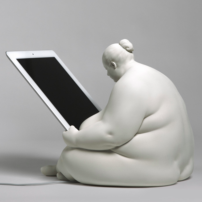
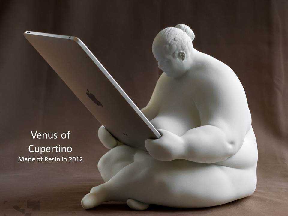
Immediate Response
My first response to this sculpture is whether it is a life size human with a large iPad, or a very small figurine with a normal size iPad. Either way, this inclusion of art and technology is very interesting. Eaton seems to have taking what appears to be a Buddha like figure and matched it with a new age technology. It is very current, hip, and if this was a real iPad docking station, as I think it may be, this would be something I could see in houses across the world. The figure is guarding the iPad and keeping it safe in a way.
Objective Description
There is a sculpture of a very rotund woman sitting down, legs crossed. Her back is hunched and her head is peering down. Her hair is in a bun. She is looking at a real iPad. Her eyes seem to be gazing into the iPad as if she is reading something on it or perhaps looking at her reflection. Her large arms go down along the side of her big belly. Her hands are gripping the side of the iPad at the bottom, as if to secure it. Her drooping, large breasts are resting against the bottom front of the iPad. There is a cord running out of the bottom of her. Her whole body is white like ivory.
Technical Decisions
Designed Orientation toward the viewer:
This work was definitely made to engage the viewer. The viewer is invited to participate in the art by physically plugging their technology, their iPad, into the actual art. It is interesting that the figure of the woman by itself could be considered art to many viewers. The woman is well crafted and well designed and could stand alone on a table as a decoration. However, the art is not finished without the human interaction of placing the iPad into the hands of the woman. Only then can she be complete and have something to look at as she passes through her day.
The Work in the World
The woman is a replica of the curvy forms and symbols of ancient Venus figurines. Apparently she is a goddess that helps the fertility of the technology age. In this sense, she has helped to birth the iPad to creation and helped its many improvements. This is very current and relates to modern day. Technology is a huge part of human experiences in life. Understanding the relationship to the goddess and the technology she is holding, I now understand this art to a new level. Also, modern ports for iPads and technology in general are very boring. This work brings creativity and art into the once dull charging station.
The Story it Tells
After analyzing the work of art some more, it became clearer what Eaton was trying to portray. As the goddess of the fertility of the technology age, the woman has been very busy over the last few years making all this new technology. Here, she is resting from a job well done. She is admiring the fruit of her labor in a way, and that is why she is gazing so intently on the iPad she is holding. She is looking at what she made and how far technology has come in the last few decades. Others might just see this as a “cool” charging port, but I believe there is so much more to the story of the lady then what is noticed at first glance.
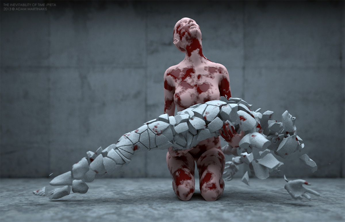
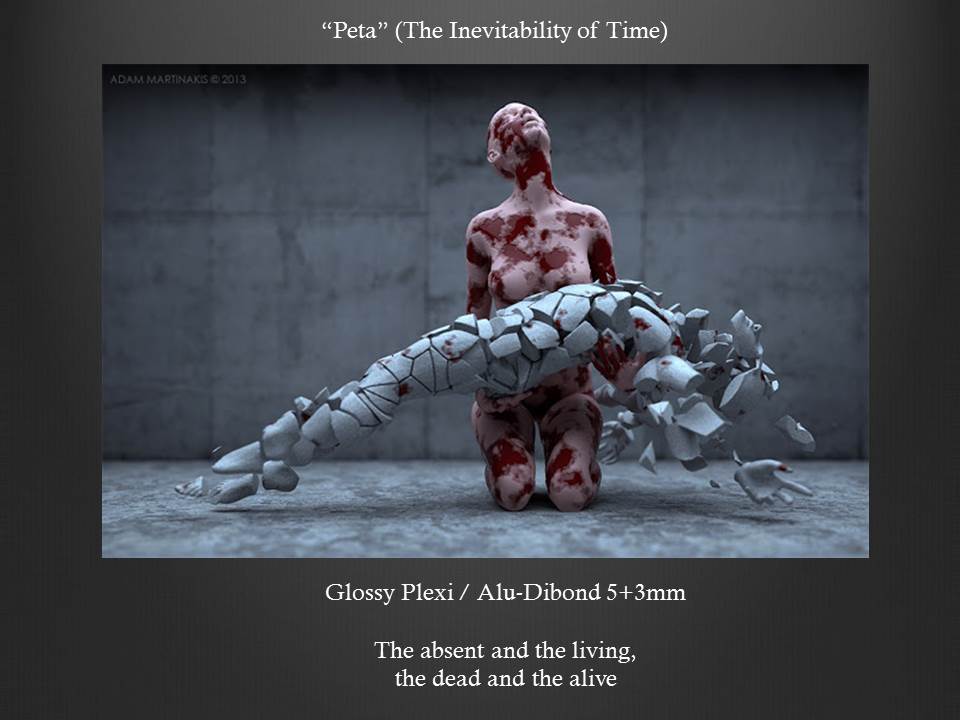
Immediate Response
Upon first glance at Adam Martinakis’s piece, “Peta,” part of his collection “The Inevitability of Time,” I was awed at the extreme detail and emotion his work has. Seeing a fleshy feminine figure holding a crumbling stone figure, seemingly a man, I thought of the idea of death. Thinking about what this piece could analogize aside from death, I though broadly and came up with the idea of the frailty of the human form and the inevitable death of the human race. The raw emotion captured in the image reminded me of a funeral, as people gather to grieve over the loss of another.
Objective Description
The piece is located in what appears to be a concrete room, with a feminine flesh-toned manikin kneeling and looking skyward in despair while holding a crumbling stone looking human figure horizontally in her arms. The female’s body is proportional and emotes an atmosphere of grievance, while covered in what looks like patches of blood breaking through her skin. The figure in her arms is of a bluish-grey stone texture and is cracked and separated throughout its body, almost looking as if a statue was hit multiple times with a hammer. Furthermore, there are multiple blood colored splotches over the stone figure implying that the feminine figure was with the body at its death.
Technical Decisions
I find the construction of the work to be absolutely stunning. The placement of the figures in the center of the isolated concrete room focus the audience’s attention to the raw emotion portrayed by the feminine figure and the crumbling stone figure enhances the feeling of gloom in the piece. The use of stone texture on the deceased body draws the audience to question the cause of death, while the bloody flesh-toned figure captivates the audience with sorrowful power. Additionally, I found the material choice interesting. The fleshy-toned figure and the stone figure together in a grieving embrace symbolize the frailty of the human condition and the inevitable idea of death.
The Work in the World
I think Adam Martinakis’s piece is a pure representation of the human condition and the continuous cycle of life and death. Captured in a moment of mourning, humans can relate to the sorrow and grievance portrayed by the kneeling human figure. Additionally, noting that Martinakis’s exhibition is called “The Inevitability of Time,” it is clear he is sending a message that mankind, as a whole, must face the fact that death is imminent, and that it cannot be avoided. In comparison to other works, I find that this similarly captures the emotion of Van Gogh’s “The Scream,” which portrays a feeling of shock, grievance, and mystery through the painting’s brush stroke curvature and array of colors. I think the true beauty of Martinakis’s work lies within his ability to freeze human emotion and the idea of death in time.
The Story It Tells
The Story Adam Martinakis’s piece “Peta” tells is that of the inevitability of death throughout time. The idea of time is endless, a stark contrast to that of a human life, something that is on a timer leading towards death. The use of flesh and blood tones in the female character contrasts the cracked and deathly looking stone figure in her arms, a symbol of the frailty of human life and the sorrow death brings with it. Additionally, the concrete room in which the two figures are contained adds a feeling of captivity to the piece, which could symbolize the idea that we as humans are trapped in a world of death with no way of escaping (at least not yet).
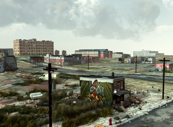
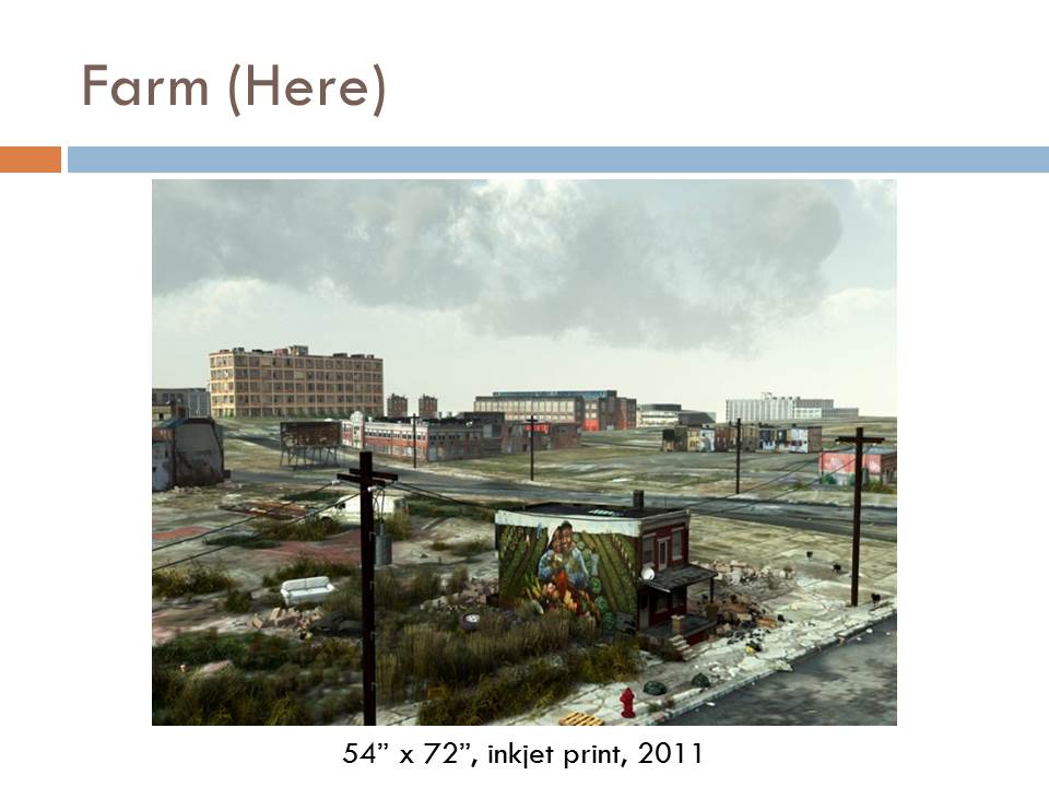
Immediate Response
Farm by Tim Portlock evokes an immediate sense of sadness and despair. I was drawn to the painting on the side of the building in the foreground as well as the yard surrounding the building. The painting humanizes the scene and makes it clear to the audience that this was once a prosperous land where happy and healthy people lived and worked. The trash in the yard consists of tires, couches, and an old car and there stray animals wandering the streets. This shows that these buildings are now uninhabitable and the owners have been forced out, leaving their old lives behind.
Objective Description
Tim Portlock’s Farm consists of an abandoned house and what is now a junkyard surrounding the house in the foreground. There is a mural on the left side of the home that depicts two African American farmers, a man and a woman, carrying a basket of colorful fruits and vegetables while standing within prosperous farmland. In the junkyard, an old couch, tires, empty boxes, an old car, and stray animals can be seen. Beyond the foreground is a series of other abandoned buildings that appear to be other homes and office buildings. The sky is gray-blue and cloudy with only small rays of light breaking through the clouds.
Technical Decisions
There are multiple aspects of the piece that demonstrate the technical decisions that went into this piece as well as the entire collection of work entitled “Here.” First, the trash and destruction that you see in Farm appear to be random but that is no accident. When the destruction that Portlock is displaying occurs naturally, tires will not be left in a junkyard lying perfectly flat next to each other and instead will likely be spread across the yard and stacked against other objects as in Portlock’s work. Additionally, while this is a strong piece of art on its own, it is presented as one of a series of six pieces all which display unfortunately common scenes of destruction. When you look at the pieces together, it becomes clear to the audience that Portlock is portraying a more widespread issue of abandonment and destruction which amplifies the emotions that the work evokes.
The Work in the World
This piece speaks to the subject of the industrialization and de-industrialization that occurred in the United States. The buildings in the image appear to be a mixture of factories, office buildings, and homes. This suggests that during the age of industrialization, people flocked to the land in search of jobs however once deindustrialization began, that factory industry was not the only industry harmed. Individuals lost their jobs and were forced to leave town leading to rampant abandonment and destruction issues in cities. The image of the African Americans on the side of the home touches on the issues of race and economic status, suggesting that many of the individuals who previously lived in such cities and were forced to leave their homes were those of color.
The Story it Tells
The title of the work, Farm, clearly tells the story behind the piece. Prior to the age of industrialization much of our country was composed of farmland where fruits and vegetables would grow. During the industrialization era, there was still growth on the land but instead it was the growth of factories, jobs, homes, etc. Once de-industrialization began, the vegetation that once existed on the farmland began to regrow but now instead of finding vegetables on the land, there is growth of trash which has been a growing problem within the United States. This piece is showing how much destruction we are causing to our land and to the people who once lived there.
Technical crash course for Keyshot – Professor’s NOTES